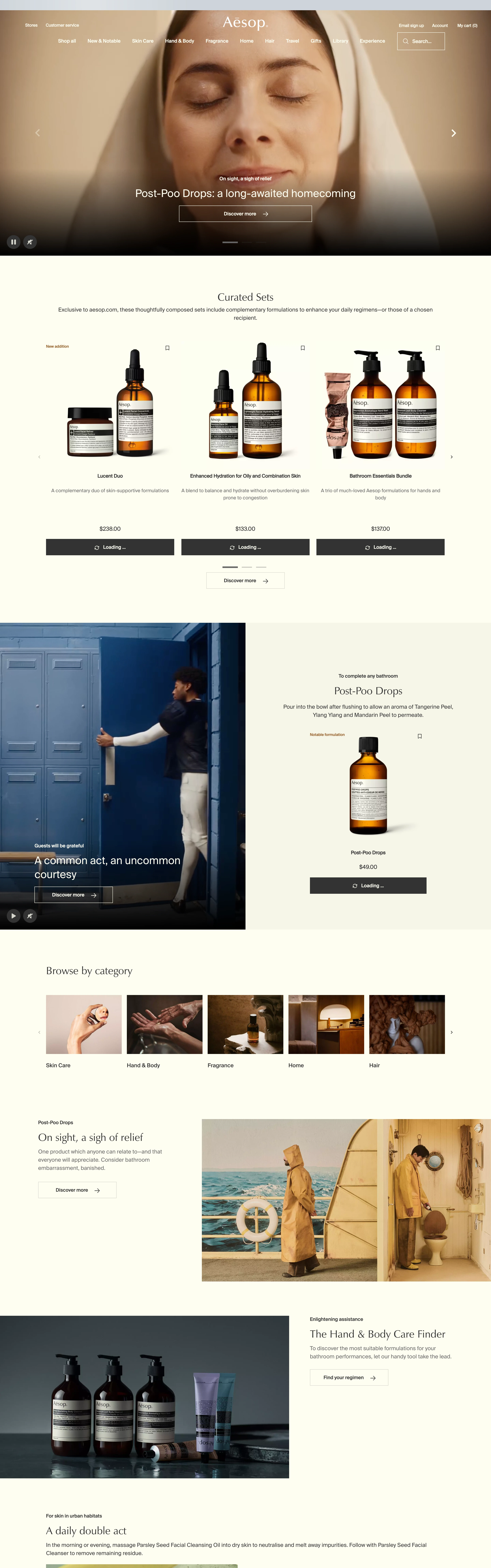
Refined, literary, unhurried. The luxury of restraint. Reads like a well-set book, not an ad.
Colors
Warm off-white / oatmeal paper base (#F3F0EA), near-black ink text, muted olive/sepia accents. No saturated color; everything desaturated and earthy.
Type
A refined serif for headlines (transitional/old-style), often set at modest size with wide margins. Long-form, well-leaded body copy. Small caps and generous tracking on labels.
Layout
Asymmetric editorial grid, big margins, lots of negative space, product/photo panels paired with quiet captions. Left-aligned, column-based, magazine-like.
Motion
Barely-there. Slow fades and subtle parallax on imagery. Elegance through stillness.
Texture
Matte, paper-like flatness. Photography is soft, natural-light, muted. No gloss, no gradients.
Imagery
Prefer real photography: muted, natural-light product still-life on matte paper/neutral backgrounds, desaturated and earthy. Tool: Pexels first for authentic stills; kie-ai Seedream for styled product shots. No bright or glossy imagery.
Don't
No bright colors, no bold sans headlines, no drop shadows, no urgency/marketing loudness.
Make it your own
Turn this reference into a useful brief for your project. Copy it into the AI tool you already use.
Add constraintsPreview & edit promptAssembled in your browser. No API key or AI request needed. Changing the fields refreshes the preview.