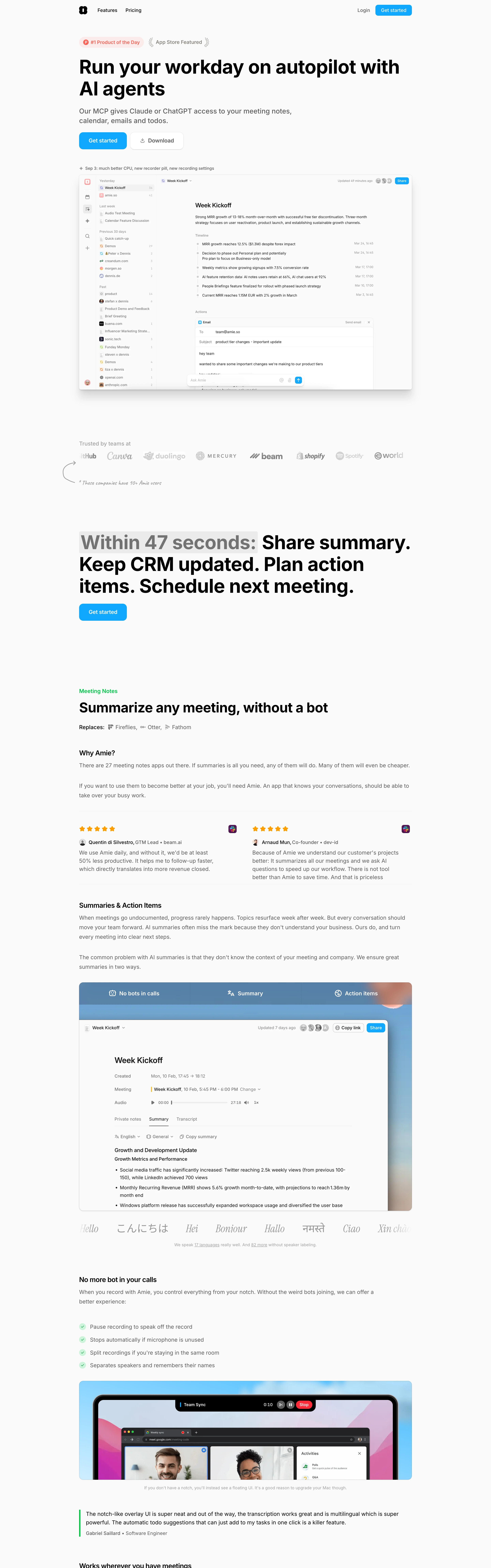
Energetic but tidy. A productivity app that talks like a confident friend — bold claims, playful highlights, everything grounded in the real UI.
Colors
White canvas, near-black headline type, ONE bright cyan (#38C4FF range) for every CTA pill and link, soft grey highlight sweeps behind key phrases, orange review stars, green check bullets, and one peach-to-blue gradient stage for the laptop section.
Type
Very large bold sans statements with mid-sentence emphasis ('Within 47 seconds: Share summary…') where a phrase carries a highlight background; small grey body; tiny coloured eyebrow labels ('Meeting Notes'); a multilingual italic hello strip as a texture break.
Layout
Left-aligned hero: badge chips, big claim, subhead, cyan CTA + outline secondary → giant rounded product screenshot → trusted-by logo row with a handwritten aside → highlighted statement block → alternating essay-like feature sections with embedded UI panels, checklists, and star-rated testimonial cards.
Motion
Snappy product energy: screenshots slide and scale in, highlight sweeps draw across phrases on scroll, pill CTAs squish on hover.
Texture
Clean white with rounded-2xl screenshot frames and soft shadows; one gradient-lit mockup stage; hand-drawn arrow annotations for warmth.
Imagery
Real product-UI screenshots ARE the imagery: calendar/notes panels in rounded frames, a laptop mockup on a soft peach-to-blue gradient stage, tiny avatar headshots on testimonials. Tool: compose actual app-UI mockups in code; kie-ai Seedream for the soft gradient stage backgrounds; Pexels only for small testimonial headshots. No abstract illustration.
Don't
No dark sections, no illustration replacing the product, no second accent colour, no fake abstract dashboards — the real UI is the hero, always.
Make it your own
Turn this reference into a useful brief for your project. Copy it into the AI tool you already use.
Add constraintsPreview & edit promptAssembled in your browser. No API key or AI request needed. Changing the fields refreshes the preview.