Apple — Product configurator
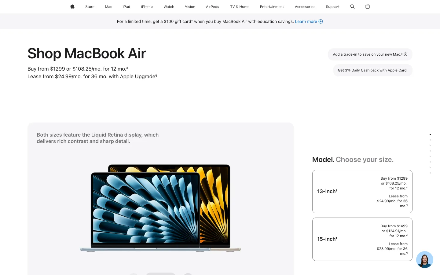
The page splits into two panes on two different clocks — a fixed product photo on the left, a pricing decision on the right — so comparing sizes never costs you the product shot. Every price lives in small right-aligned type inside a thin-bordered card, never announced in the headline.
Why this pattern works
Steal the asymmetric split itself: a wide image pane paired with a narrower, independently-scrolling option column, so the product stays in frame no matter how many variants you're weighing. Inside that column, steal the option-card anatomy — model name bold and left-aligned, the full price stack (buy price, monthly financing, lease price) right-aligned in small type on its own lines. It lets one card hold four numbers without ever looking like a spreadsheet.
Design notes
- Surface
- Buy MacBook Air configurator, model-size step
- Navigation
- One flat global nav — Store, Mac, iPad, iPhone, Watch, Vision, AirPods, TV & Home, Entertainment, Accessories, Support — centered at ~12px, no dropdowns visible, search and bag icons closing the row. A full-width grey promo strip runs directly under it with one merchandising line and a single blue text link. Two tiers, but the second is a banner, not a menu.
- Layout
- Below the promo strip, two panes that scroll independently: a ~870px light-grey rounded-corner panel on the left holding the product photo (pagination dots along its base imply it advances on its own), and a ~340px white column on the right holding the size-picker cards, sitting beside it.
- Density
- Low-density, high-stakes. One headline, one product photo, two option cards — every element gets room precisely because there are only a handful of them.
- Color
- White page, one grey banner strip, one grey product-photo panel, two grey informational pills. The only saturated color is the product render itself (a blue laptop lid and a gold one) and a single blue text link — nav, borders and price text all stay black, white or grey.
- Type
- One sans (SF Pro). 'Shop MacBook Air' is the sole large moment at ~40px bold; financing copy, nav and both option cards sit in a tight 12-17px band. Hierarchy comes from one oversized headline against a field of uniform small text, not a multi-step type scale.
- Pattern
- The option card: a thin grey-bordered white rectangle with the model name bold and left-aligned, and the full price stack — buy price, 12-month financing, 36-month lease — right-aligned in small type, each on its own line. It's a comparison table disguised as two simple boxes.
- States
- Logged out: a floating circular support-chat avatar sits bottom-right as the only account-adjacent element; no cart badge or sign-in state shown. Both size cards render fully even though neither is selected yet.
- Don't
- Don't merge the image pane and the option list into a single scroll region — the split exists so evaluating 13-inch against 15-inch never pushes the product photo off-screen.
Make it your own
Turn this reference into a useful brief for your project. Copy it into the AI tool you already use.