ArtStation — Explore
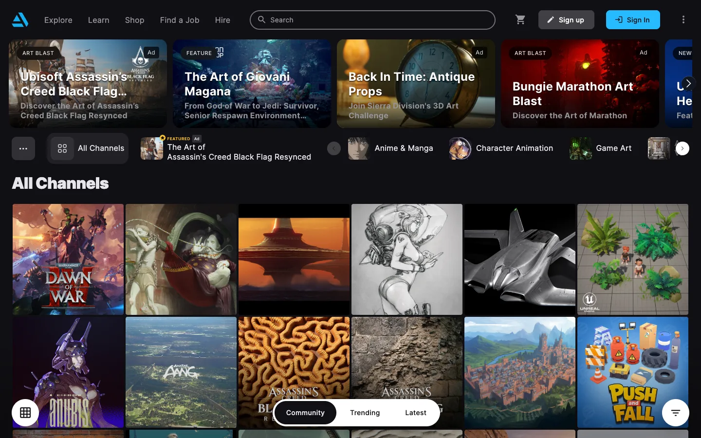
Three separate discovery mechanisms — a hero carousel, a channel strip, and a gapless grid — stack on the same screen with no dividing line between them, because they all share one near-black canvas and one borderless-tile language.
Why this pattern works
Two patterns worth lifting. First, the channel strip where each chip carries its own thumbnail image instead of a plain text label, so browsing categories feels like browsing content rather than filtering a list. Second, the floating bottom cluster — a dark segmented pill plus two circular FABs pinned over the grid rather than docked into a toolbar — which keeps sort and filter reachable without spending any of the fixed header's height.
Design notes
- Surface
- ArtStation, Explore / All Channels view
- Navigation
- Two fixed tiers plus a floating third. A slim top bar (logo, Explore/Learn/Shop/Find a Job/Hire, search pill, cart, sign up/sign in) is the first tier; a horizontally-scrolling channel strip beneath it is the second; a floating segmented pill (Community/Trending/Latest) plus two circular FABs pinned over the bottom of the grid is a third tier that isn't docked to anything.
- Layout
- Fixed top bar and channel strip, fluid scrolling grid beneath. A horizontally-scrolling featured carousel sits between the top bar and the channel strip. The grid is the only region that scrolls vertically; the floating bottom controls stay pinned over it regardless of scroll position.
- Density
- High. Grid tiles are small and edge-to-edge with near-zero gutter, six-plus columns visible at once, no captions, avatars or titles rendered on the tile itself — density comes from image count, not from text.
- Color
- Near-black canvas throughout — nav, channel strip and grid background all read as the same dark value, so no region feels like a separate panel. Colour only appears inside the artwork thumbnails and the blue triangular logo / Sign In button; every structural element (chips, pills, FABs, borders) stays flat dark grey or black.
- Type
- One sans throughout. Nav links ~15px regular white; the 'All Channels' heading ~24px bold; carousel titles ~18px bold white over a gradient scrim; small uppercase badges ('AD', 'FEATURED', 'NEW', 'ART BLAST') at ~10px inside pill chips. No type at all inside the main grid tiles.
- Pattern
- Chip-with-thumbnail channel strip: instead of a plain text filter chip, each channel chip is a small square image of that channel's content plus its label, so the filter bar doubles as a preview rail.
- States
- No empty or logged-out state visible — the grid, carousel and channel strip all render fully populated, and 'Sign up' / 'Sign In' sit permanently in the header as a persistent logged-out affordance rather than a gate.
- Don't
- Don't caption the grid tiles or add hover cards 'for clarity' — the moment every tile carries a title, avatar or stat row, the gapless density that makes this screen scannable turns into a busy list. Also don't hide or oversell the sponsored slots: ArtStation marks only the genuinely paid placements with a small 'Ad' chip at the same visual weight as its other badges, and treats everything else as unmarked.
Make it your own
Turn this reference into a useful brief for your project. Copy it into the AI tool you already use.