← Back to library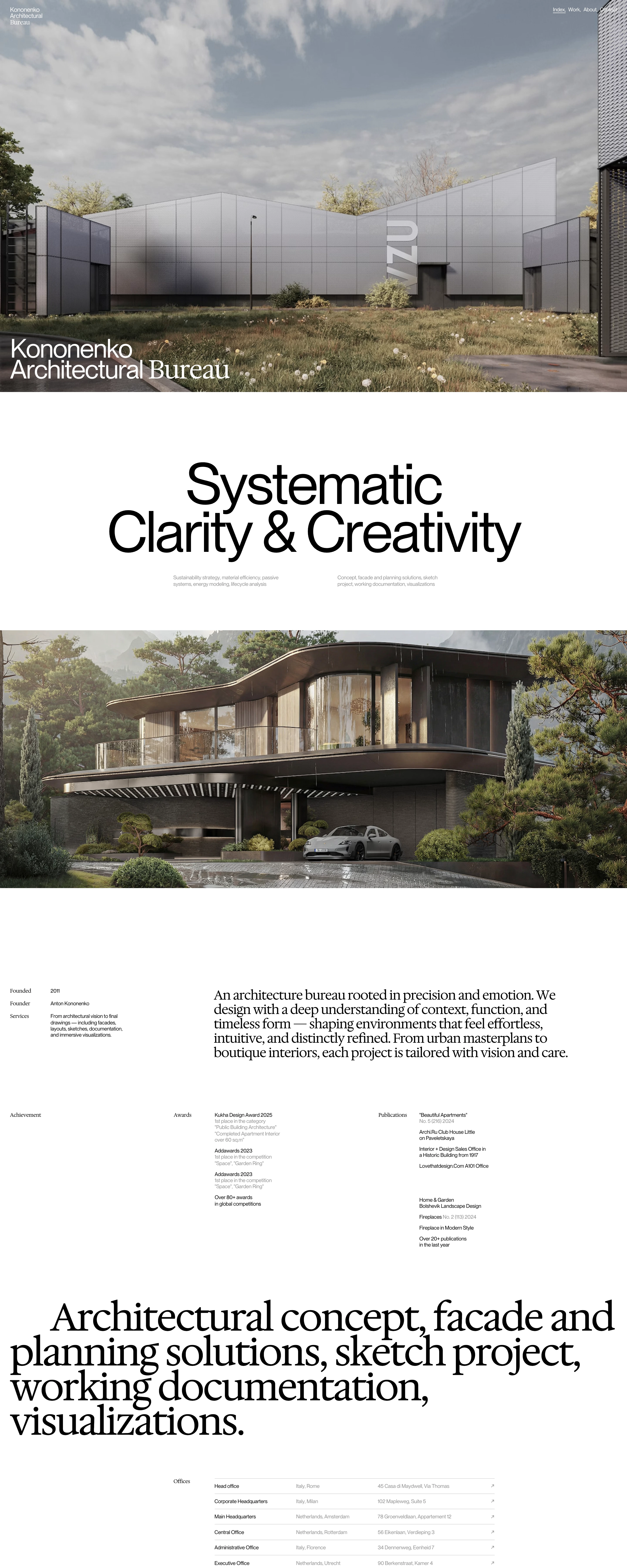
Page excerpt · scroll inside to explore Assembled in your browser. No API key or AI request needed. Changing the fields refreshes the preview.
Kononenko Architectural Bureau
Editorial AgencyVisit sitekononenkogroup.com
Architecture leads the page, followed by a large statement and a sparse studio profile. Mixing sans and serif display type gives the project work an editorial rhythm.
Why this pattern works
Architecture and design practices whose project photography should carry the presentation.
Design notes
- Mood
- Quiet and deliberate
- Colors
- White, black, neutral architecture photography
- Type
- Large sans statements alternating with expressive serif service text
- Layout
- Full-bleed project image, centered statement, second project image, then a split studio profile
- Motion
- Static capture of a live site. Open the source to study its interactive behavior.
- Texture
- Natural materials in imagery with a flat paper-like page
- Don't
- Adapt the hierarchy and visual principles to your own content; avoid copying the identity, imagery, or exact layout.
Make it your own
Turn this reference into a useful brief for your project. Copy it into the AI tool you already use.