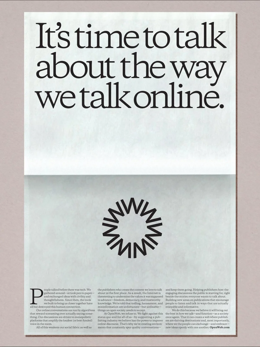
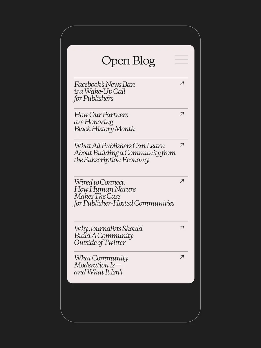
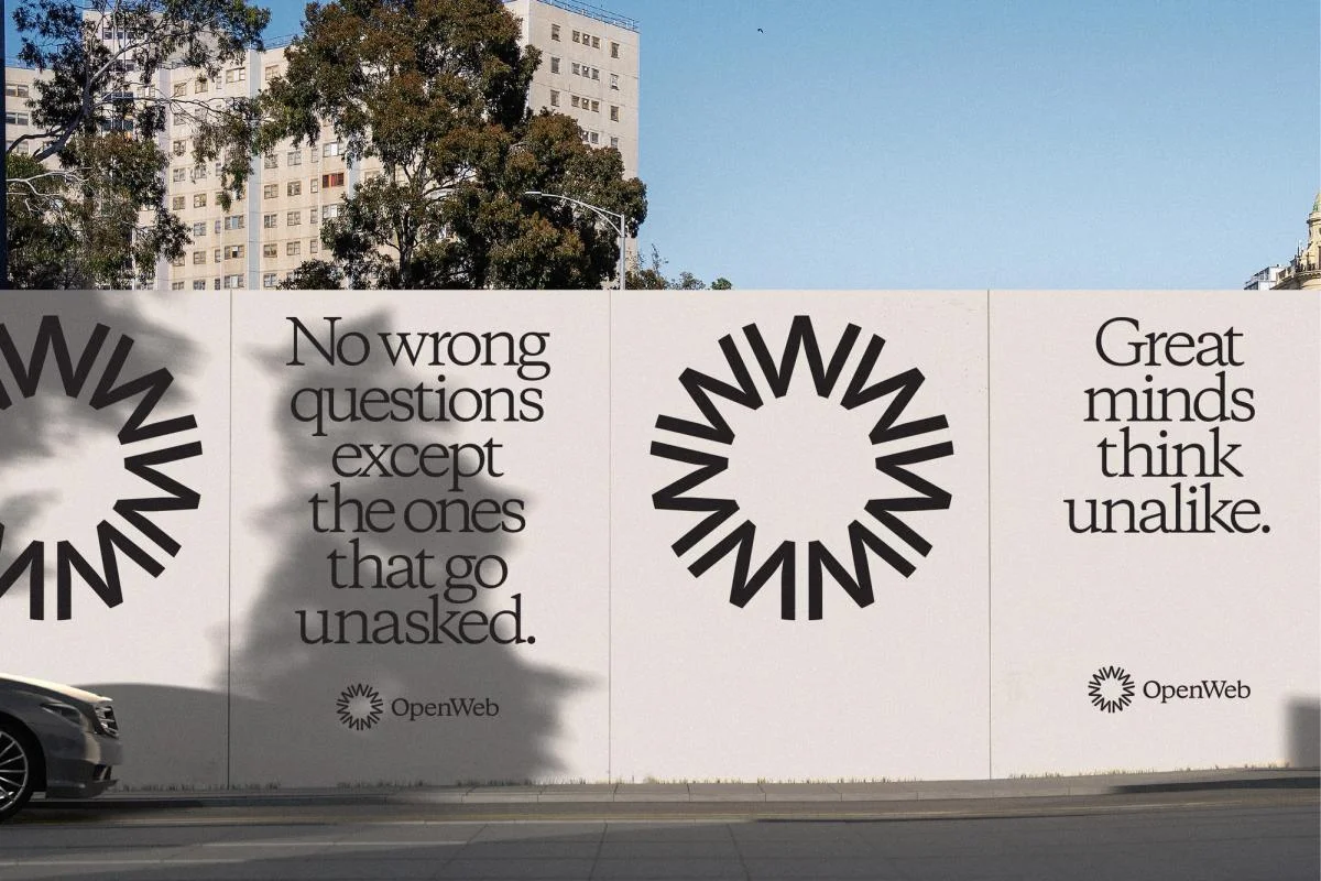
A radiating black emblem provides a strong counterpoint to fine text. A consistent balance of emblem, headline, and quiet margins spans formats.
Identity work by COLLINS. Selected images from the linked case study, reviewed 2026-09-09. Study the published design; consult the brand’s current guidelines for authorized usage.
Study a printed statement, mobile layout, and outdoor communication.
Design notes
Logo
A radiating black emblem provides a strong counterpoint to fine text.
Color
Warm off-white and black dominate the editorial compositions.
Type
Large serif headlines give digital conversation a newspaper-like voice.
System
A consistent balance of emblem, headline, and quiet margins spans formats.
In use
Study a printed statement, mobile layout, and outdoor communication.
Don't
Study the principles and develop an original identity. Do not copy these logos, proprietary typefaces, illustrations, or claims. These are selected images from a published case study; current brand guidelines, asset licenses, and real-world performance have not been verified.
Make it your own
Turn this reference into a useful brief for your project. Copy it into the AI tool you already use.
Add constraintsPreview & edit promptAssembled in your browser. No API key or AI request needed. Changing the fields refreshes the preview.