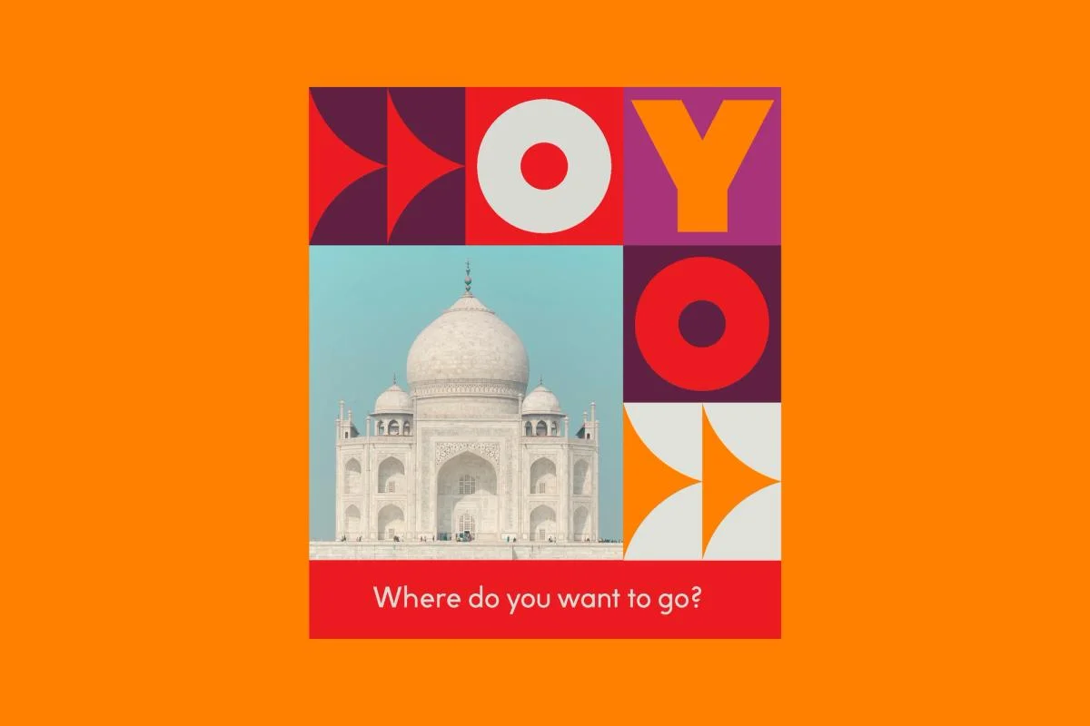
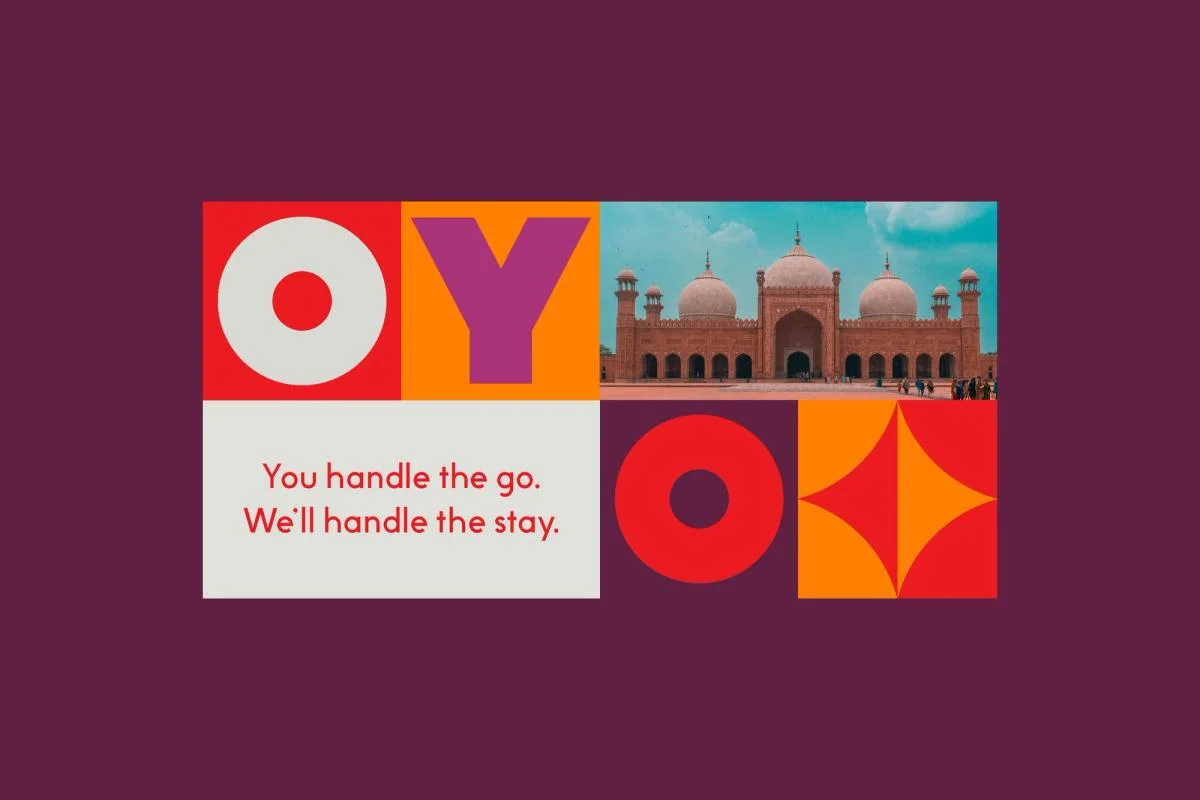
Large O and Y forms become modules within a square grid. A repeatable grid combines the name, destinations, and short messages.
Identity work by COLLINS. Selected images from the linked case study, reviewed 2026-09-09. Study the published design; consult the brand’s current guidelines for authorized usage.
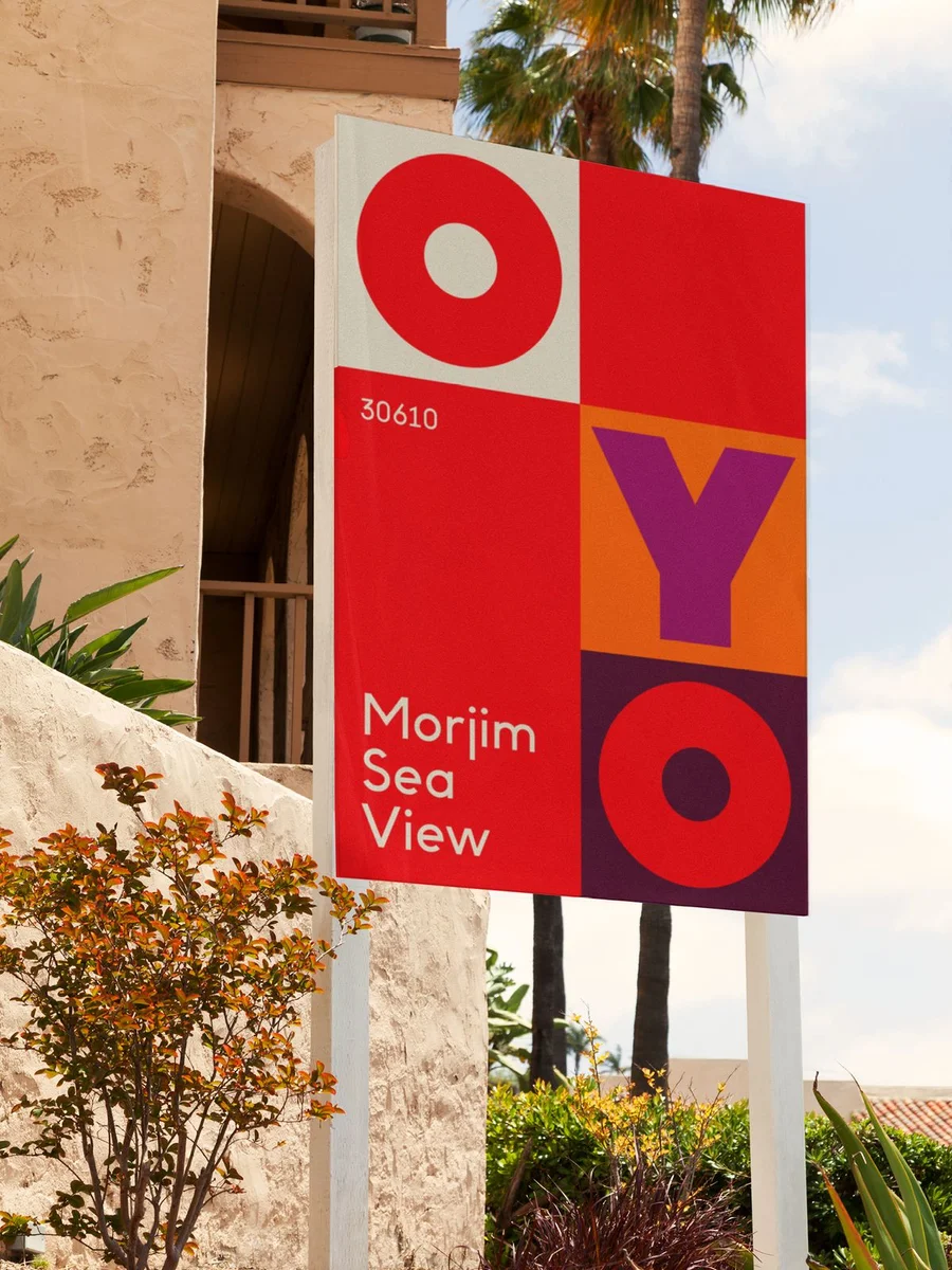
Compare a brand composition, exterior sign, and campaign variation.
Design notes
Logo
Large O and Y forms become modules within a square grid.
Color
Orange, red, pink, and deep plum create strong tile contrasts.
Type
Heavy geometric letters share equal space with image tiles.
System
A repeatable grid combines the name, destinations, and short messages.
In use
Compare a brand composition, exterior sign, and campaign variation.
Don't
Study the principles and develop an original identity. Do not copy these logos, proprietary typefaces, illustrations, or claims. These are selected images from a published case study; current brand guidelines, asset licenses, and real-world performance have not been verified.
Make it your own
Turn this reference into a useful brief for your project. Copy it into the AI tool you already use.
Add constraintsPreview & edit promptAssembled in your browser. No API key or AI request needed. Changing the fields refreshes the preview.