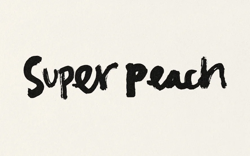
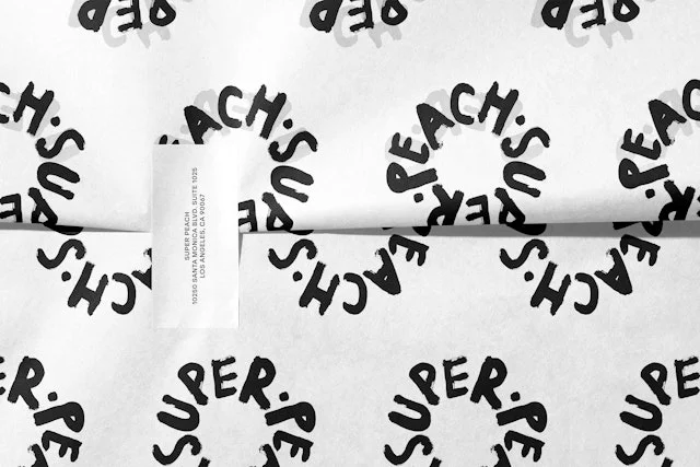
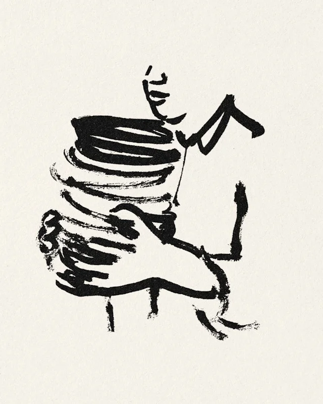
Loose hand lettering gives the restaurant name an informal voice. Illustrated characters and repeated lettering extend the logo's handmade quality.
Identity work by Pentagram. Selected images from the linked case study, reviewed 2026-09-09. Study the published design; consult the brand’s current guidelines for authorized usage.
Hand-lettered wordmarkRepeating letteringRestaurant character
Compare the primary wordmark, a radial pattern, and a character illustration.
Design notes
Logo
Loose hand lettering gives the restaurant name an informal voice.
Color
Black and cream put the emphasis on expressive linework.
Type
Brush-like letters vary in scale and rhythm.
System
Illustrated characters and repeated lettering extend the logo's handmade quality.
In use
Compare the primary wordmark, a radial pattern, and a character illustration.
Don't
Study the principles and develop an original identity. Do not copy these logos, proprietary typefaces, illustrations, or claims. These are selected images from a published case study; current brand guidelines, asset licenses, and real-world performance have not been verified.
Make it your own
Turn this reference into a useful brief for your project. Copy it into the AI tool you already use.
Add constraintsPreview & edit promptAssembled in your browser. No API key or AI request needed. Changing the fields refreshes the preview.