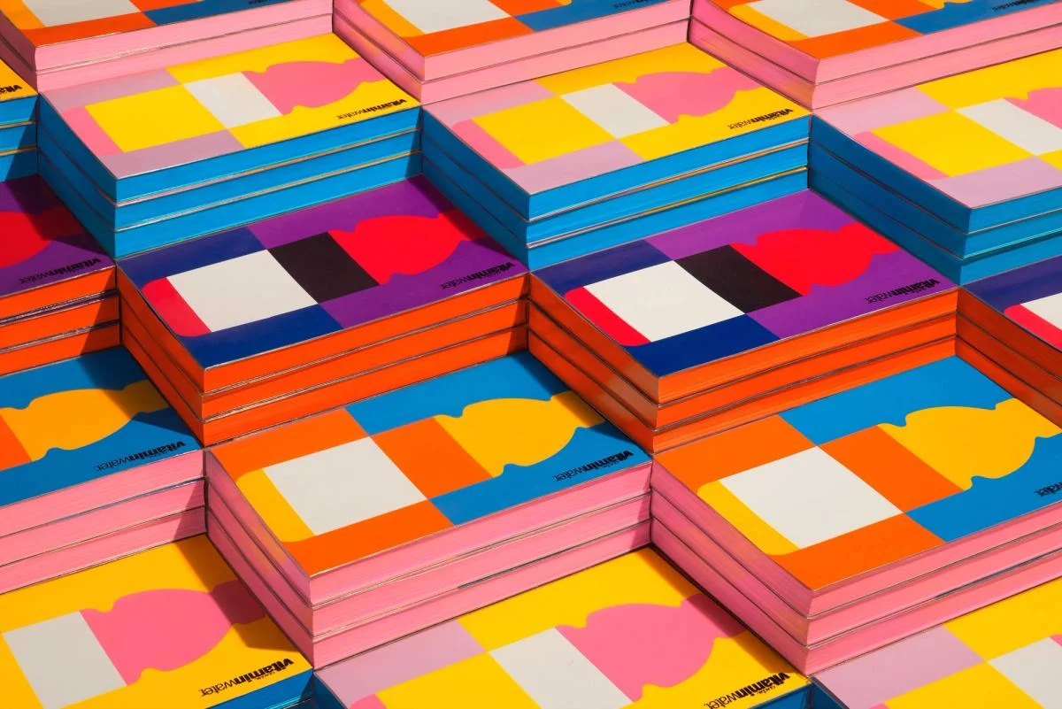
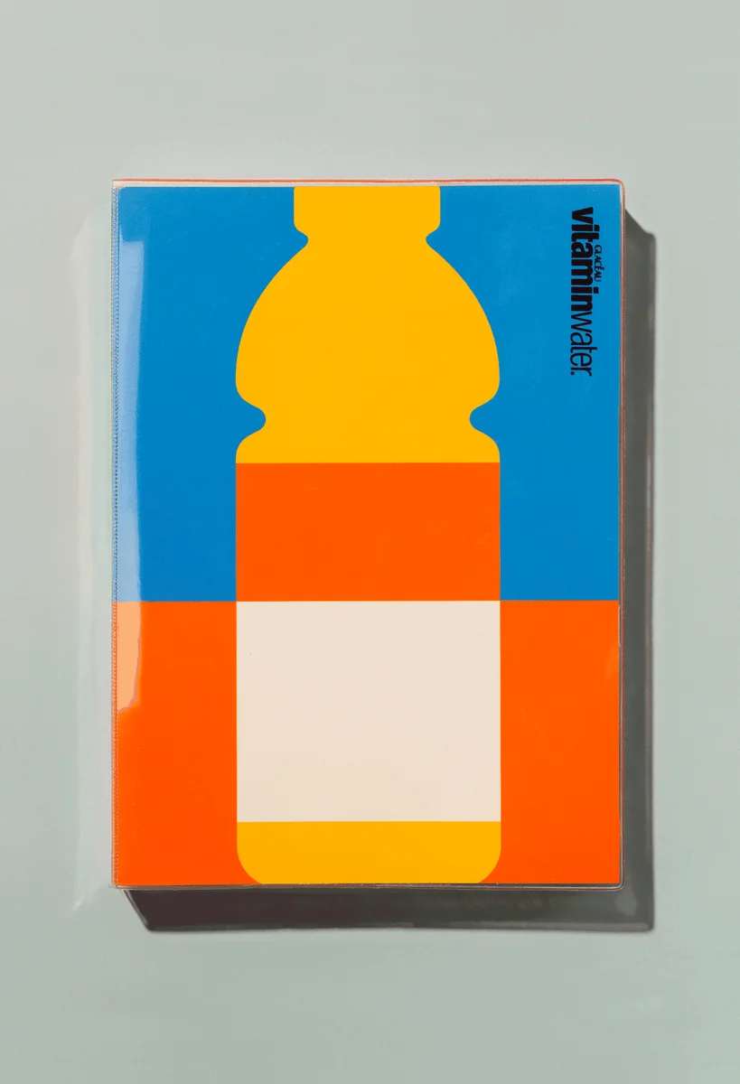
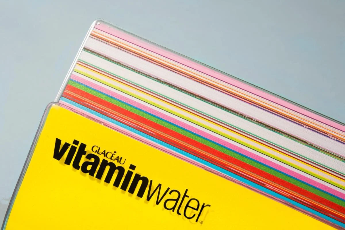
A simplified bottle silhouette becomes a recurring graphic identifier. Repeated bottle proportions connect colorful covers with the wider printed system.
Identity work by COLLINS. Selected images from the linked case study, reviewed 2026-09-09. Study the published design; consult the brand’s current guidelines for authorized usage.
Printed color familyBottle graphicBrand book detail
Compare the cover family, one bottle composition, and a brand book detail.
Design notes
Logo
A simplified bottle silhouette becomes a recurring graphic identifier.
Color
Vivid blocks of orange, pink, blue, and yellow create varied combinations.
Type
Bold and light sans-serif weights distinguish parts of the name.
System
Repeated bottle proportions connect colorful covers with the wider printed system.
In use
Compare the cover family, one bottle composition, and a brand book detail.
Don't
Study the principles and develop an original identity. Do not copy these logos, proprietary typefaces, illustrations, or claims. These are selected images from a published case study; current brand guidelines, asset licenses, and real-world performance have not been verified.
Make it your own
Turn this reference into a useful brief for your project. Copy it into the AI tool you already use.
Add constraintsPreview & edit promptAssembled in your browser. No API key or AI request needed. Changing the fields refreshes the preview.