Can I Use — Support matrix
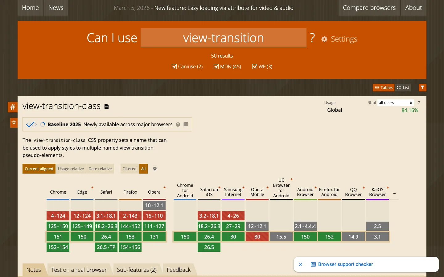
The support matrix doesn't align browsers by version number, it aligns them by era — a handful of stacked bands (dead, previous, current, next) — so Chrome's 150-odd releases and a mobile browser's five still read as one comparable grid, and the only thing that carries meaning across the table is four flat colours.
Why this pattern works
Steal the era-banding, not the version numbers: when you need to compare things that update at different rates (browser versions, plan tiers over time, API versions), don't build a literal timeline column per row — bucket everything into the same small number of semantic bands (unsupported / previous / current / upcoming) and let colour alone carry the comparison. Also take the permalink-and-favorite icon pair living in the page's dark gutter, outside the content card entirely — it keeps page-level actions (link to this, star this) from competing with the content card's own internal toolbar.
Design notes
- Surface
- Can I Use feature-support page for the CSS `view-transition-class` property, table view
- Navigation
- Two tiers, both cheap. A slim top bar (Home, News, a dated changelog line, Compare browsers, About) on near-black, then a big orange hero acting as the real navigation: the search query itself rendered huge inside a darker-orange pill, result counts with source-toggle checkboxes (Caniuse/MDN/WF), and a Tables/List/Filter control cluster below it.
- Layout
- Full-bleed orange hero, then a warm off-white parchment content card sitting on a dark brown page background, wide enough to hold 14+ browser columns before truncating into a '…' overflow. Two small icon buttons (permalink, favorite) sit in the dark margin to the left of the card, not inside it.
- Density
- The header/description area is roomy (large title, generous line-height body copy); the matrix itself is dense and grid-like, ~40px cells, small bold numerals, built for horizontal scanning across a browser row.
- Color
- Saturated orange is spent entirely on the hero/brand chrome. The card itself is warm neutral parchment. Inside the matrix, colour is the only signal: red (unsupported), green (supported, brighter for the current version), gray (unknown/untested), and a dark maroon-brown (historical partial support) — four flat fills, no gradients, no icons layered on top.
- Type
- A display serif for the page title and property name; a plain sans for body copy and buttons; small bold numerals in the matrix cells that read almost like a stock ticker. The CSS property name is set in monospace inline within the description sentence.
- Pattern
- Era-banded colour coding: each browser column stacks the same small number of horizontal bands regardless of how many actual version numbers that browser has shipped, so a 150-version-deep browser and a 5-version-deep one still compare at a glance. Blank cream cells appear wherever a browser genuinely has no data for that band, rather than forcing a fake zero.
- States
- A fully-loaded data state (50 results, live usage percentage, populated matrix) — no empty state visible — but it does show a dismissible floating helper card ('Browser support checker') anchored bottom-right over the content, and toggle groups (Current aligned/Usage relative/Date relative, Filtered/All) for re-slicing the same data without a page reload.
- Don't
- Don't add a fifth colour or a gradient to the matrix to show more nuance. The whole thing is scannable specifically because it's four flat fills — the moment a cell needs a legend to read, the at-a-glance property is gone.
Make it your own
Turn this reference into a useful brief for your project. Copy it into the AI tool you already use.