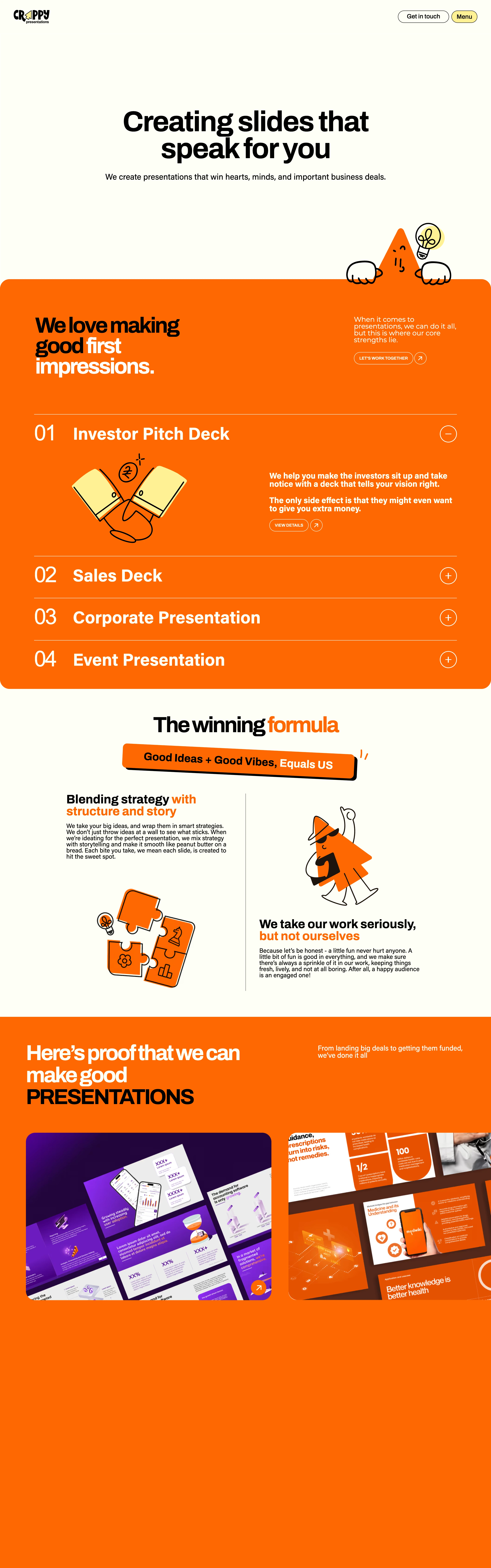
Loud, confident, a little irreverent — an agency that wants you to smile before you buy.
Colors
Cream base #FAF6EC, near-black text/logo #121212, vivid orange block #EE6C2E, white #FFFFFF, small yellow accent badge #F5D949.
Type
A heavy, rounded grotesque (like Poppins ExtraBold or General Sans Bold) at huge sizes with tight tracking for headlines; simple, small sans body text for contrast.
Layout
Big centered hero statement, full-bleed orange block housing a numbered accordion list (01-04), stacked two-column proof/portfolio sections, rotated sticker-badge callouts breaking the grid.
Motion
Accordion items expand and collapse on click; rotated badge callouts suggest a hand-placed tilt; simple hover/scale states on buttons and cards.
Texture
Flat solid color blocks with zero gradients, black hand-drawn doodle illustrations, pill buttons with arrow icons, no drop shadows — everything flat and graphic.
Imagery
Generate: black hand-drawn line-art doodle mascots (a triangle character, jigsaw puzzle pieces, a sunglasses-wearing figure) and colorful flat-graphic presentation-slide thumbnails. Tool: kie-ai GPT-Image or nanobanana for the illustrated line-art style; no photography needed.
Don't
No gradients, no photographic hero imagery, no muted or desaturated colors, no serif type, no soft pastel tones.
Make it your own
Turn this reference into a useful brief for your project. Copy it into the AI tool you already use.
Add constraintsPreview & edit promptAssembled in your browser. No API key or AI request needed. Changing the fields refreshes the preview.