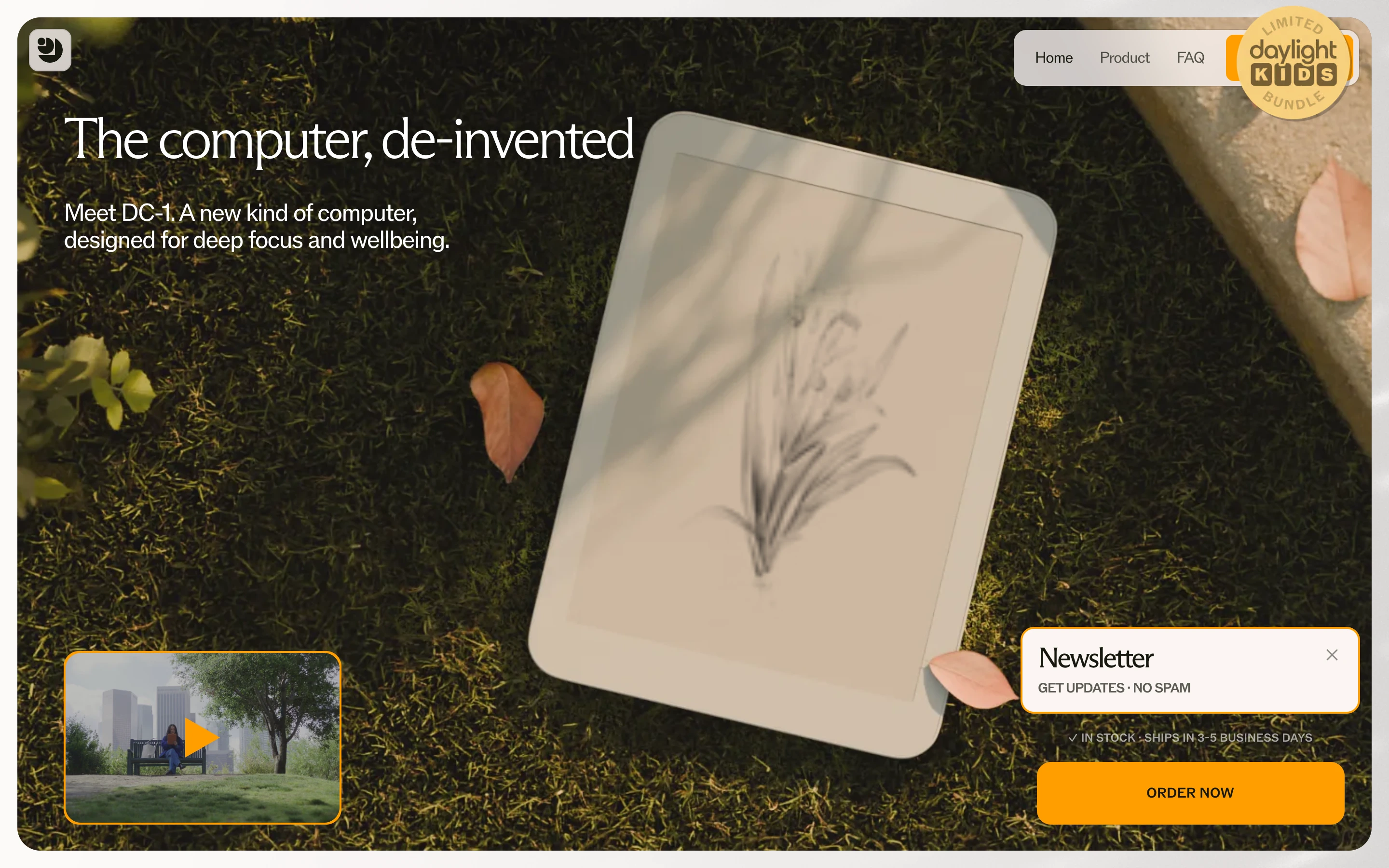
Analog calm. Anti-gadget hardware marketing — feels like a Kinfolk spread, not a spec sheet.
Colors
Sun-warmed greens and ambers from full-bleed photography; cream/bone paper surfaces (#FBF3EC); a single amber-orange accent for CTAs and the brand mark. No pure white, no tech blue.
Type
A gentle humanist serif for the headline ('The computer, de-invented') set small over the photo — confident, not shouty. Tiny sans caption text for supporting lines; small pill nav.
Layout
One full-bleed photographic hero owns the viewport: product flat on moss, top-left headline, floating rounded cards at the edges (video preview bottom-left, newsletter card and amber ORDER NOW bottom-right, badge sticker top-right). Content lives ON the photo, not above it.
Motion
Almost none — a soft video inset loops in its small card; everything else is still, like a photograph should be.
Texture
Organic and tactile: moss, leaf shadows, e-paper matte screen, rounded corners on every floating element, soft natural-light shadows.
Imagery
Golden-hour nature photography with the product lying IN the scene — on grass, moss, wood — dappled shadows falling across a paper-like screen showing a delicate line drawing. Tool: kie-ai Seedream for product-in-nature composites; Pexels for sunlit texture plates. Warm amber grade on everything.
Don't
No dark tech gradients, no glossy device renders on white studio sweeps, no feature grids in the hero, no saturated RGB accents — the warmth IS the pitch.
Make it your own
Turn this reference into a useful brief for your project. Copy it into the AI tool you already use.
Add constraintsPreview & edit promptAssembled in your browser. No API key or AI request needed. Changing the fields refreshes the preview.