Dimensions — Reference library
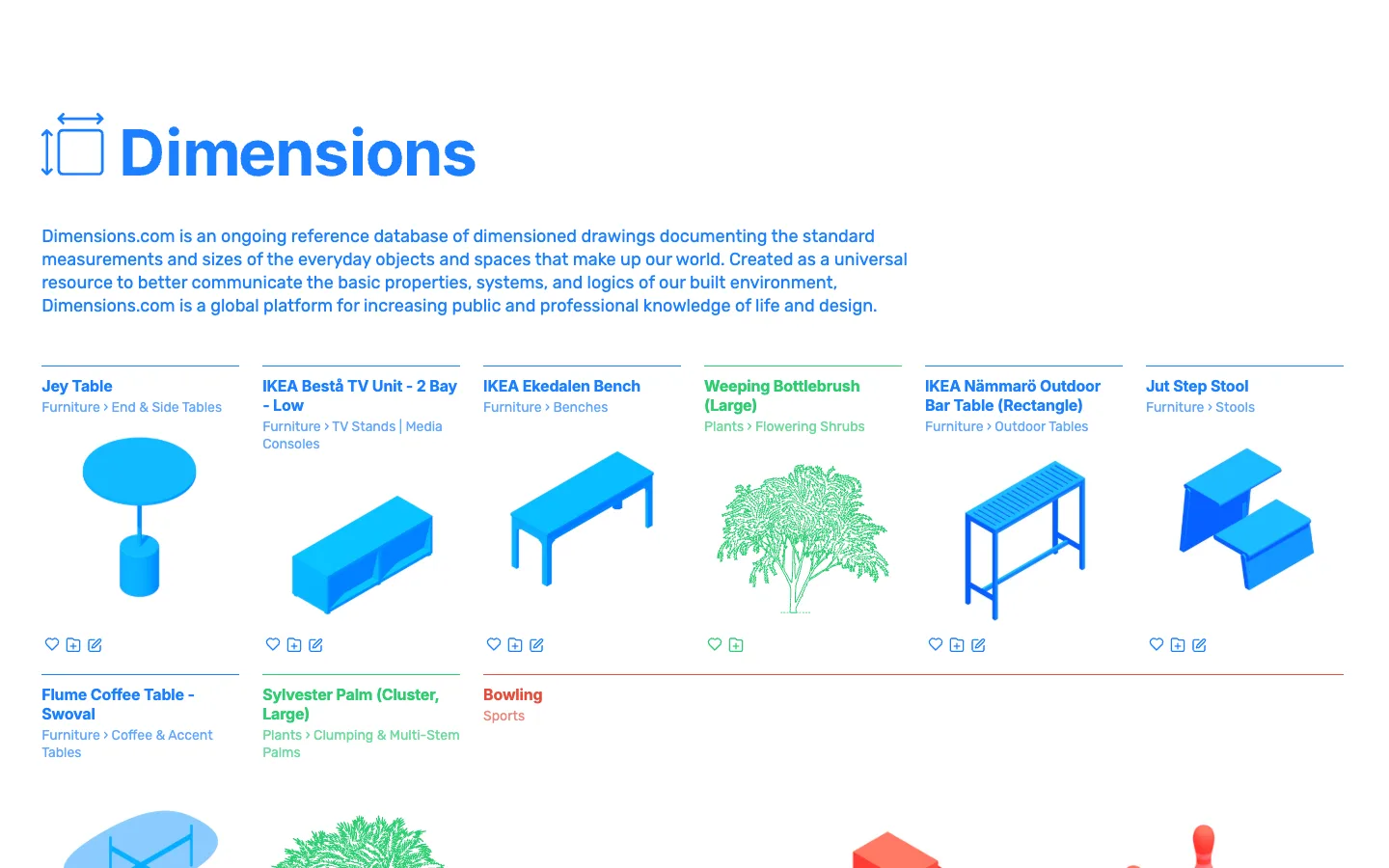
Every line drawing is rendered in one of three colours, and that colour is the category, not a decoration — blue is furniture, green is plants, red is sports, so the whole grid can be scanned and sorted by hue before a single label is read.
Why this pattern works
Assigning one saturated colour per top-level category and applying it to everything in that card — title, breadcrumb, line drawing, and utility icons — instead of using colour as a one-off badge. Worth stealing for any browse/catalog grid with more than 2-3 categories: it lets users pattern-match by peripheral colour vision before they've focused on a single word, which is strictly faster than reading labels.
Design notes
- Surface
- Dimensions.com homepage / browse grid, top of the reference catalogue
- Navigation
- Effectively none visible in this shot — no persistent sidebar, no top nav bar beyond the hero wordmark. This is a flat browse page: a headline, one paragraph of description, then straight into the grid. Discovery here comes from scanning, not from a navigation hierarchy.
- Layout
- Fluid 6-column grid, no card containers, no borders, no shadows on any cell. Rows are only as long as the category has items — a row can end at 2 items instead of 6 without breaking the grid's rhythm.
- Density
- Sparse and gallery-like: one large illustration per cell, generous gutters, a single title and breadcrumb line of text per item. Built for recognizing a silhouette before reading a label, not for scanning dense text.
- Color
- Pure white background and exactly three saturated colours on screen, each locked to one category: blue for furniture, green for plants, red for sports. Nothing else on the page carries colour except the hero wordmark, which is also blue.
- Type
- Bold coloured titles over lighter/smaller coloured breadcrumbs, both set in the category's colour rather than neutral black or grey — hierarchy comes from weight and size at a shared hue, not from a separate grayscale text tone.
- Pattern
- Colour as taxonomy: the illustration's stroke colour, the title colour, the breadcrumb colour, and even the utility icons underneath all inherit one fixed hue per category. The entire grid can be sorted by category with peripheral vision alone, before focusing on a single word.
- States
- No empty, loading, or logged-out state is visible — every visible cell is fully populated with title, breadcrumb, illustration and icon row. The grid simply stops rendering cells when a category's items run out, rather than padding with placeholders.
- Don't
- Don't treat the category colour as a one-off badge or icon tint. If the title stayed black and only a small tag went blue, or if two different categories shared a colour, the entire 'scan by hue' mechanism collapses and it becomes an ordinary grayscale catalogue with occasional coloured accents.
Make it your own
Turn this reference into a useful brief for your project. Copy it into the AI tool you already use.