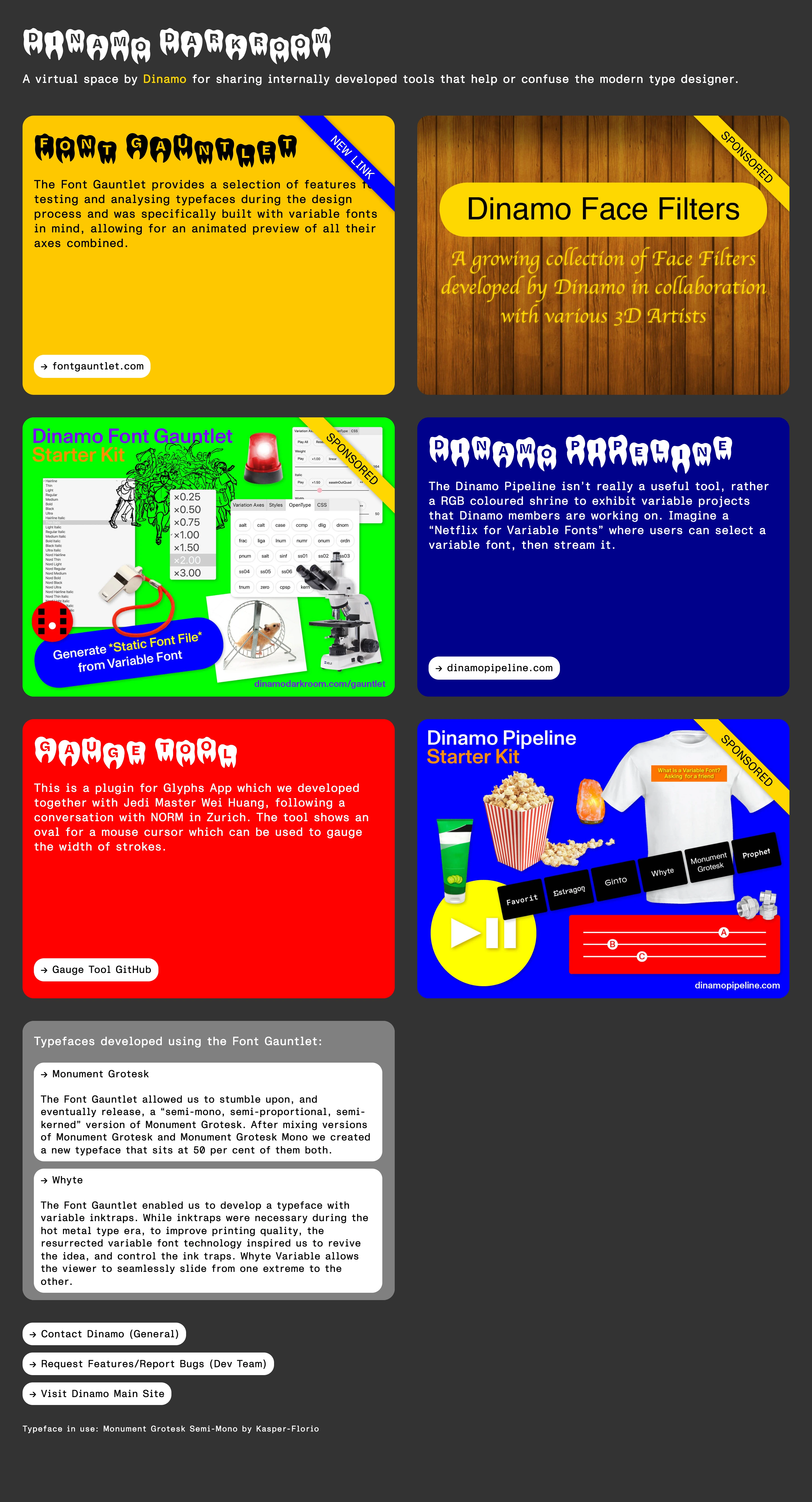
The distortion lives in the type, not the photography — every headline is set in a bubble face pushed through a melting drip axis until the letters droop like wax, then dropped onto flat primary-colour tiles collaged with clip art and diagonal 'SPONSORED' ribbons.
DIY internal-tools zine — a type foundry's junk drawer presented as a joke storefront, half-parodying ad placements ('SPONSORED', 'NEW LINK') on tools nobody is actually paying to advertise.
Colors
Flat, fully saturated primaries with zero gradient: egg-yolk yellow, kelly green, fire-engine red, deep cobalt blue, plus one wood-grain photographic tile, all sitting on a dark charcoal page background. Each tile is a single flat fill — no shading, no texture beyond the collaged elements.
Type
Two registers at war: a dripping, melting bubble display face (set in white or black) for every headline, against small plain monospace body copy inside each tile. The drip treatment is the identity of the whole site — nothing on the page is set in a normal, undistorted display face.
Layout
A loose, unevenly-sized two-column grid of colour tiles, each a self-contained poster: headline, a few lines of body copy, a link button, and often a diagonal corner ribbon plus a clip-art collage. Closes with a plain white/cream index card listing related work, then three pill-button footer links and a typeface credit line.
Motion
Static poster grid — nothing in the capture implies animation. The energy comes from density and color clash, not movement.
Texture
Melt/drip distortion on the type: letterforms balloon into rounded blobs and taper into dripping points at the baseline, applied consistently enough to read as a typeface rather than a glitch effect. Diagonal ribbon banners and collaged clip-art add a second, unrelated layer of visual noise on top.
Imagery
The type IS the imagery here, so budget for a real melt/drip pass on a bold rounded display face, applied identically to every headline on the page — the page wordmark, tool names, everything — so the drip reads as a typeface choice, not a one-off effect. Pair it with flat, shadowless clip-art elements: a crowd silhouette, a spinning warning beacon, screenshotted font-testing UI panels, a t-shirt mockup, popcorn and drink-cup illustrations. Tool: kie-ai or nanobanana to generate the flat sticker/clip-art elements as separate PNGs with no gradient or drop shadow; the drip type itself needs either a genuine variable font with a melt/drip axis pushed to its extreme, or a real mesh-warp/liquify pass on a bold rounded face — not a CSS text-shadow or blur trick, which reads as soft instead of dripping.
Don't
Don't smooth the drips into a clean rounded logotype — the melt needs to look uneven and slightly gross, or it collapses into a cute bubble font. Don't mute the colours or drop the ribbons/clip-art collage; a restrained version of this page has no reason to exist.
Make it your own
Turn this reference into a useful brief for your project. Copy it into the AI tool you already use.
Add constraintsPreview & edit promptAssembled in your browser. No API key or AI request needed. Changing the fields refreshes the preview.