← Back to library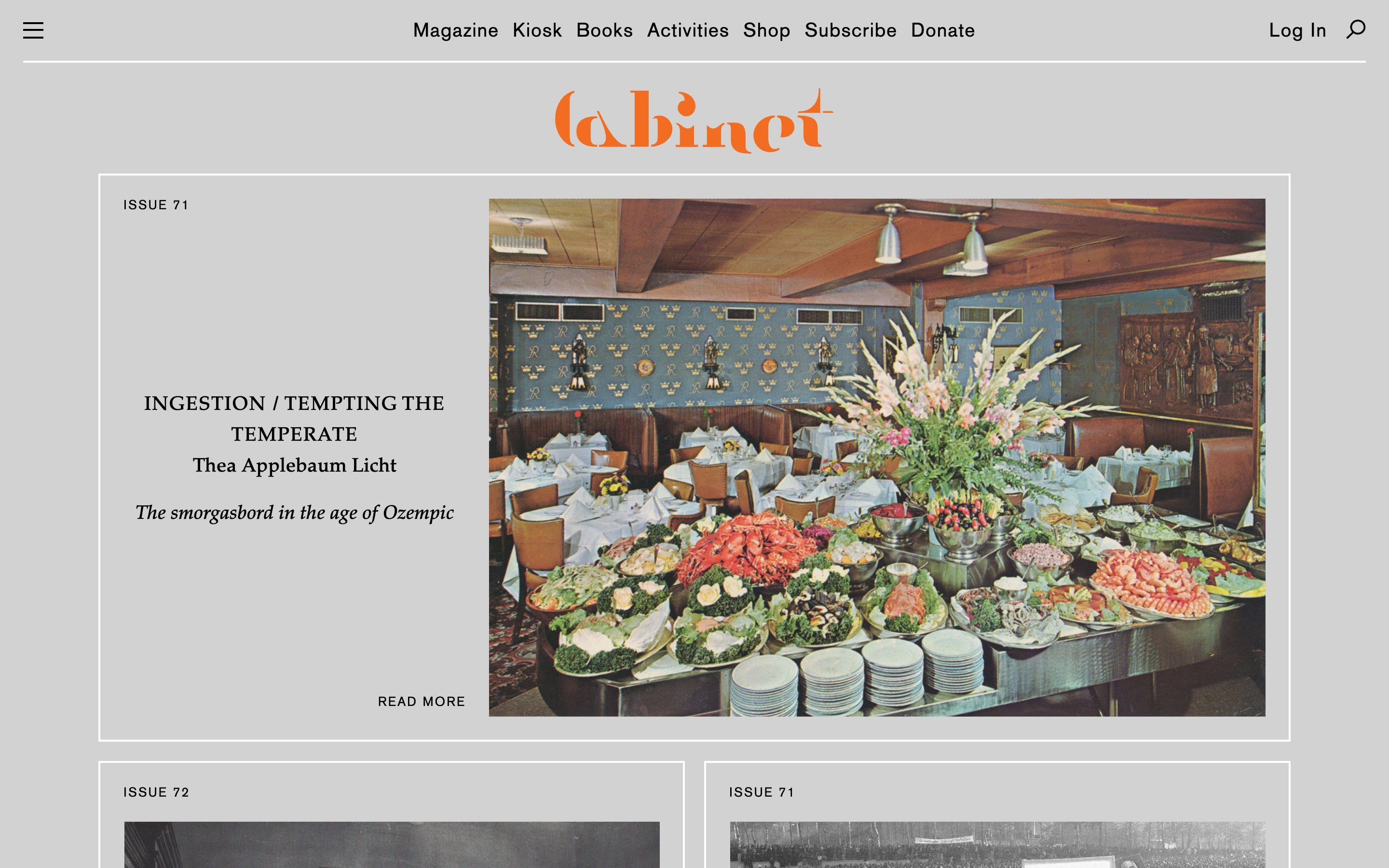
Viewport capture · opening screen Assembled in your browser. No API key or AI request needed. Changing the fields refreshes the preview.
Cabinet Magazine
Editorial GridVisit sitecabinetmagazine.org
Thin rules and an issue-based grid make an arts publication feel like a browsable archive, with one large story anchoring the opening.
Why this pattern works
Thin rules and an issue-based grid make an arts publication feel like a browsable archive, with one large story anchoring the opening.
Design notes
- Mood
- Editorial and content-led
- Colors
- Gray ground, orange wordmark and photographic color.
- Type
- Compact navigation and serif editorial headlines.
- Layout
- A wide feature pairs text and photography inside a bordered grid, followed by smaller issue cards.
- Motion
- A still opening-viewport capture. Visit the original source to inspect motion and scrolling.
- Texture
- The captured imagery supplies visual character; surrounding interface decoration stays restrained.
- Don't
- Adapt the hierarchy and composition to your own content. Use your own identity, text and imagery.
Make it your own
Turn this reference into a useful brief for your project. Copy it into the AI tool you already use.