← Back to library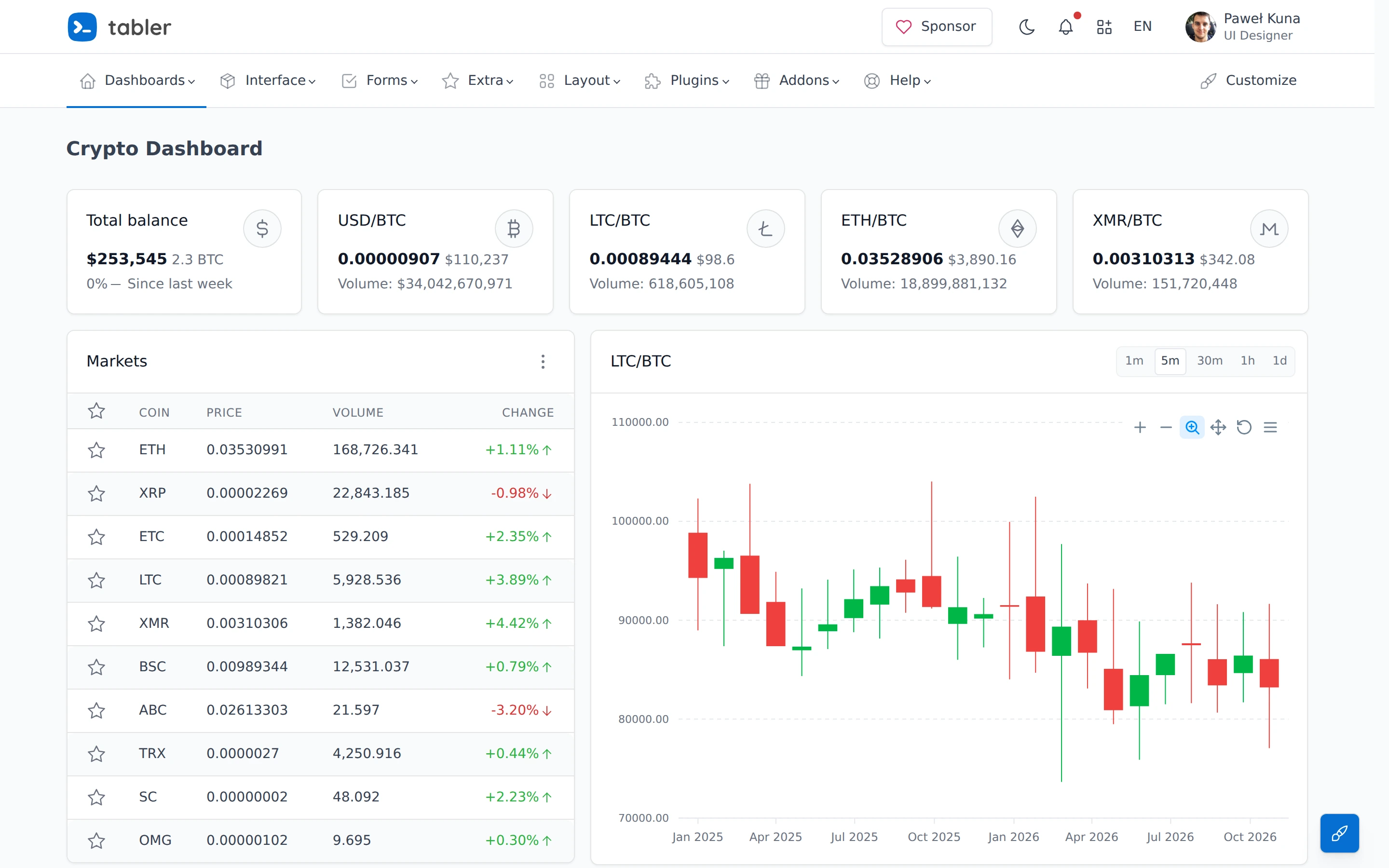
Viewport capture · opening screen Assembled in your browser. No API key or AI request needed. Changing the fields refreshes the preview.
Tabler — Dashboard crypto demo
Analytics DashboardSee it livepreview.tabler.io
Asset balances sit above a market list and a large candlestick chart, combining overview and instrument detail.
Why this pattern works
Asset balances sit above a market list and a large candlestick chart, combining overview and instrument detail.
Design notes
- Surface
- Tabler — Dashboard crypto demo
- Navigation
- Top metric strip, market table at left and chart at right.
- Layout
- Top metric strip, market table at left and chart at right.
- Density
- Compact supporting controls preserve space for the primary content.
- Color
- White, pale gray, green and red
- Type
- Clear sans-serif labels with stronger section headings and smaller metadata.
- Pattern
- Asset balances sit above a market list and a large candlestick chart, combining overview and instrument detail.
- States
- Public example or template in its captured initial state; visible sample data is demonstration content.
- Don't
- Use the structure as a reference, with your own content and identity. This still does not establish the behavior of controls or unseen states.
Make it your own
Turn this reference into a useful brief for your project. Copy it into the AI tool you already use.