Figma — Pricing
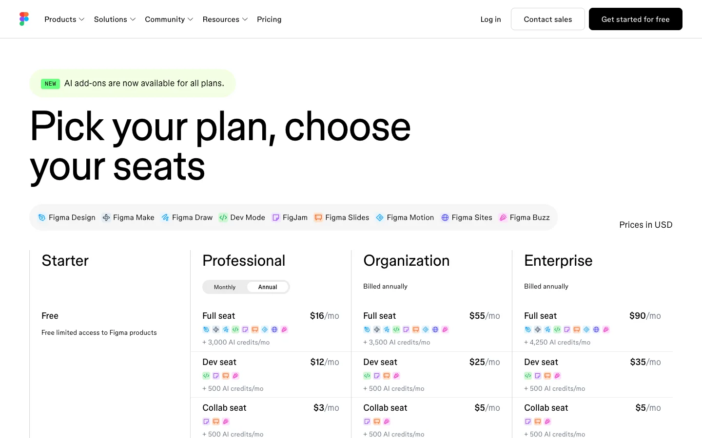
Two-axis pricing (plan × seat type) made scannable: a product-chip legend up top, then four hairline columns where every seat row states its price and shows its product entitlements as tiny colourful chips instead of words.
Why this pattern works
The product-chip entitlement system. Figma sells nine products across three seat types and four plans — a grid that would normally be a giant feature table — and collapses it into rows of ~16px colourful product icons: a legend capsule at the top names all nine chips once (icon + label), then every seat row below repeats only the icons it includes, plus one '+ N AI credits/mo' line. Full seat shows nine chips, Dev seat four, Collab seat three — you read entitlements by chip count and colour without a single word repeated. Steal this any time a plan's contents are a subset of a known set: legend once, icons forever. Also worth taking: the Monthly/Annual mini-toggle living INSIDE the one column where billing choice matters, instead of a page-level toggle.
Design notes
- Surface
- Pricing page top: NEW banner, hero headline, product legend capsule, and the four-plan seat matrix
- Navigation
- White bar: multicolour logomark left, ~15px text links (Products, Solutions, Community, Resources with chevrons, Pricing), right-aligned quiet 'Log in', a white bordered 'Contact sales' pill, and a solid-black 'Get started for free' pill.
- Layout
- Centred page, left-aligned content. A rounded banner chip, the display headline, the full-width legend capsule with 'Prices in USD' floating right, then four equal columns separated by hairline vertical rules — Starter holds only 'Free' + one line, while the three paid columns each stack three seat rows divided by hairlines.
- Density
- The hero is airy; the matrix is compact and information-dense — three seat rows per column, each carrying name, price, chip row, and credit line in ~90px of height. Chips keep it dense without feeling like a table.
- Color
- White canvas, near-black text. Colour belongs to the product chips only — nine distinct hues (teal, blue, green, purple, orange, pink, magenta) at icon size — plus the green NEW banner (bright green chip on a pale-green pill). Buttons are black or bordered white; prices are plain black.
- Type
- One grotesk. Headline ~72px medium over two lines; plan names ~32px regular; seat names ~17px medium; prices ~17px bold right-aligned with a grey '/mo' suffix; chip labels and credit lines ~13px grey.
- Pattern
- The seat matrix: columns are plans, rows within each column are seat types (Full / Dev / Collab), and each cell = seat name + right-aligned price + a row of tiny product chips + an AI-credits line. The top legend capsule (nine icon+label chips in a grey rounded band) is the decoder ring that lets every row below drop its labels.
- States
- The Professional column embeds its own Monthly/Annual segmented mini-toggle (Annual active as a white pill in a grey capsule); Organization and Enterprise instead state 'Billed annually' as plain grey text. Starter's column is mostly empty space — 'Free' plus one grey line — and that emptiness reads as the honest size of the free tier.
- Don't
- Don't spell out product names inside the matrix rows or the chip system collapses back into a feature table. And don't promote the mini-toggle to a page-level control — it belongs only in the column where the price actually changes.
Make it your own
Turn this reference into a useful brief for your project. Copy it into the AI tool you already use.