Finviz — S&P 500 Heatmap
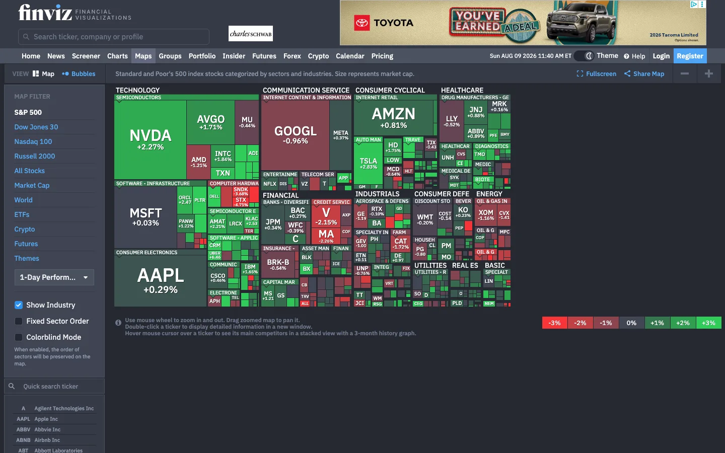
A market treemap where two encodings do all the talking: tile area is market cap, green-to-red saturation is the day's move, and thousands of data points become one readable picture.
Why this pattern works
The self-labelling treemap. Every tile carries its ticker, and label detail scales with tile area: mega-caps get ticker + percentage at large bold sizes ('NVDA +2.27%'), mid tiles get just the ticker, and the smallest tiles go unlabelled — so the map annotates itself exactly in proportion to what matters, with zero tooltips required for the headline read. The grouping hierarchy is typographic, not boxed: caps sector headers (TECHNOLOGY, FINANCIAL) and smaller industry sub-labels sit as text strips above their tile clusters. The decoder is a row of discrete legend chips (-3% -2% -1% 0% +1% +2% +3%) pinned bottom-right, each chip filled with its actual tile colour — steal that over a continuous gradient bar, because it shows the exact bucket colours the eye must match. Dark grey at 0% keeps flat stocks silent.
Design notes
- Surface
- Maps view: dark top chrome, description strip, left filter panel, the sector-grouped treemap, legend chips
- Navigation
- Two dark tiers: a masthead with the wordmark, a rounded search field ('Search ticker, company or profile'), then a tab row (Home, News, Screener, Charts, Maps, Groups, Portfolio, Insider, Futures, Forex, Crypto, Calendar, Pricing) with Maps active, plus date/time, a theme toggle, Help, Login, and a blue Register button at the right.
- Layout
- A slim sub-bar (VIEW switcher Map/Bubbles, a one-line description of the encoding, Fullscreen/Share/zoom controls), then a ~200px left MAP FILTER panel and the fluid treemap canvas. Legend chips float bottom-right; a three-line usage hint sits quietly bottom-left under the map.
- Density
- Extreme by design — hundreds of tiles, ~11 sector groups, dozens of industry labels — yet scannable because the only variables are area and one colour axis. The filter panel and chrome stay minimal so the map takes ~85% of the viewport.
- Color
- Dark slate chrome around a treemap that owns all saturation: greens for gainers and reds for losers, deepening with magnitude, with near-neutral dark tiles at ~0%. White tile text throughout. Chrome accents are limited to the blue Register button, blue filter links, and blue checkbox fills.
- Type
- One condensed-leaning sans. Tile labels scale with area — from ~34px bold tickers on mega-caps down to ~8px on small tiles, percentages a step smaller beneath. Sector headers are ~12px white caps strips; industry labels ~9px dim caps. Chrome text 12-13px.
- Pattern
- Area + diverging colour as the entire grammar: size = market cap, hue = direction, saturation = magnitude, position = sector cluster. The left panel is a one-column decision tree — index links (S&P 500 active, Dow Jones 30, Nasdaq 100…), a timeframe dropdown ('1-Day Performance'), and three checkboxes — every control changing the whole map, not one tile.
- States
- The active index reads as white text against the blue links of its siblings; 'Show Industry' is checked, which is why the sub-labels render. Flat tickers sit near-neutral so silence reads as 'unchanged'. A hint block below the map teaches zoom/hover/double-click without a tour.
- Don't
- Don't add borders, gaps, or shadows between tiles, and never introduce a third hue — the instant anything but the green/red axis is saturated, the treemap stops being readable as a single picture. Labels must truncate to nothing on small tiles rather than shrink the type below legibility.
Make it your own
Turn this reference into a useful brief for your project. Copy it into the AI tool you already use.