Fontshare — Font browser
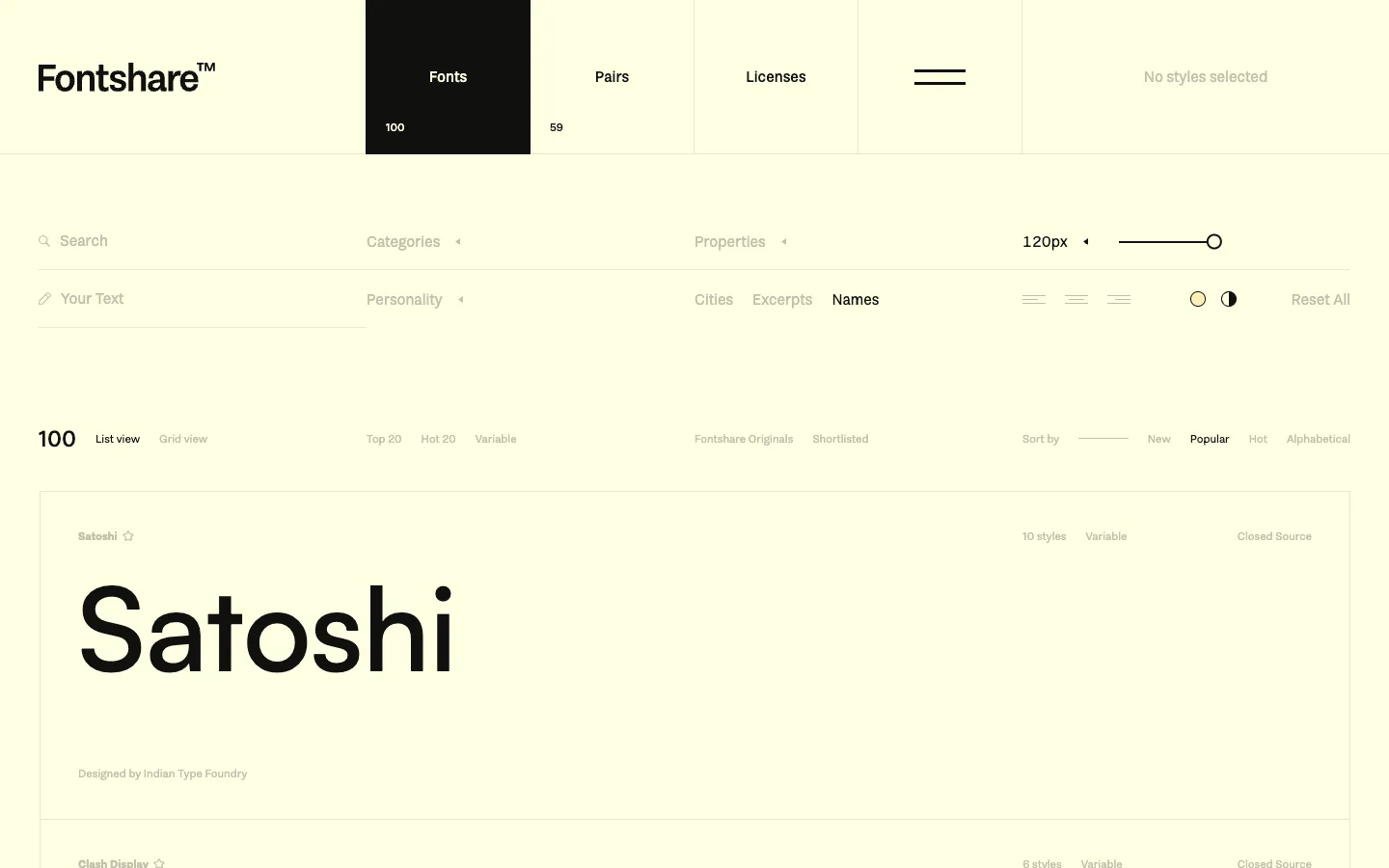
The font's own name, rendered at whatever size the live slider is set to, is the entire content of the row — there's no separate thumbnail or card. And the one riot of color on an otherwise flat cream page is a single tab filled solid black.
Why this pattern works
The self-referential specimen row: the row's only visual content is the font's own name set in itself at a large, live-adjustable size, with metadata (style count, license, foundry) shrunk to ~11px above and below it. Steal it whenever browsing a list of type — the item and its preview become the same object, so there's nothing extra to design. Also take the single filled-black active-tab treatment: it turns a plain-text tab strip into a clear, ownable state without building a tab-bar component.
Design notes
- Surface
- Fontshare homepage, Fonts tab active, list view, sorted by Popular
- Navigation
- Two flat-text tiers. A top row of five equal-width blocks (Fonts / Pairs / Licenses / a divider glyph / a status readout) where only the active one, Fonts, gets a solid black fill — the rest stay plain cream. Under that, a filter row (Search, Your Text, Categories, Properties, a size input) that reads as plain text with tiny disclosure triangles, not buttons.
- Layout
- Full-bleed cream page, no visible max-width, no sidebar. Header block, filter bar, list-controls bar, then a flat list of font rows closed off by a hairline rule top and bottom. Everything stacks in one scrolling column.
- Density
- Each row runs ~330px tall because the specimen itself needs the vertical room. Metadata lines stay ~11px top and bottom of that space, so a row is almost entirely whitespace-plus-type — built for reading typefaces slowly, not scanning many rows fast.
- Color
- Warm cream (~#FDFCE8) canvas, black type, muted grey for anything unselected (categories, counts, Reset All). The only saturated mark on the page is the solid black fill on the active Fonts tab; every other selection state, including Names or Popular, is just a weight/color change on text, never a filled shape.
- Type
- The specimen line is the whole hierarchy: ~120px for the font name, live-adjustable via the px slider, against ~11-13px for every label, count, and control around it. Nothing mid-size exists on the page — it's the giant specimen or near-invisible chrome.
- Pattern
- The live px slider is wired directly to the specimen: dragging it resizes the actual rendered word in place, so the control and the result are the same object on screen — no separate preview panel to keep in sync.
- States
- One filter chip reads 'No styles selected' in grey — a genuine empty-selection state left visible in the header row as if it were just another tab, rather than hidden until something is chosen.
- Don't
- Don't rebuild this as a card grid with a font-name label next to a small separate live-preview box — that's two objects doing one job. The trick is that the row's title and its preview are the same 120px string; shrinking the surrounding metadata to near-nothing is what sells the scale.
Make it your own
Turn this reference into a useful brief for your project. Copy it into the AI tool you already use.