Compiler Explorer — Split panes
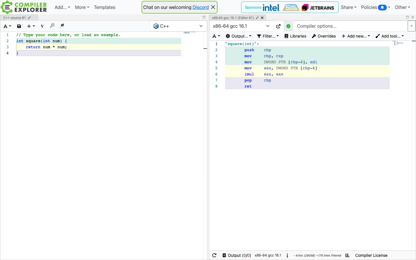
Source lines and the assembly they compile to share the exact same pastel background colour, so two independently-scrolling panes stay visually linked with zero interaction — a wire you can see instead of one you have to hover to find.
Why this pattern works
Steal the colour-linked pane pattern wholesale: assign each logical block of source a distinct pale background (mint, yellow, lavender) and paint the exact same colour behind whatever it maps to in the other pane. It replaces a hover-to-highlight interaction with a permanently-visible one, which matters anywhere two representations of the same thing sit side by side — source/preview, query/result, input/diff. Also worth lifting: each pane gets its own compact toolbar (language picker, action icons) directly under its own tab, so panes are self-contained enough to add a third or a fourth without redesigning anything.
Design notes
- Surface
- Compiler Explorer split-pane view, one C++ source pane and one x86-64 assembly output pane, both showing a single trivial example function
- Navigation
- Barely any. A slim top bar (logo, Add/More/Templates menus, a dismissible Discord banner, sponsor logos, Share/Policies/Other) sits above the workspace and is never touched again once you're editing. Everything else lives inside the two panes themselves.
- Layout
- A hard vertical split down the middle, each half a card with its own tab strip. Left pane fixed to source, right pane fixed to output; both scroll independently and can presumably be resized or multiplied via the per-pane corner controls.
- Density
- Editor-dense: 13px monospace, tight line-height, line numbers flush left. Built for staring at four lines of code and eight lines of assembly, not for browsing.
- Color
- White canvas, near-black monospace text, one blue accent on the language/compiler badges — and then three pastel row washes (mint, pale yellow, pale lavender) that exist purely to link lines across panes. No other colour anywhere in the shot.
- Type
- Monospace for all code in both panes; a small humanist sans for every chrome element (tabs, toolbar labels, dropdowns). Size never changes — hierarchy is entirely positional (which pane, which toolbar row), not typographic.
- Pattern
- Line-level colour linking: line 2 of the source and the three assembly lines it produced share one pastel background; line 3 and its two lines share another; line 4, the closing brace, and its two lines share a third. Scroll either pane and the colour is still there — it's not a hover state, it's baked into the row.
- States
- This is the default/example state — Compiler Explorer loads with a placeholder comment and a working example rather than a blank editor, plus a live green compile-status dot showing the last run succeeded.
- Don't
- Don't make the link colours a hover-only highlight. The entire value is that it's ambient and always-on — a hover version makes you check every line one at a time instead of seeing the whole shape of the mapping in one glance.
Make it your own
Turn this reference into a useful brief for your project. Copy it into the AI tool you already use.