Google Fonts — Specimen
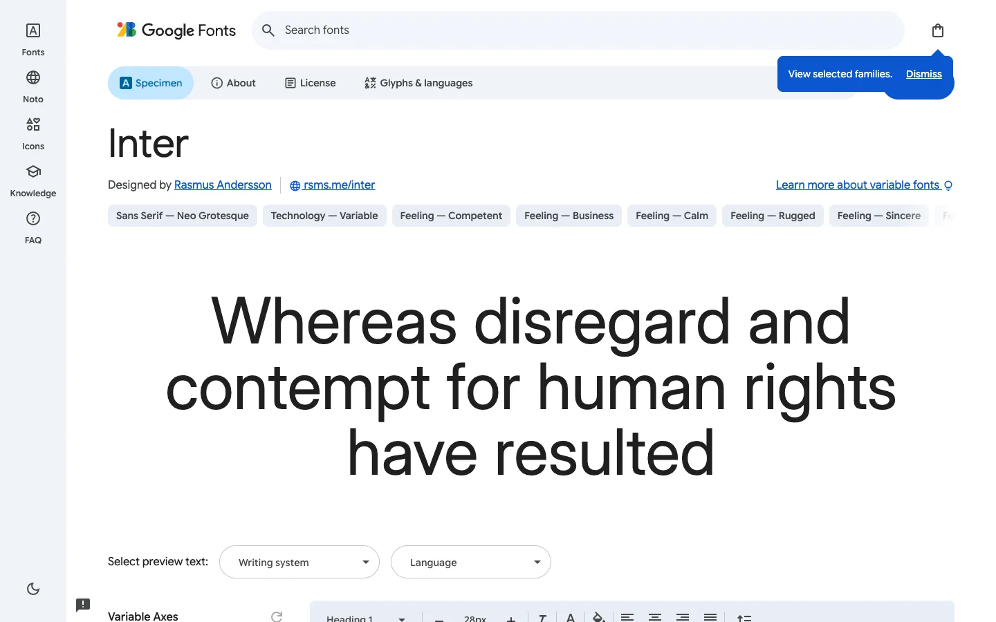
The page has almost no chrome because its entire content area is one giant, live-editable specimen paragraph set in the font itself — everything else is a slim icon rail on the left and a toolbar that only shows up at the very bottom.
Why this pattern works
The attribute-pill row above the specimen (Sans Serif — Neo Grotesque, Feeling — Competent, Feeling — Calm) — plain-language, editorial descriptors in a colon-free 'category — value' pill format instead of a spec sheet. Steal this whenever a product needs to communicate a qualitative attribute (mood, tone, fit) without a rating widget. Also take putting the type-editing toolbar off-screen at the bottom, entering only on scroll, so the hero specimen owns the first viewport uncontested.
Design notes
- Surface
- Google Fonts specimen page for Inter, Specimen tab active
- Navigation
- Two tiers. A ~96px white icon rail on the far left (Fonts, Noto, Icons, Knowledge, FAQ, each a stacked icon over an 11px label, dark-mode toggle pinned to the bottom) that never changes across the product. Beside it, a page-level tab strip (Specimen / About / License / Glyphs & languages) where the active tab is a filled light-blue pill with a letter icon.
- Layout
- Fixed icon rail, fluid content. The content column has no visible right edge or max-width — the specimen paragraph and pill row both run nearly full width. A sticky toolbar is anchored to the bottom of the viewport and only starts to appear on scroll, so it never competes with the specimen on load.
- Density
- Extremely sparse. One search bar, one tab strip, one heading, one pill row, one giant paragraph, one preview-text control — six elements make up the entire visible page, built for one decision at a time rather than for scanning many things.
- Color
- White canvas, near-black text, Google blue (~#1a73e8) reserved for links, the active tab pill, and the selected-family toast. Attribute pills stay neutral light grey so they read as metadata, not as calls to action.
- Type
- The specimen paragraph is the largest thing on the page by a wide margin — roughly 64-72px — set directly in the font being viewed, so the typeface is the copy. The page's own UI type (nav labels, pills, tab text) stays small and neutral (11-14px) specifically so it never competes with the specimen.
- Pattern
- The specimen paragraph is itself the input — the giant visible text is edited in place via the bottom toolbar (heading style, size, alignment, line height) rather than being a static preview with settings living elsewhere on the page.
- States
- A dismissible toast — 'View selected families. Dismiss' — sits pinned near the top-right, overlapping the tab strip; this is the logged-out default nudge, not a saved-state confirmation. A small flag/report icon floats near the bottom-left as a persistent feedback affordance.
- Don't
- Don't give the attribute pills equal visual weight to the tab strip above them — they're findable-on-read metadata, not another layer of navigation. Making them look clickable would suggest they filter the page, which they don't.
Make it your own
Turn this reference into a useful brief for your project. Copy it into the AI tool you already use.