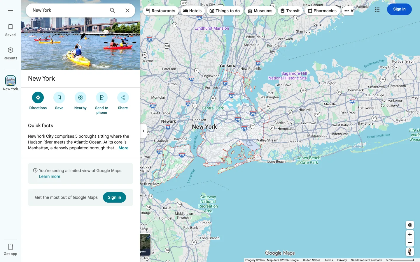
The entire product is a full-bleed map with one fixed-width panel floating on top of it — every piece of chrome, including the category filters, is an island resting on the canvas rather than a layout region that resizes it.
The place-detail panel: hero photo, title, then a row of five identical circular icon buttons with a label under each (Directions, Save, Nearby, Send to phone, Share) — a clean, reusable 'primary actions for an entity' component for any detail view. Also the floating pill filter row sitting directly on the map with no background bar behind it — filters as free-floating chips, not a toolbar.
Design notes
Surface
Place search result for 'New York', logged out, default map view
Navigation
Two tiers, both floating over the map rather than framing it. A slim icon-only rail on the far left (Saved, Recents, a pinned-location tab, Get app) with no visible labels beside the icons, just centered icon-and-caption stacks. Beside it, a search-and-detail panel that behaves like an application in its own right.
Layout
The map is the entire canvas, full bleed, edge to edge. Two floating panels sit on top of it on the left (icon rail plus search/detail panel), and a floating pill row of category filters sits on top of it along the top edge. Nothing pushes or resizes the map — panels overlay it and collapse via a chevron without moving the map underneath.
Density
Loose. The panel has real breathing room between the hero photo, the action icons and the text blocks. The map itself carries standard road-map density, only getting busier at higher zoom.
Color
White panels on a pale beige/grey map by default; colour is reserved for state and category, not decoration — teal-blue for primary actions (the Directions circle, Sign in buttons), purple for point-of-interest labels, red/orange dotted overlays for specific area boundaries. The map's own road/water colour coding is left untouched by the UI sitting on top of it.
Type
One sans throughout, in both the panel and the map labels. The place title is the only large type (~28px bold); action-icon captions are tiny (~11px); quick-facts body copy runs ~14px regular with a '...More' truncation link instead of wrapping fully.
Pattern
The five-icon action row under the place title: identical filled circular icon buttons, evenly spaced, each with a one-word label centered beneath it. It generalizes to any 'primary actions for an entity' panel — swap the five verbs and the component is reusable as-is.
States
Logged out: two separate soft-grey notice boxes stack under the quick facts — one flagging a 'limited view' with a Learn more link, one an explicit 'Get the most out of Google Maps' pitch with its own Sign in button. The product still fully functions (search, directions, save) before authentication; the notices inform, they don't block.
Don't
Don't put a background bar or container behind the top category-filter pills — they're meant to read as floating directly on the map, and adding a toolbar strip behind them would visually merge them with the map's own top edge instead of feeling like an overlay.
Make it your own
Turn this reference into a useful brief for your project. Copy it into the AI tool you already use.
Add constraintsPreview & edit promptAssembled in your browser. No API key or AI request needed. Changing the fields refreshes the preview.