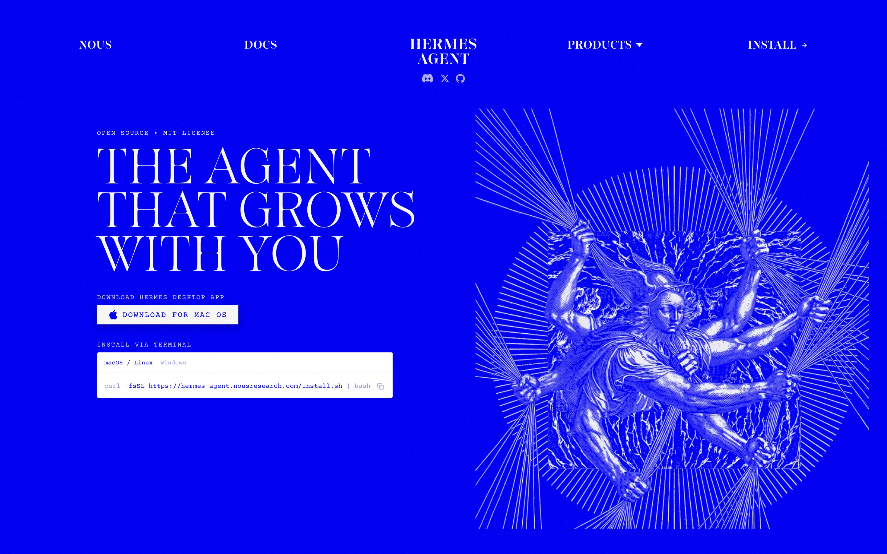
One electric ink colour, classical engravings run through a halftone dither, and a Didone display face — an AI product page that looks like a 19th-century broadsheet printed on a failing monitor.
Scholarly and slightly occult. An AI agent framed as a classical deity rather than a productivity tool. Serious, unhurried, and completely uninterested in looking friendly.
Colors
One saturated ultramarine ink and paper white. That is the entire palette — there is no grey, no accent, no second hue anywhere. Sections invert (blue-on-white, white-on-blue) to create rhythm, which is the only 'colour' move on the page.
Type
A high-contrast Didone serif in ALL CAPS for display, set enormous and letter-spaced tight, against ~10px uppercase monospace with wide tracking for every label, caption and body line. Two faces, maximum contrast between them, nothing in between.
Layout
A centred wordmark with nav split left and right of it. Below, an asymmetric hero — copy block left, dithered artwork bleeding off the right edge. Then a three-up feature grid where each cell is numbered (#1, #2…), captioned in mono, and illustrated with its own dithered plate. Closes with the product name set as a full-bleed word that overflows the viewport on both sides.
Motion
Almost none, and that is the point. No scroll animation, no hover states worth mentioning. The only movement is a video panel embedded in a dithered frame. Stillness is what makes the type read as printed.
Texture
Ordered dithering everywhere — the images are visibly screened, with the dot pattern coarse enough to read as a texture rather than as compression. A subtle scanline treatment sits over the video panel.
Imagery
This is the whole style, so budget for it. Take public-domain classical engravings and mythological sculpture, convert to 1-bit or duotone with an ordered dither (Bayer or Atkinson), and force everything to the single ink colour plus paper. Generate new imagery in the same register — winged figures, radiating burst lines, orbital diagrams, armoured busts — then dither it identically so commissioned and found imagery become indistinguishable. Tool: kie-ai or nanobanana for the source art, then a real dither pass (not a CSS filter) so the pattern survives at 1x.
Don't
Don't add a second colour, and don't use a soft greyscale halftone. The severity comes from exactly one ink and a hard 1-bit threshold; introduce a mid-tone and it collapses into an ordinary duotone photo treatment.
Make it your own
Turn this reference into a useful brief for your project. Copy it into the AI tool you already use.
Add constraintsPreview & edit promptAssembled in your browser. No API key or AI request needed. Changing the fields refreshes the preview.