Hugging Face — Spaces directory
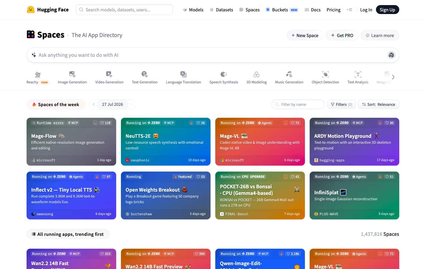
Every card is a colour field first and a screenshot never — status, likes and org are all overlaid badges sitting directly on a full-bleed gradient, so the grid reads as a wall of mood rather than a wall of screenshots.
Why this pattern works
The badge stack overlaid directly on a full-bleed gradient card: a status pill top-left (Running on ZERO / Runtime error / Running) plus tag pills (MCP, Agents), an engagement count top-right, and an org avatar plus relative-time footer baked into the bottom of the same coloured surface — no screenshot asset required at all. Also worth lifting: the horizontally-scrollable category icon rail sitting between global nav and the results grid, a content-specific third nav tier that never competes with primary nav.
Design notes
- Surface
- Spaces directory homepage — the AI App Directory index
- Navigation
- Two tiers plus a content-level filter rail. Global top nav (logo, search, Models/Datasets/Spaces/Buckets/Docs/Pricing, Log In/Sign Up) is one thin white bar. Below it a page header (Spaces title + New Space/Get PRO/Learn more actions), then a full-width AI prompt bar, then a horizontally scrollable row of category icons (Image Generation, Video Generation, and so on) acting as a third, content-specific nav tier.
- Layout
- Fluid single column down to a 4-column card grid. Nothing is pinned or fixed; the whole page scrolls as one document. The category icon row scrolls its own horizontal axis independent of page scroll.
- Density
- Loose. Cards run roughly 4:3, gutters are generous, and each card has exactly one focal point. Built for browsing, not scanning a dataset.
- Color
- White chrome everywhere except the cards. Every card thumbnail is a distinct saturated gradient (teal, red-orange, purple, indigo, green) that IS the visual identity of that Space — there's no product screenshot, the colour itself is the branding. Status badges sit on dark translucent chips rather than their own hue, so they stay legible over any gradient.
- Type
- One grotesque sans throughout. The page title 'Spaces' is boldest and largest; card titles are white semibold sitting on the gradient for contrast; descriptions drop to a lighter white/grey on the same surface; footer metadata is the smallest size on the card.
- Pattern
- The gradient-card-as-full-metadata-surface: status pill, tag pills, like count, emoji plus title, description, org avatar and timestamp are all badges layered on one colour field, so a card is legible and scannable with zero screenshot or thumbnail asset required.
- States
- Live cards show 'Running on ZERO' in a status-coloured chip; a broken one shows 'Runtime error' in the same position and size, so the eye scans status across the whole grid without reading. A trophy icon appears on the highest-liked card as an implicit rank signal.
- Don't
- Don't build these as image thumbnails with badges glued on afterward. The gradient has to BE the card background — a generated colour field, not a screenshot with a status strip bolted underneath — or every card needs custom art and the wall stops being uniform.
Make it your own
Turn this reference into a useful brief for your project. Copy it into the AI tool you already use.