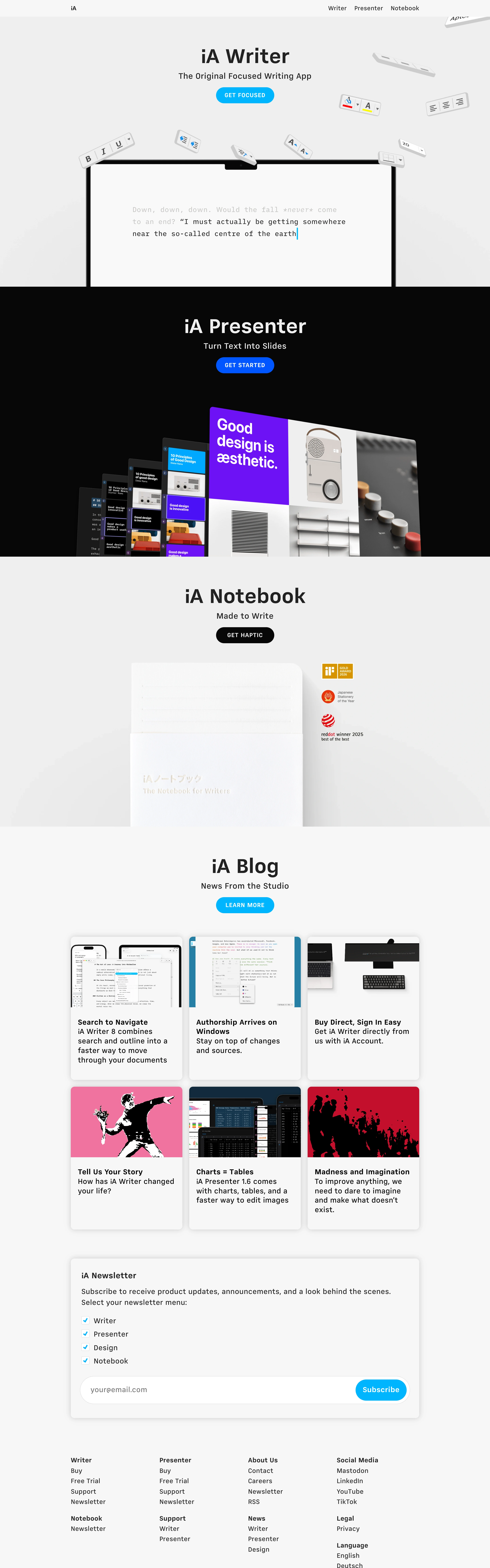
Typographic discipline as brand. Quiet, exact, self-assured — every section says one thing, centered, and trusts the product image to carry the rest.
Colors
Strict monochrome section alternation: light grey (#F2F2F2), pure black, white — one band per product. Near-black and white text respectively. A single blue accent family for pill CTAs (bright cyan-blue and deeper blue), tiny blue checkmarks in forms. Color otherwise only inside product screenshots (one purple slide, red/pink blog art).
Type
One grotesk, few weights, small sizes: medium-large centered product names ('iA Writer'), a one-line regular subtitle beneath, tiny letterspaced caps inside pill buttons ('GET FOCUSED'). Blog cards use small bold heads over tiny grey body. Mono type inside the editor mockup. No display extravagance anywhere.
Layout
Vertical rhythm of full-width centered bands, one product per viewport: name, subtitle, pill CTA, hero mockup — repeat. Then a 3x2 blog card grid on light grey, a boxed newsletter form with checkbox list, and a dense multi-column footer of tiny links. Everything on the center axis; margins do the design.
Motion
Minimal and precise: floating key props drift subtly as if weightless, mockups fade up on section entry, hovers are simple color shifts. Motion never exceeds the products' own calm.
Texture
Flat fields with photographic product texture inside the mockups — embossed paper, matte keys, screen glow on black. Soft realistic shadows under floating props; zero decorative texture on the canvas.
Imagery
Product-as-object mockups only: a minimal editor window with mono placeholder text, floating physical formatting-key props (keyboard keys) scattered at angles around it, a fanned deck of slide mockups on black, an embossed paper notebook on white. Build UI mockups in HTML/CSS; kie-ai Seedream for the floating key props and paper-embossed product stills. No lifestyle photography, no people.
Don't
No multiple typefaces, no gradients, no rounded cards beyond gentle radii, no marketing superlatives, no asymmetric layouts. Never introduce a second accent color — blue is the only voice besides black and white.
Make it your own
Turn this reference into a useful brief for your project. Copy it into the AI tool you already use.
Add constraintsPreview & edit promptAssembled in your browser. No API key or AI request needed. Changing the fields refreshes the preview.