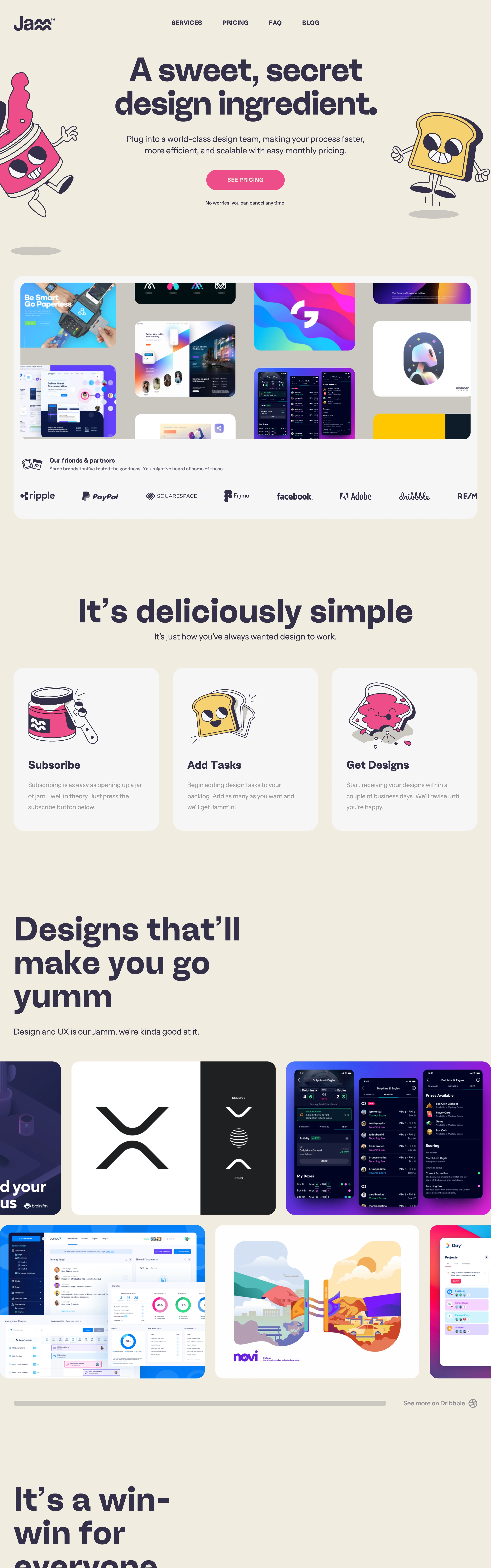
Friendly, snackable, low-pressure. Reads like a consumer app, not a B2B tool, even though it sells design services.
Colors
Warm cream base (#EFE9DC), near-black navy text (#1B1A2E), candy-pink primary CTA (#F0568C), mustard-yellow accents (#F2B33D), white cards on the cream field for contrast.
Type
A bold, slightly rounded grotesque (like Poppins or a rounded Inter) for headlines set in heavy weight; small uppercase letter-spaced labels for nav and eyebrows; plain sans body copy.
Layout
Centered hero with mascots flanking the headline, single pill CTA below the subhead, then a full-width white card holding a partner-logo strip. Below that, 3-up icon+illustration feature blocks, then a masonry grid of case-study thumbnails.
Motion
Implied light bounce on mascots and hover-lift on cards; nothing aggressive — the whole feel is calm despite the cartoon assets.
Texture
Flat cartoon illustration linework, soft drop shadows under white cards, no gradients or noise — everything is flat color fills.
Imagery
Generate: hand-drawn cartoon mascot characters (jam jar, toast slice) with simple wobbly linework and flat fills, plus a Dribbble-style grid of colorful UI/brand-design thumbnails. Tool: kie-ai GPT-Image or nanobanana for the mascot illustrations; Pexels not needed, everything is illustrated or mocked UI.
Don't
No dark mode, no corporate stock photography, no sharp corners — every card and button is heavily rounded, no muted/desaturated palette.
Make it your own
Turn this reference into a useful brief for your project. Copy it into the AI tool you already use.
Add constraintsPreview & edit promptAssembled in your browser. No API key or AI request needed. Changing the fields refreshes the preview.