Lexica — Image search
There's no marketing copy between the search bar and the content — the masonry grid starts within about 40px of the Search/Generate buttons, so the page sells itself with actual output instead of a promise of it.
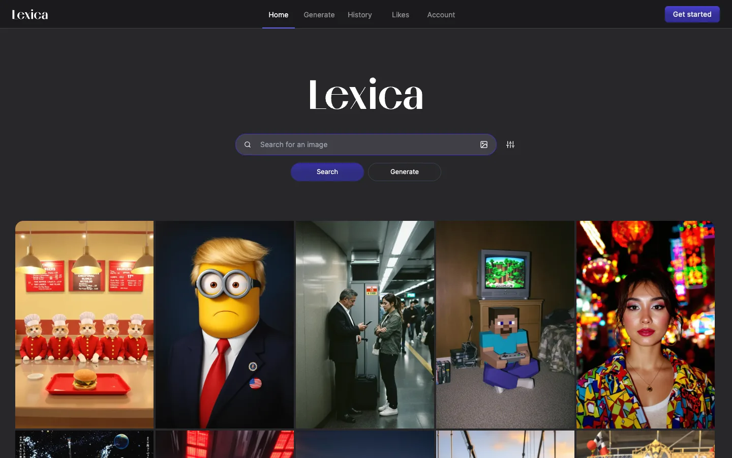
Why this pattern works
The gapless masonry grid: images butt directly against each other with zero gutter, so the grid reads as one continuous image-wall rather than a set of separated cards. Steal this whenever the content itself, not the chrome around it, is the selling point. Also take the search-bar-with-two-CTAs pattern — one filled 'Search' plus one outlined 'Generate' directly under the input — for serving two distinct intents from one field without a mode switch.
Design notes
- Surface
- Lexica homepage, logged out, default/trending image feed
- Navigation
- One tier. A slim top bar with the wordmark left, five text nav items centered (Home / Generate / History with a dropdown chevron / Likes / Account), and a single filled 'Get started' button on the right — no secondary nav, no breadcrumbs.
- Layout
- Full-bleed, no side rails. Everything above the grid sits centered in a narrow column (wordmark, search field, buttons); the grid itself goes edge-to-edge full viewport width the moment it starts. Vertical scroll only, aside from the thin fixed top bar.
- Density
- The hero is sparse — one wordmark, one field, two buttons — but the handoff to the grid below it is immediate and dense: five-plus columns of images with no captions, no metadata, no padding, built for rapid visual scanning, not reading.
- Color
- Near-black (~#18181c) canvas throughout, white and light-grey text, a single indigo/violet accent used consistently for the active nav underline, the filled 'Get started' button, and the filled 'Search' button — the outlined 'Generate' button deliberately withholds that color to read as the secondary action.
- Type
- A high-contrast, Didot-style serif wordmark appears at two sizes — small in the top bar, large and centered as the page's actual headline — and nowhere else. Every UI label (nav, placeholder, buttons) is a plain grotesque at ~14-15px, so the serif is reserved entirely for brand, never for interface text.
- Pattern
- Zero-distance handoff from hero to content: the search hero has no supporting paragraph, no feature list, no scroll cue — wordmark, field, two buttons, then content immediately. The grid begins before the user has to scroll.
- States
- Logged-out state shows a fully populated default feed, not an empty state, with a 'Get started' CTA in the top bar — browsing is allowed without an account, signup is offered but not gated.
- Don't
- Don't add gutters or card backgrounds to the grid to tidy it up — the effect depends on images touching edge-to-edge like a contact sheet; any gap turns the image-wall back into a generic card grid.
Make it your own
Turn this reference into a useful brief for your project. Copy it into the AI tool you already use.