Lichess — Lobby
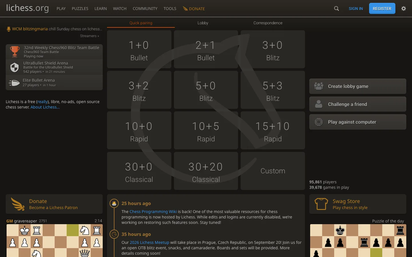
A game lobby that makes starting a game the whole page: twelve giant time-control tiles where the number is the design, ringed by live community proof on a near-black canvas.
Why this pattern works
The time-control tile grid. What would normally be a settings form (pick minutes, pick increment, pick mode) is rendered as a 3x4 grid of huge tappable tiles — '1+0 Bullet', '5+3 Blitz', '15+10 Rapid', '30+20 Classical', 'Custom' — each just a ~40px light number over a dim ~20px category word on a dark panel. One tap starts matchmaking; the most common choices cost zero configuration and the grid doubles as a legend teaching the format taxonomy. A huge ghosted knight watermark behind the grid brands the void without adding an element. Steal this whenever the primary action has a handful of standard presets: promote the presets to giant tiles, demote configuration to the single 'Custom' tile. Also worth taking: live counts as social proof ('95,861 players / 39,678 games in play') sitting quietly beside the action buttons.
Design notes
- Surface
- Logged-out home lobby: top nav, tabbed pairing grid, side rails of tournaments, actions, news, and mini boards
- Navigation
- A single dark text bar: 'lichess.org' wordmark left, plain-caps links (PLAY, PUZZLES, LEARN, WATCH, COMMUNITY, TOOLS) plus an orange DONATE, then right-aligned search icon, quiet SIGN IN, a solid-blue REGISTER button, and a settings gear. No dropdown chrome visible — just words on dark.
- Layout
- Three columns on a near-black canvas: a left rail (streamer line, tournament tiles, blurb, donate panel, a live-game mini board), the wide centre (three-tab lobby over the 3x4 tile grid, then a timestamped news feed), and a right rail (three stacked action buttons, player/game counts, swag-store panel, puzzle-of-the-day mini board).
- Density
- High but calm — tournaments, twelve tiles, three buttons, counts, news, and two mini chessboards all fit because almost everything is text on dark panels one shade lighter than the canvas, with no borders or shadows.
- Color
- Near-black background with panels a step lighter, warm grey text. Accents are sparse and semantic: orange for the active tab underline, links, and Donate; blue for REGISTER and inline links; the chessboard tan/brown of the mini boards is the biggest colour mass on screen. Tile numbers are simply lighter grey — no colour needed.
- Type
- One humanist sans. Tile numbers at ~40px light are the largest type; their category labels ~20px dimmer below; nav caps ~14px; everything else 13-15px. Hierarchy is built almost entirely from grey-value steps against the dark canvas.
- Pattern
- Preset-first action design: the 3x4 grid covers every standard speed (Bullet through Classical) with exactly one non-preset escape hatch ('Custom'), behind a three-tab switcher (Quick pairing / Lobby / Correspondence) whose active tab is an orange-underlined label. The ghosted knight watermark fills the grid's negative space at ~4% contrast.
- States
- The lobby breathes even when logged out: live player and game counts tick beside the actions, tournament tiles show 'Playing now' and '542 players • in 21 minutes', mini boards display real positions with clocks, and the news feed timestamps itself ('25 hours ago'). Nothing on the page is a placeholder.
- Don't
- Don't decorate the tiles — no icons, borders, or per-speed colours; the bare number-over-word is what makes twelve options scannable in one glance. And don't let accent colours spread past the active tab, links, and the two CTA buttons, or the dark canvas loses its calm.
Make it your own
Turn this reference into a useful brief for your project. Copy it into the AI tool you already use.