LMArena — Leaderboard
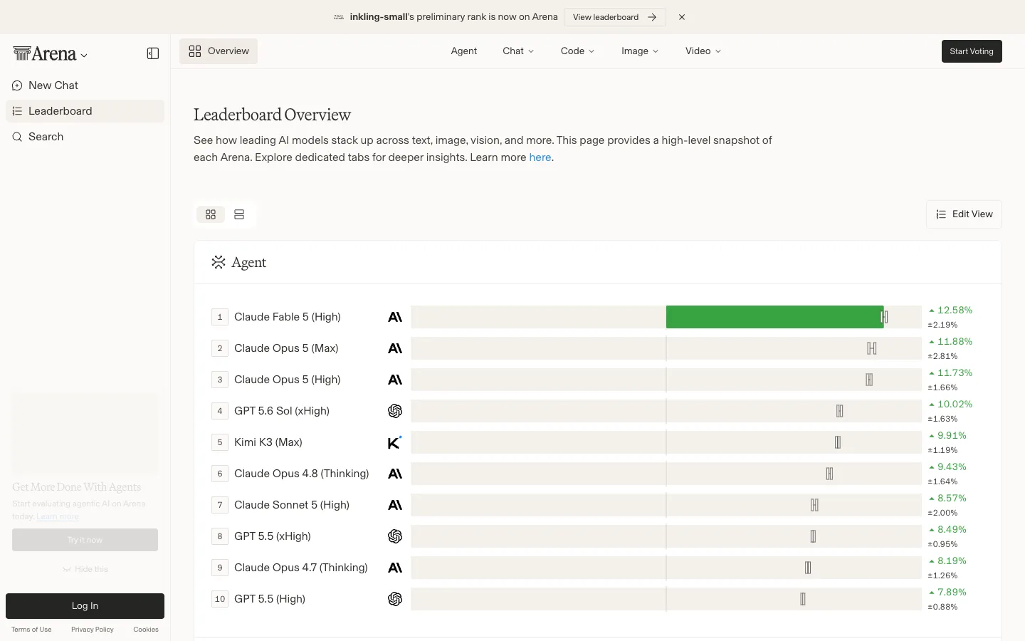
A leaderboard that refuses to look like SaaS — cream paper background, a serif display face on every heading, and the confidence bar isn't a chart beside the ranking, it's drawn inside each row.
Why this pattern works
The in-row confidence bar: a light-grey track spans the full width of every ranking row, filled solid green to the leader's score with a thin vertical bracket marking the confidence-interval edge — a chart built into the row instead of bolted beside it as a separate column. Pair it with the cream-and-serif treatment (warm paper backdrop, serif display headings against a plain sans for data) and a dense AI-benchmark table reads like a printed report instead of another blue SaaS dashboard.
Design notes
- Surface
- LMArena Leaderboard, Overview tab, Agent category
- Navigation
- Two tiers. A left sidebar (logo with a collapse toggle, New Chat, Leaderboard as the active item, Search, then a promo card and Log In pinned to the bottom) and a top tab strip inside the content area (Overview as an active boxed icon tab, then Agent/Chat/Code/Image/Video category tabs with dropdown chevrons) plus a black 'Start Voting' button on the far right. A dismissible cream announcement banner sits above everything.
- Layout
- Fixed sidebar, fluid content. The ranking table is a single column filling the remaining width; each row is full-bleed with no card borders between rows, just a hairline divider.
- Density
- Comfortable. Rows run roughly 56-60px tall with room for a secondary confidence line under the percentage figure — built for scanning ten rows at a glance, not hundreds.
- Color
- Cream/paper background throughout, including the announcement bar — not white. The only saturated colour is the green fill of the leading confidence bar and the green up-arrow percentage figures; every rank badge, logo glyph and divider stays black, grey, or the paper tone.
- Type
- A serif display face for page titles and section labels ('Leaderboard Overview', the italic-leaning 'Agent' section header) paired with a plain sans for body copy, table content and the percentage figures — serif signals editorial authority, sans carries the data.
- Pattern
- The in-row confidence bar: a full-width light-grey track sits inside every ranking row, filled solid green up to the leader's score with a thin vertical bracket marking the statistical interval edge; lower rows show the same track with only the bracket mark, no fill, so the eye reads relative standing without a separate chart.
- States
- Rank #1 is the only row with a filled bar — every other row shows an empty track with just its interval bracket, which reads as 'not yet statistically separated from the leader' rather than an empty or loading state. The announcement banner is dismissible via a top-right X.
- Don't
- Don't render the confidence bar as a separate sparkline column bolted onto the right of the table. It has to share the row's left-to-right axis with the rank and name, or the 'chart built into the row' effect is lost and it just becomes another numeric column.
Make it your own
Turn this reference into a useful brief for your project. Copy it into the AI tool you already use.