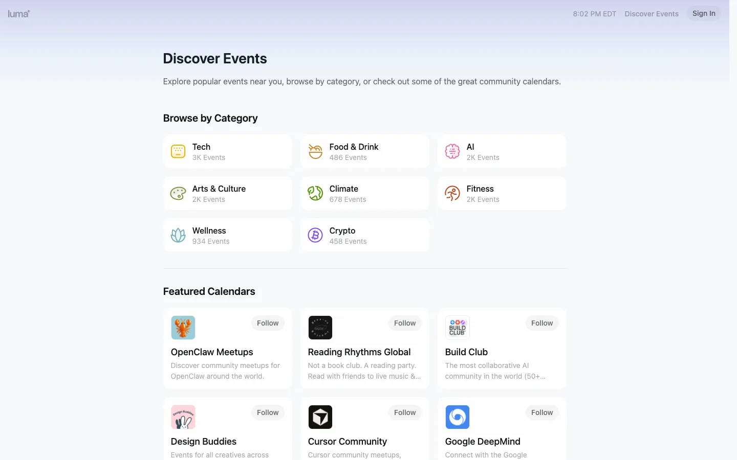
Every card on the page is a plain white rectangle with a 1px border — the only color anywhere lives inside the small circular category glyphs, and there are exactly eight of them. Restraint is the entire visual strategy.
The category-card format — a single illustrated glyph, a bold name, and a count, nothing else — as the fastest possible browse affordance for a large catalog. Steal it wholesale for any discovery page needing a category grid: it works precisely because it refuses to add a description, a CTA, or a hover state beyond what's already there.
Design notes
Surface
Discover Events landing page, logged out
Navigation
One tier. A borderless top bar: wordmark left, plain right-aligned items (live time, a text nav link, a Sign In pill) — no icon rail, no sidebar, no tabs. The page is a single scrolling document, header included.
Layout
Single fluid column, max-width centered, no fixed regions — the entire page including the header scrolls together. Two stacked 3-column card grids separated by one hairline rule and generous vertical whitespace.
Density
Loose. Category cards run ~80px tall with generous internal padding; wide gutters mean 8 cards read as a light list, not a dense wall. Featured-calendar cards run taller to fit a 2-line description.
Color
A single lilac-to-white vertical gradient behind everything at the top of the page, fading to solid white by mid-scroll. Every card is neutral — white fill, black text, grey meta — and the only saturation on the entire page lives inside each category glyph, each a different hue.
Type
One sans family. The page title is the only large type (~38px bold); section headers sit at ~20px bold; card titles ~15-16px semibold; counts and descriptions ~13px grey. Hierarchy is pure size-stepping, never color or decoration.
Pattern
Glyph-plus-label category cards on a bare page: the illustrated icon does all the visual differentiation work so the layout itself can stay completely flat and identical card to card.
States
Logged out: Sign In pill top right, Follow buttons (not Following) on every featured-calendar card, page fully populated with no empty or loading state visible.
Don't
Don't add a second gradient, a shadow, or a hover-elevate effect to make the cards feel more 'alive.' The whole point is that a plain 1px-bordered rectangle is enough once the glyph is doing the work — extra chrome here reads as compensating, not polishing.
Make it your own
Turn this reference into a useful brief for your project. Copy it into the AI tool you already use.
Add constraintsPreview & edit promptAssembled in your browser. No API key or AI request needed. Changing the fields refreshes the preview.