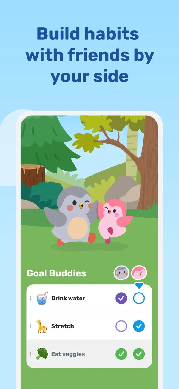
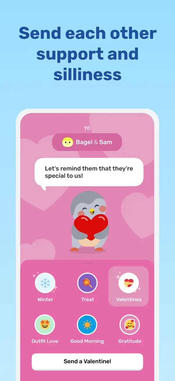
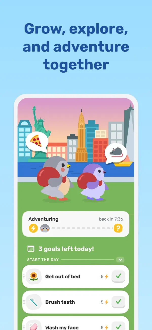
A character scene sits above approachable checklists, while a support picker presents friendly illustrated reactions.
Finch Care Public Benefit Corporation · iOS · Listing version 3.73.204. Publisher-provided App Store previews, reviewed 2026-09-09. Promotional framing is retained; screen order does not represent a tested flow.
Shared goal checklistSupport message pickerAdventure and daily goals
Study shared goal checklist, support message picker, adventure and daily goals. Compare the hierarchy and controls shown in these publisher previews, then test the corresponding behavior in your own app.
Design notes
Surface
Shared goal checklist · Support message picker · Adventure and daily goals
Navigation
Goal lists and a dedicated message-selection surface separate personal progress from social encouragement.
Layout
A character scene sits above approachable checklists, while a support picker presents friendly illustrated reactions.
Density
Compare the space reserved for the primary task with secondary metadata. The previews retain promotional framing; evaluate target sizes in your implemented screen.
Color
Bright green and pink panels with soft character illustrations.
Type
Use clear heading, body, and metadata levels. Keep interface text scalable and verify readability with the device text-size settings.
Pattern
Habits & progress
States
Static publisher previews only. Loading, empty, error, offline, permission, and keyboard behavior have not been tested. Specify and verify those states in your own implementation.
Don't
Do not copy the app identity, proprietary artwork, or promotional claims. Screenshot order is not a verified flow, and the listing version does not date every image.
Make it your own
Turn this reference into a useful brief for your project. Copy it into the AI tool you already use.
Add constraintsPreview & edit promptAssembled in your browser. No API key or AI request needed. Changing the fields refreshes the preview.