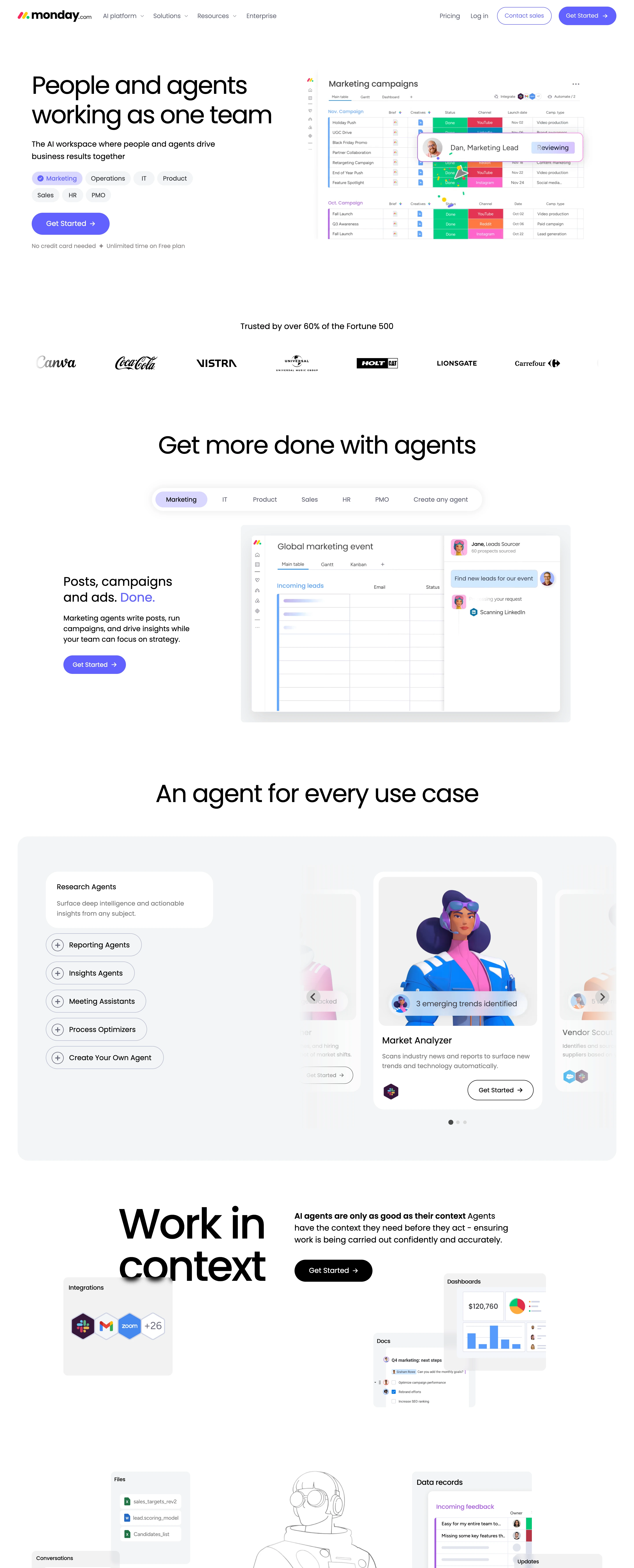
A quiet white canvas that lets the color-coded product UI be the entire visual identity, with one indigo pill as the only loud element outside the screenshots.
Confident and legible, not loud. The page reads as calm and almost under-designed so that the product screenshots — which are where all the color lives — feel like the interesting thing on screen. Friendly and modern, never corporate-serious.
Colors
White canvas (#FFFFFF) with a soft grey panel (#F3F4F5) marking the sections that need separation. Pure black text (#000000) with grey support copy (#585965, #7C7B7B). Exactly one action color: indigo #6161FF for every CTA, plus its tint #D9D7FF for the active tab chip with #6161FF text. A secondary palette (deep purple #4B00D7, cyan #24C4E6, pink #F4CDFF, lavender #DED4FC, cream #FFF0C8, hot pink #FE81E4) appears only in full-bleed feature blocks and inside the illustrations, one block one color. The saturated status colors (green, orange, red, purple, yellow) live only inside the product UI mockups — never in page chrome.
Type
Poppins for everything, and the weights stay LIGHT: display headlines are 56–80px at weight 400 with hard negative tracking (-0.04em, so 80px runs about -3.2px), body copy sits at 14–16px at weight 300–400, and a single 128px w500 line carries one section on its own. Sentence case, short declarative headlines built on a period — 'Posts, campaigns and ads. Done.' — where the second clause takes the indigo. No bold, no all-caps, no serif anywhere.
Layout
Split hero: copy column left (headline, one-line subhead, a wrapping row of persona chips, one pill CTA, a small no-credit-card line), a large product-UI mockup bleeding off the right edge. Then a centered greyscale logo strip under a plain 'Trusted by…' line. Every section below is centered headline → tab-chip row → an asymmetric copy/screenshot pair, or a carousel inside a grey #F3F4F5 panel where the adjacent cards peek in at both edges. Generous vertical rhythm, 1200-1280px container, cards at 16–24px radius, chips at 32px, buttons fully round.
Motion
Everything moves a little and nothing moves a lot. Persona tabs cycle on their own and swap the screenshot beneath them, the product mockups animate in-place (a cursor typing into a field, a row highlighting, a 'Generating…' chip appearing), sections fade and rise a few pixels on entry, and the carousel slides with peeking neighbours. Buttons lift on hover. Nothing pins, nothing parallaxes, nothing scrubs.
Texture
There is almost no page texture on purpose — the texture is the product UI: color-coded status pills in a grid, small circular avatars, tiny column headers, layered floating panels at slight offsets with wide soft shadows. Plus stylized 3D character renders on the feature cards and a line-art illustration used as a section divider. Backgrounds stay flat.
Imagery
Generate: (1) the hero product-UI mockup — a board/table interface with color-coded status pills (green #00C875, orange #FDAB3D, red #E2445C, purple #A25DDC, blue #579BFC, yellow #FFCB00), small round avatars, and one AI element mid-action (a highlighted row, a typing cursor, a floating 'Generating…' chip); (2) 3–4 smaller floating panel mockups (dashboard with a donut + bars, a doc with a checklist, a chat thread, a files list) that layer at slight offsets with soft shadows; (3) one stylized 3D character portrait per feature card — saturated hair and jacket, studio-lit, plain light background, shoulders-up; (4) a greyscale client-logo strip. Tool: GPT-Image or kie-ai Flux for the UI mockups (ask for a flat, crisp SaaS board UI, no browser chrome), kie-ai Seedream or Midjourney for the 3D characters, Recraft remove-bg to cut them out. Never screenshot a real competitor's product.
Don't
No dark sections, no gradient backgrounds, no glassmorphism, no bold or condensed type, no serif, no hard-edged shadows, no icon-grid feature lists, no stock photos of people in offices, and never put the product's saturated status colors into the page chrome — the moment buttons, headings and backgrounds go multicolor the whole system reads as a template.
Make it your own
Turn this reference into a useful brief for your project. Copy it into the AI tool you already use.
Add constraintsPreview & edit promptAssembled in your browser. No API key or AI request needed. Changing the fields refreshes the preview.