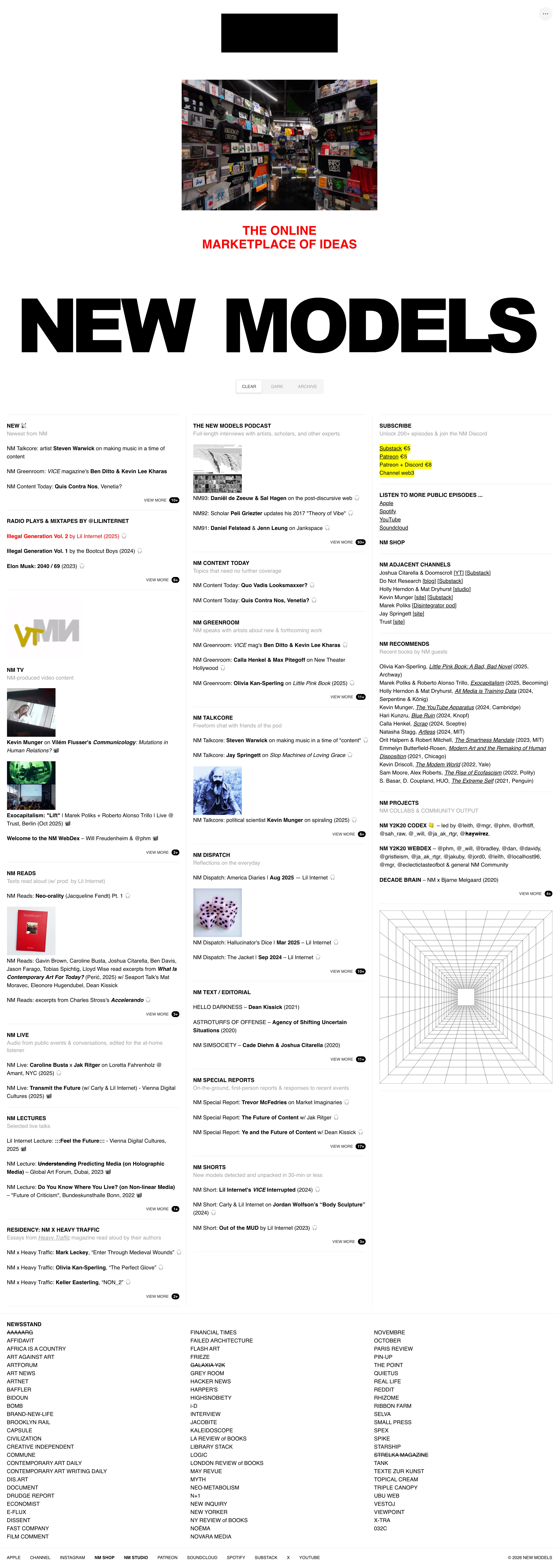
An extreme-density three-column link index that treats imagery as an afterthought — a flat black rectangle standing in for a logo, one giant sans wordmark, and hundreds of small text links, with only the subscribe box picked out in literal yellow highlighter.
Web-1.0 zine and insider media network — deliberately undesigned density that signals 'we have too much to say to bother with white space.'
Colors
Black text on white, one flat red accent for a single tagline, and highlighter-yellow marker blocks behind the paid-subscribe links. No other colour appears anywhere on the page.
Type
One enormous heavy grotesk sans set as the page wordmark, wide enough to span the full page width edge to edge. Everything else — section headers, links, captions, footer list — sits in a small, plain, rounded sans at nearly uniform size; there is almost no type-scale hierarchy inside the index itself, only bold weight, underlines, and the occasional strikethrough doing the differentiating work.
Layout
A short centred masthead (a small black rectangle standing in for a logo mark, one plain photograph, a red tagline, the giant wordmark, three pill-shaped filter buttons), then a dense three-column index of dozens of independently labelled sections, each a bold heading plus a stack of small text links, with the occasional thumbnail dropped in. Closes with a multi-column footer list of publication names — several struck through — followed by a plain row of text-only nav links and a copyright line.
Motion
None implied — the capture reads as a static, scrollable document, not an interactive one.
Texture
No image treatment to speak of — flat, uncorrected, undithered. The only applied texture is the yellow highlighter block sitting behind text like a literal marker stroke, and the strikethrough rule cutting through cancelled or past items.
Imagery
Near-zero, and that absence is the point. The handful of thumbnails on the page — podcast art, book covers, event photos — sit at small, native, inconsistent sizes with no unifying crop ratio, filter, or art direction; one plain photograph (a shop interior) runs slightly larger but is presented flatly, with no hero treatment, no gradient overlay, no caption styling beyond the index's own type. If supporting imagery is needed, keep every image small, let aspect ratios stay inconsistent, and resist giving any single image a moment — the second an image gets special treatment, the page stops reading as a newsstand and starts reading as a designed site.
Don't
Don't add hero images, card shadows, rounded containers, or generous whitespace to 'clean it up' — the crowded, undesigned density is the entire style. Don't give every link its own icon or thumbnail; most entries get none, and that inconsistency is intentional.
Make it your own
Turn this reference into a useful brief for your project. Copy it into the AI tool you already use.
Add constraintsPreview & edit promptAssembled in your browser. No API key or AI request needed. Changing the fields refreshes the preview.