Notion — Pricing
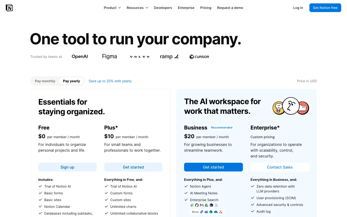
Four plans compressed into a two-card decision: pricing tiers grouped into narrative pairs, with a blue tint and Recommended badge steering the whole page toward one card.
Why this pattern works
Tier GROUPING. Instead of four sibling columns, Notion wraps Free+Plus in one white card headlined 'Essentials for staying organized.' and Business+Enterprise in a second, blue-tinted card headlined 'The AI workspace for work that matters.' The buyer's first decision becomes a story choice between two cards, not a spec comparison across four columns — and the tinted card plus the single solid-blue CTA and 'Recommended' badge pre-answers it. Steal this whenever you have 4+ plans: group them by audience narrative, headline each group, and tint exactly one group. The per-plan columns inside each card stay conventional (price, blurb, CTA, checklist), so nothing else has to be reinvented.
Design notes
- Surface
- Full pricing page: nav, headline with logo strip, billing toggle row, and the two grouped plan cards
- Navigation
- One white bar: N logomark left, centred text links (Product ⌄, Resources ⌄, Developers, Enterprise, Pricing, Request a demo), right-aligned quiet 'Log in' text plus a solid-blue 'Get Notion free' pill — the nav CTA already matches the page's accent.
- Layout
- Centred column. Headline, then a greyscale trusted-by logo row, then a control row (segmented billing toggle left, 'Price in USD' right), then two side-by-side rounded cards — the left slightly narrower — each internally split into two plan columns.
- Density
- Comfortable. Big open hero, roomy card padding (~32px), checklists at ~30px line height. Four plans' worth of content fits without feeling like a matrix because the grouping halves the perceived width.
- Color
- White canvas, near-black text. Blue is the only accent and it's spent as a gradient of commitment: pale-blue button fills on Free/Plus, a pale-blue tint over the entire right card, the blue 'Recommended' badge, and one solid-blue 'Get started' on Business. Grey checkmarks, greyscale partner logos, one playful face-doodle illustration in the tinted card.
- Type
- One geometric sans. Page headline ~64px bold ending in a period; group headlines ~28px bold inside the cards (also ending in periods); plan names ~20px bold; prices ~24px bold with 'per member / month' at ~13px grey beside them; checklist items ~14px.
- Pattern
- Grouped tiers: each card = a headline naming the audience story + two plan columns sharing that frame. Inheritance lines ('Everything in Free, and:', 'Everything in Plus, and:') chain ACROSS the cards, so the four plans still read as one ladder even though they're visually paired.
- States
- 'Pay yearly' is the active segment — a white pill inside the grey capsule — with a blue 'Save up to 20% with yearly' note beside it. Business carries the blue 'Recommended' badge; asterisks on Plus and Enterprise flag footnoted terms. Enterprise shows 'Custom pricing' where a number would go, keeping column alignment.
- Don't
- Don't tint both cards or give every plan a filled CTA. The funnel works because exactly one card is tinted and exactly one button is solid blue; equal treatment turns the story back into a four-column spec sheet.
Make it your own
Turn this reference into a useful brief for your project. Copy it into the AI tool you already use.