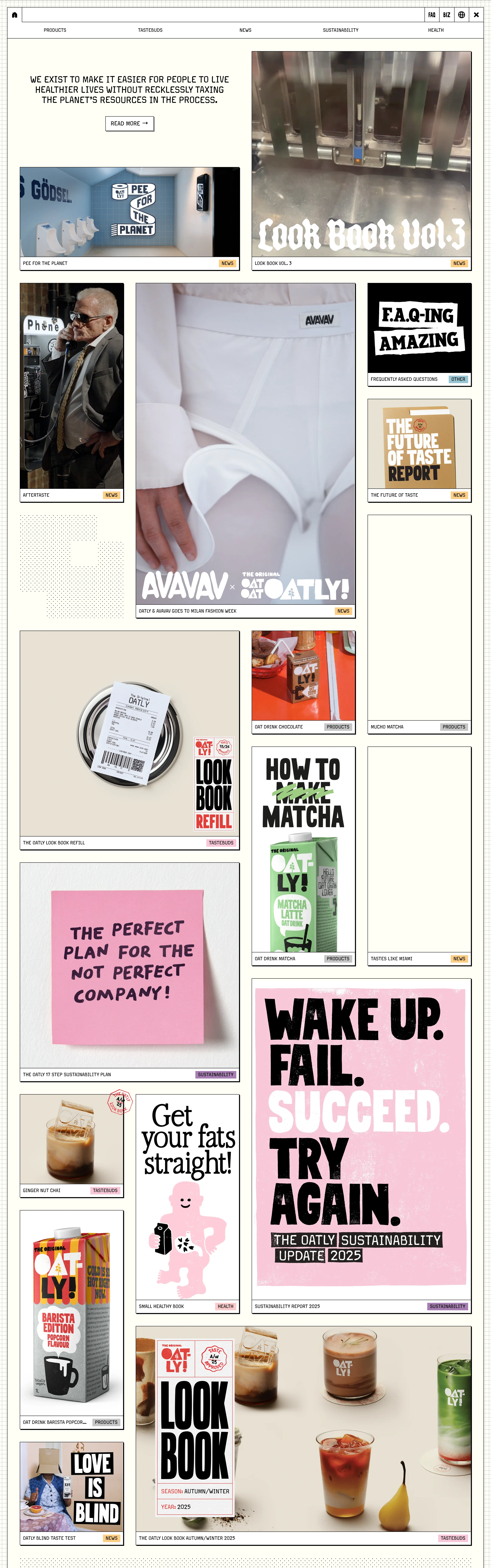
Irreverent, warm, human, a little chaotic on purpose. Anti-corporate, conversational, funny.
Colors
Cream/off-white base, black ink, one or two bold flat accents (Oatly blue, warm red). Slightly off-register, zine-like color.
Type
Chunky condensed sans or hand-lettered display for headlines, mixed with a plain typewriter/sans body. Intentionally imperfect, mixed sizes, handwritten scrawls.
Layout
Collage/zine energy. Off-grid placements, hand-drawn doodles and arrows, stickers, packaging cutouts. Copy is the hero — long, funny, first-person.
Motion
Playful wiggle/scribble reveals, sticker pop-ins, jittery hover states. Fun over polish.
Texture
Hand-drawn linework, marker doodles, halftone, paper cutout collage, visible imperfection.
Imagery
Generate: hand-drawn doodles, marker scribbles, halftone cutout collage elements, and sticker badges as transparent PNGs. Intentionally imperfect. Tool: kie-ai Flux or nanobanana for illustration; kie-ai Recraft remove-bg for cutouts.
Don't
No slick gradients, no corporate stock photography, no rigid symmetry, no formal tone.
Make it your own
Turn this reference into a useful brief for your project. Copy it into the AI tool you already use.
Add constraintsPreview & edit promptAssembled in your browser. No API key or AI request needed. Changing the fields refreshes the preview.