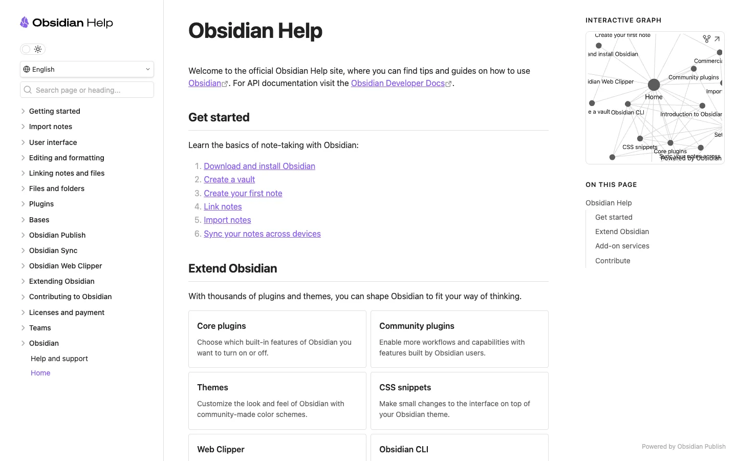
A standard three-column docs layout with one genuinely rare addition: a live force-directed graph of linked pages sitting above the table of contents in the right rail.
Pairing a mini interactive knowledge-graph (nodes are pages, edges are links, the current page is the largest node) with a conventional auto-generated 'On this page' TOC directly beneath it in the same right rail. The graph answers 'where am I in the whole site'; the TOC answers 'where am I on this page.' Together they replace breadcrumbs entirely. Steal this for any docs product built on genuinely interlinked pages — it's wasted on a linear, tutorial-style doc set.
Design notes
Surface
Obsidian's own help/docs site, Home article, built on Obsidian Publish
Navigation
Three tiers. A left sidebar nav tree (collapsed sections with chevrons, current page highlighted in purple), a search box and language/theme switcher above it, and on the right, a self-contained pair — the graph, then the TOC — that functions as orientation rather than navigation.
Layout
Fixed left sidebar (~320px), fixed right rail (~270px), fluid centre column capped at a comfortable reading width in between. Only the centre column and the left nav tree scroll; the graph panel holds a static height.
Density
Airy. Generous line height and paragraph spacing in the centre column; the sidebar nav is a plain list with no icons, just indentation and chevrons to show depth.
Color
White throughout, purple reserved for links and the active nav item. Section cards (Core plugins, Community plugins, Themes, CSS snippets) get a hairline border only — no fill, no shadow. Colour is not how hierarchy is shown here.
Type
One sans family. A large bold H1, plain-weight H2 section heads with a hairline rule underneath, and body copy that's clearly tuned for reading, not scanning — no bold-everything, no callout boxes.
Pattern
The graph-plus-TOC stack in the right rail: a small interactive network diagram of the site's link structure sitting directly above the standard heading-based table of contents, both scoped to the same rail.
States
Populated steady-state — a mature docs site with a dense graph and a full nav tree. No loading or empty variant visible.
Don't
Don't ship the graph without the TOC underneath it, or vice versa. The graph alone is decorative and the TOC alone is generic; the pairing is what makes each one earn its space.
Make it your own
Turn this reference into a useful brief for your project. Copy it into the AI tool you already use.
Add constraintsPreview & edit promptAssembled in your browser. No API key or AI request needed. Changing the fields refreshes the preview.