← Back to library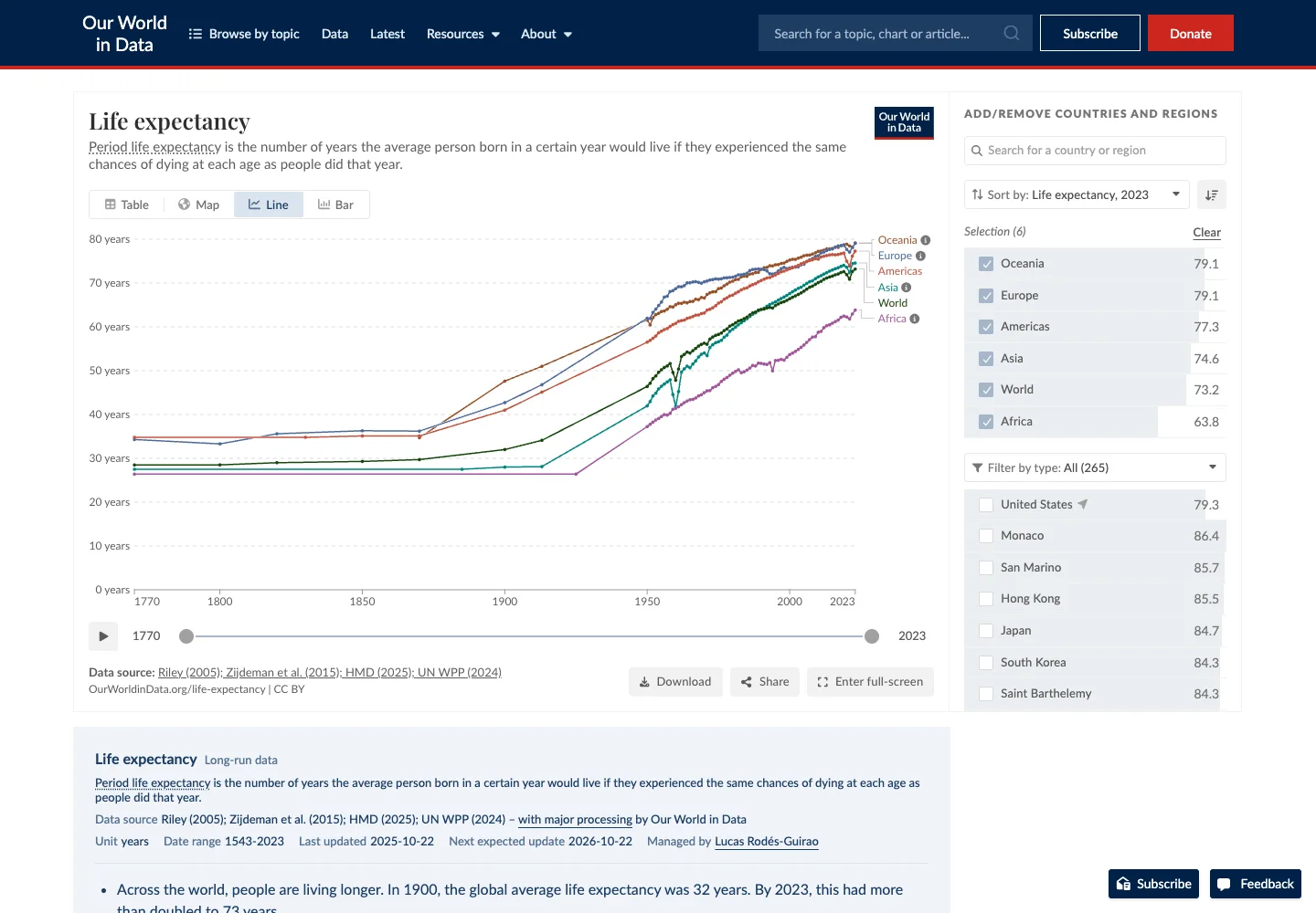
Page excerpt · scroll inside to explore Assembled in your browser. No API key or AI request needed. Changing the fields refreshes the preview.
Our World in Data — Life expectancy
Analytics DashboardSee it liveourworldindata.org
A public chart combines country comparison with time and data controls.
Why this pattern works
Keep chart configuration near the visual and expose the source behind the values.
Design notes
- Surface
- Life expectancy
- Navigation
- Chart/map/table choices and data actions surround the plotted result.
- Layout
- The main line chart sits beside a country selector, with time controls below.
- Density
- Use consistent spacing within repeated information so headings, values, and secondary details remain easy to compare.
- Color
- White plotting surface and distinct colored series with readable labels.
- Type
- Use a clear type hierarchy for the page title, primary content, and supporting labels.
- Pattern
- Keep chart configuration near the visual and expose the source behind the values.
- States
- Public life-expectancy data shown as a multi-country comparison.
- Don't
- Do not copy brand assets or sample records. Preserve keyboard access and design empty, loading, and error states for the actual task.
Make it your own
Turn this reference into a useful brief for your project. Copy it into the AI tool you already use.