Perplexity — Home
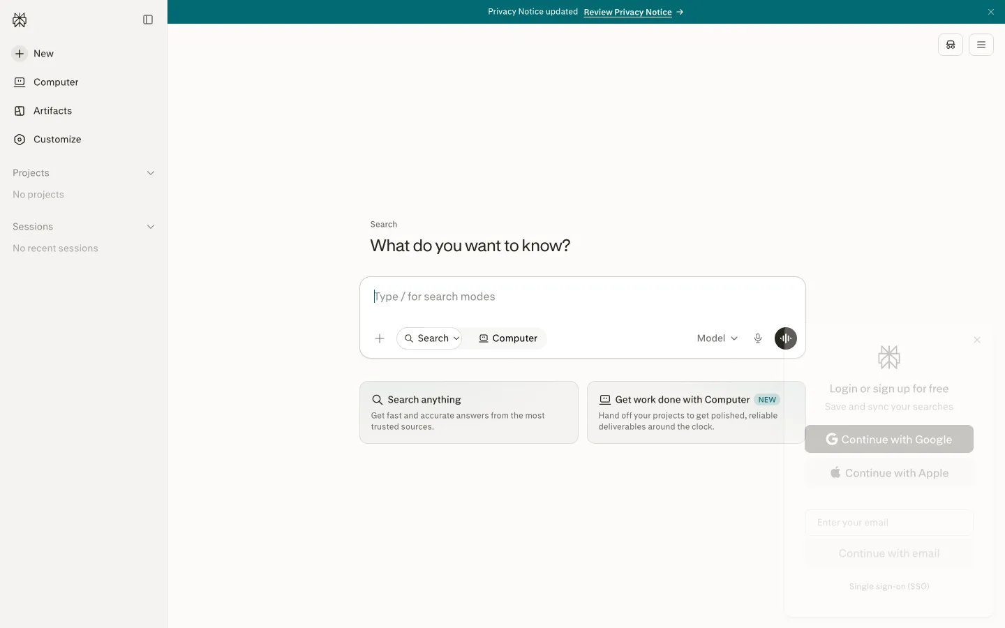
An answer-engine home where the composer is the entire product: one question as the headline, one oversized input carrying its own mode chips and model picker, and two cards that teach the modes.
Why this pattern works
Mode chips inside the composer. Instead of tabs or a nav switch, Perplexity puts the product's two modes — 'Search' (with a dropdown chevron) and 'Computer' — as toggle chips INSIDE the input card's bottom row, next to the + attach button, the Model picker, and the mic. Switching what the app does is part of composing the request, not a navigation act, and the input becomes a self-documenting command surface. The two suggestion cards below ('Search anything' / 'Get work done with Computer', the second wearing a NEW badge) each explain one mode in a title plus two grey lines, so the empty state doubles as the feature tour. Steal this for any multi-mode AI product: modes live in the composer, and the empty state's suggestions map one-to-one onto those modes.
Design notes
- Surface
- Logged-out home: notice banner, left sidebar, and the centred ask-anything hero with suggestion cards
- Navigation
- A ~240px light sidebar: logomark and collapse icon up top, then icon+label items at ~15px — New (with a + in a dark circle), Computer, Artifacts, Customize — followed by two collapsible sections, 'Projects' and 'Sessions', each showing a quiet grey empty line ('No projects', 'No recent sessions'). Two icon buttons float top-right of the main pane.
- Layout
- Sidebar plus one centred column. The hero stack — eyebrow, headline, input card, suggestion-card pair — sits slightly above vertical centre; everything else is off-white breathing room. A full-width teal notice banner runs across the very top.
- Density
- Extremely sparse. One headline, one input, two cards. The sidebar holds six items and two empty sections. The screen bets everything on the composer.
- Color
- Warm off-white canvas with a paper feel, near-black text, grey secondary text. The accent is a deep teal, spent on the top banner, the submit button in the input, and small highlights; the active 'Computer' chip gets a light tint. No other colour anywhere.
- Type
- A quiet serif-inflected face for the headline — 'What do you want to know?' at ~32px regular, warm not shouty — over a tiny grey 'Search' eyebrow at ~13px. Sidebar and chips at ~14-15px; card titles ~15px medium with ~13px grey body lines.
- Pattern
- The composer as command surface: a large rounded input card (~640px wide) whose bottom row is a toolbar — + attach, a 'Search ⌄' chip, a 'Computer' chip, then right-aligned Model ⌄ picker, mic icon, and a round teal submit button. Every capability of the product is physically attached to the box where you type.
- States
- A fresh-account state that stays composed: Projects and Sessions sections render with grey one-line empties instead of hiding, the input shows a teaching placeholder ('Type / for search modes'), and the suggestion cards stand in for history. The NEW badge marks the newer mode without redesigning anything.
- Don't
- Don't move the mode switch out of the composer into tabs or the sidebar — the input stops being the product. And don't add a second accent: the page's calm depends on teal being the only saturated thing on an off-white field.
Make it your own
Turn this reference into a useful brief for your project. Copy it into the AI tool you already use.