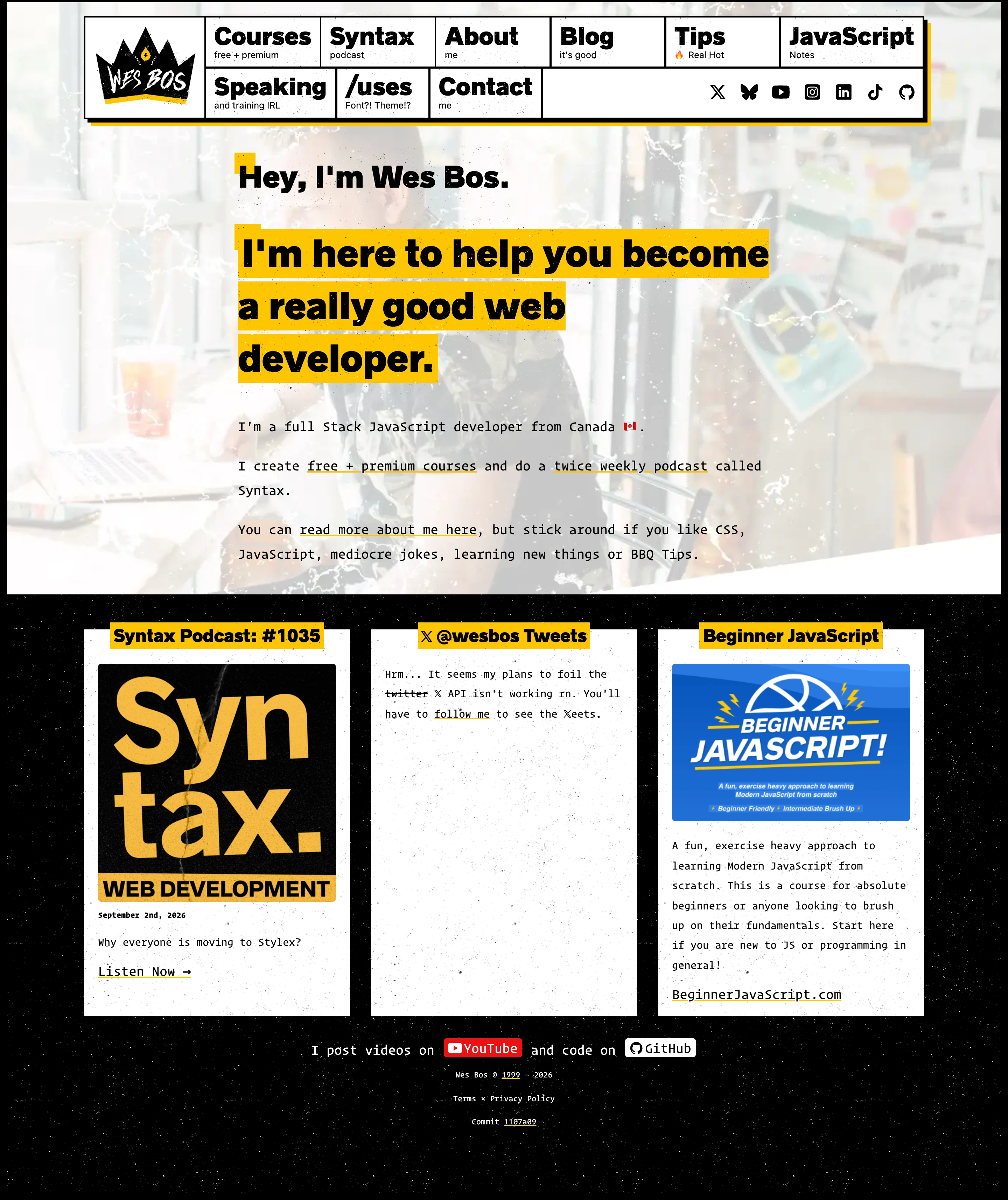
Routing visitors toward courses, the podcast, and practical tips after a short audience-focused introduction. Each content card has a distinct purpose. Selection is based on observable design and conversion paths; conversion rates have not been independently verified.
Design notes
Mood
Developer Educator Brand. A punchy black-and-yellow personal site makes a developer’s teaching offer immediately recognizable.
Colors
Black, white, and saturated yellow with color in course artwork.
Type
Heavy sans-serif navigation, highlighted headings, and code-like body text.
Layout
Boxed navigation over a photo-backed introduction, then a compact row of content and course panels.
Motion
Keep navigation and reading immediate; motion should support the work rather than delay access.
Texture
Marker-like highlights, grid lines, and workshop photography.
Imagery
Use original workshop photographs, course covers, and podcast artwork.
Don't
Do not allow dense navigation to reduce target sizes or hide the primary course route on mobile.
Make it your own
Turn this reference into a useful brief for your project. Copy it into the AI tool you already use.
Add constraintsPreview & edit promptAssembled in your browser. No API key or AI request needed. Changing the fields refreshes the preview.