Plausible — Analytics dashboard
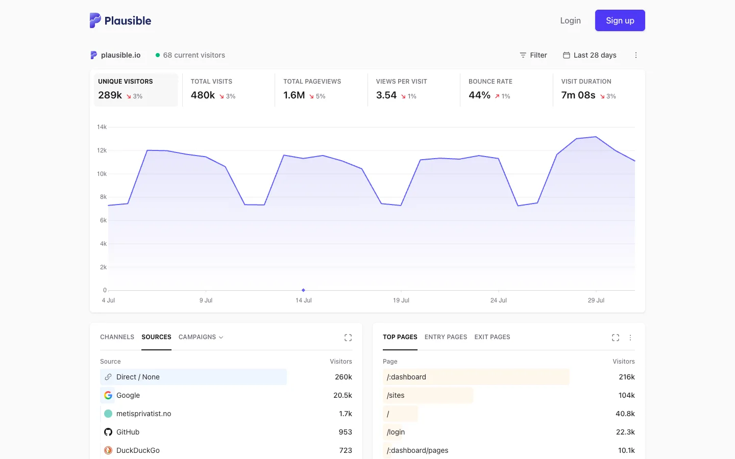
The stat row IS the chart legend — click a tile and the line chart replots to that metric — and every ranked list underneath fakes a bar chart by tinting a proportion of each row's own background.
Why this pattern works
Steal the in-row proportional bar: Sources and Top Pages are plain two-column lists, but each row has a translucent fill scaled to that row's share of the total sitting behind the text, so you get a bar chart's read without ever drawing an axis. Also take the six-tile stat strip where every tile is a button that reassigns what the chart above is plotting, with the active metric getting a soft grey selection card — one row of numbers replaces a metric-picker dropdown.
Design notes
- Surface
- Public/shared analytics dashboard for a single site (plausible.io), logged-out marketing chrome above it
- Navigation
- Effectively one tier: a site-identity row (favicon, domain, live-visitor dot) stands in for navigation, plus `Filter` and a date-range control on the right. No sidebar, no settings rail — this is the shared/embed view, not the logged-in app shell.
- Layout
- Single centered column on a faint grey-blue page tint. The stat strip is one fixed-height row of six equal tiles; the chart is a single flexible block beneath it; two list panels close the page side by side, each roughly half width with a gap between.
- Density
- Airy. Stat tiles carry real padding around one big number; list rows run about 40px with only two columns (name, count) so nothing competes with the figures.
- Color
- White cards on a faint grey page tint. One accent (indigo) is reused for the logo, the `Sign up` button, the chart line and fill, and the active tab underline. Red marks negative deltas beside the big numbers. The row-tint bars in the two list panels use a low-opacity wash, never full saturation.
- Type
- One sans throughout. Stat labels are tiny uppercase grey tracked-out text; the numbers beneath them are the largest bold type on the page. List rows are regular weight with the count right-aligned and slightly heavier.
- Pattern
- A proportional background tint hiding inside a plain two-column list row — it turns Sources and Top Pages into bar charts for free, with nothing more than a width-scaled wash behind the text.
- States
- The top source row (Direct/None) carries a highlighted background, reading as either a hover or a pinned top-rank state. A single marker dot sits on the chart at one date, like a frozen tooltip anchor.
- Don't
- Don't let the row-tint bars gain a border or full opacity. The moment they look like a deliberate progress bar instead of a background wash, the list stops reading as a plain table and starts competing with the real chart above it.
Make it your own
Turn this reference into a useful brief for your project. Copy it into the AI tool you already use.