← Back to library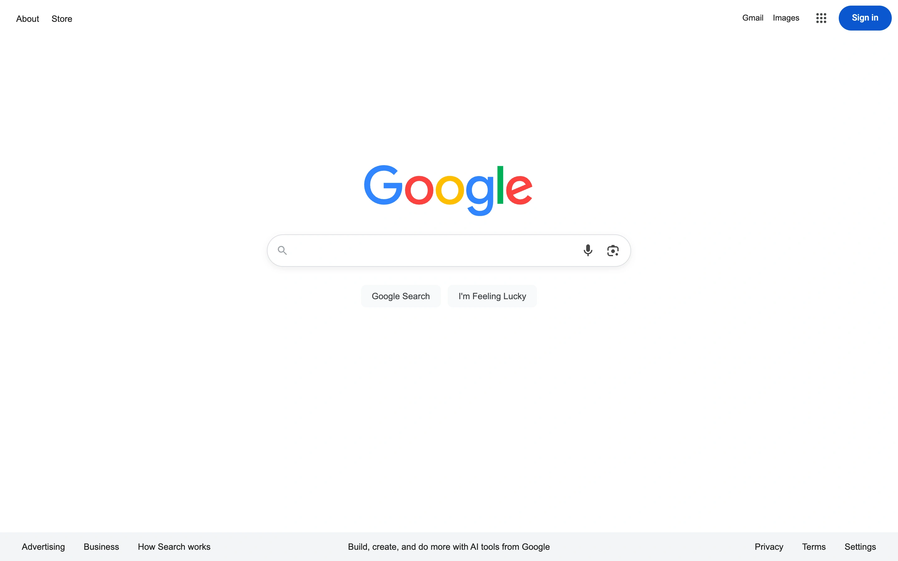
Viewport capture · opening screen Assembled in your browser. No API key or AI request needed. Changing the fields refreshes the preview.
Google — Search start
Search & DiscoverySee it livegoogle.com
A centered logo and rounded search field dominate a deliberately sparse page, with utilities moved to the corners and footer.
Why this pattern works
Single-purpose search tools where the input itself should be the main interface.
Design notes
- Surface
- Google public search homepage.
- Navigation
- Sparse top-corner links and a compact footer.
- Layout
- Centered search cluster surrounded by extensive white space.
- Density
- Very low, concentrating attention on one input.
- Color
- White, gray controls, small multicolor brand accents.
- Type
- Small neutral sans utilities beneath the large brand mark.
- Pattern
- Give the dominant task more visual space by moving secondary links to the perimeter.
- States
- Initial unsigned search state, before typing or results.
- Don't
- Minimalism still needs visible keyboard focus, accessible input names, and clear submission behavior.
Make it your own
Turn this reference into a useful brief for your project. Copy it into the AI tool you already use.