Radix Themes — Playground
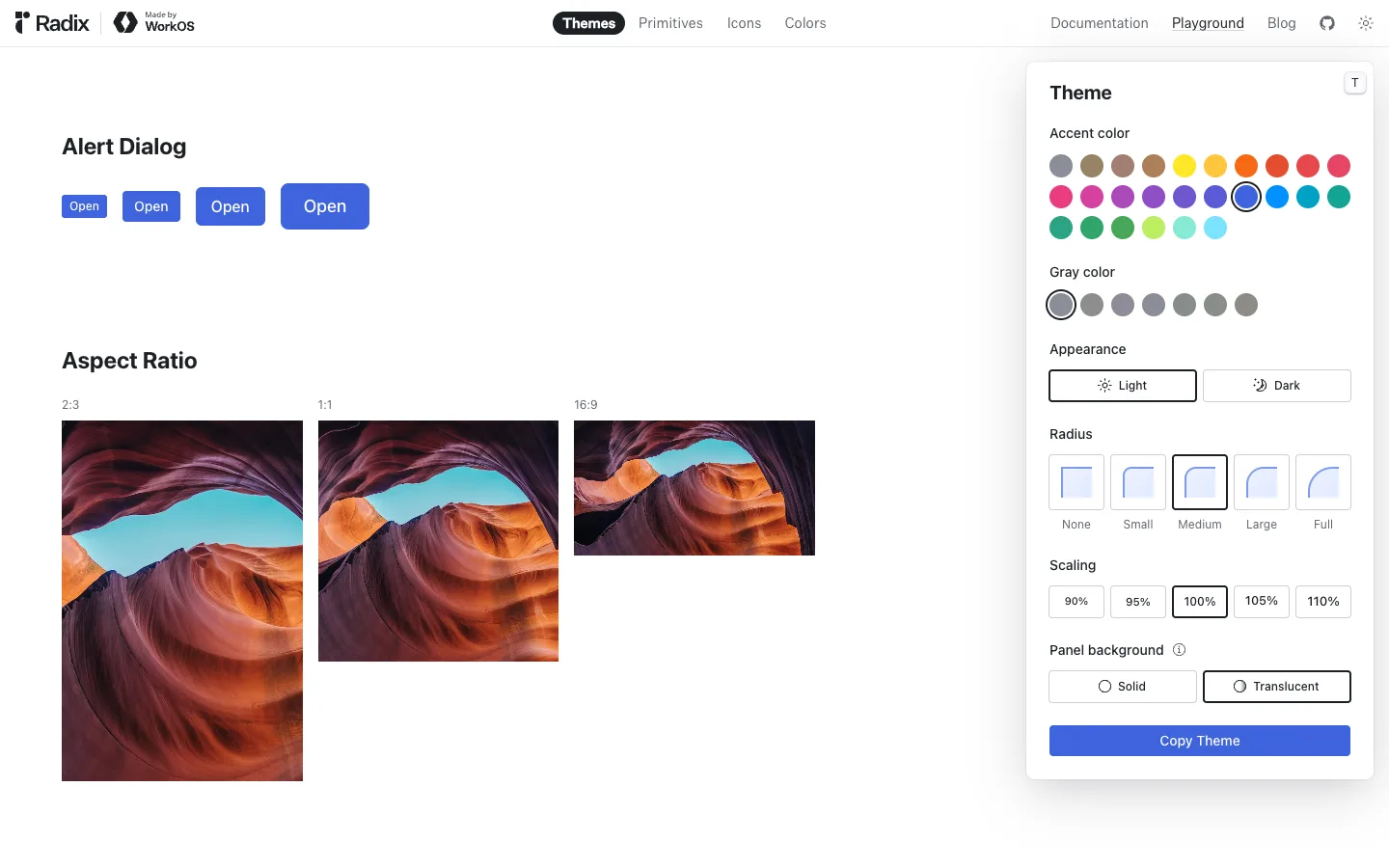
A floating theme-control panel sits on top of a live component canvas, not beside it — nudge one token and the entire canvas re-renders in place, so the panel and the canvas read as one continuously synced object rather than settings-plus-preview.
Why this pattern works
The floating (not docked) control panel over a live canvas: every field in the panel is a real design token, and the canvas is the actual rendered component tree, not a screenshot — so changing Radius or Accent color restyles real buttons a few hundred pixels away in real time. Worth stealing wholesale for any settings/theme-builder or config UI: float the controls so the eye can hold both the lever and its effect in one glance, and close the panel with an explicit export action ('Copy Theme') instead of an implicit 'it autosaves'.
Design notes
- Surface
- Radix Themes marketing site, Playground page — live component canvas with the Themes tab active
- Navigation
- One shallow tier: a top bar mixing two nav systems in one row — product tabs on the left (Themes as a solid black pill, then Primitives / Icons / Colors as plain text) and site-level links on the right (Documentation, Playground, Blog, GitHub, theme toggle). No sidebar, no breadcrumb — this is a single flat page.
- Layout
- Fluid canvas underneath a floating, fixed-width control panel. The panel is not a docked sidebar — it overlaps the canvas in the top-right corner with a drop shadow, so the canvas keeps its full width and the panel visually sits a layer above it.
- Density
- Loose on the canvas (large components, lots of whitespace, one example per row) and tight in the panel (seven stacked control groups in ~340px), because the canvas is the showroom and the panel is the workbench.
- Color
- White canvas and white panel, both neutral. The only saturated colour on the entire screen is the accent-swatch grid inside the panel — roughly two dozen colour dots spanning the full hue wheel — plus whatever accent colour is currently selected showing up faithfully in the canvas's solid button.
- Type
- Plain black sans throughout, no serif or monospace anywhere. Hierarchy comes entirely from weight and size: bold ~20px section headings on the canvas, bold ~18px panel title, ~13-14px labels for every control group.
- Pattern
- Tokens, not settings: every control in the floating panel (accent colour, gray colour, radius, scaling, panel background, appearance) maps 1:1 to a real design token, and the canvas is live rendered output — so touching a swatch restyles real buttons a few hundred pixels away in the same frame, with no save step, no reload, no separate preview mode.
- States
- Every control opens on a sane, complete default (Medium radius, 100% scaling, Light appearance, Translucent panel, a blue accent already applied to the canvas buttons) — there is no blank or unstyled first-paint state; the demo is always mid-story.
- Don't
- Don't dock this panel as a sidebar that resizes the canvas. The moment it stops floating over the content and starts pushing it aside, it reads as a settings screen instead of a live 'watch the product restyle itself' demo — the overlap and the shadow are doing real work, not just decoration.
Make it your own
Turn this reference into a useful brief for your project. Copy it into the AI tool you already use.