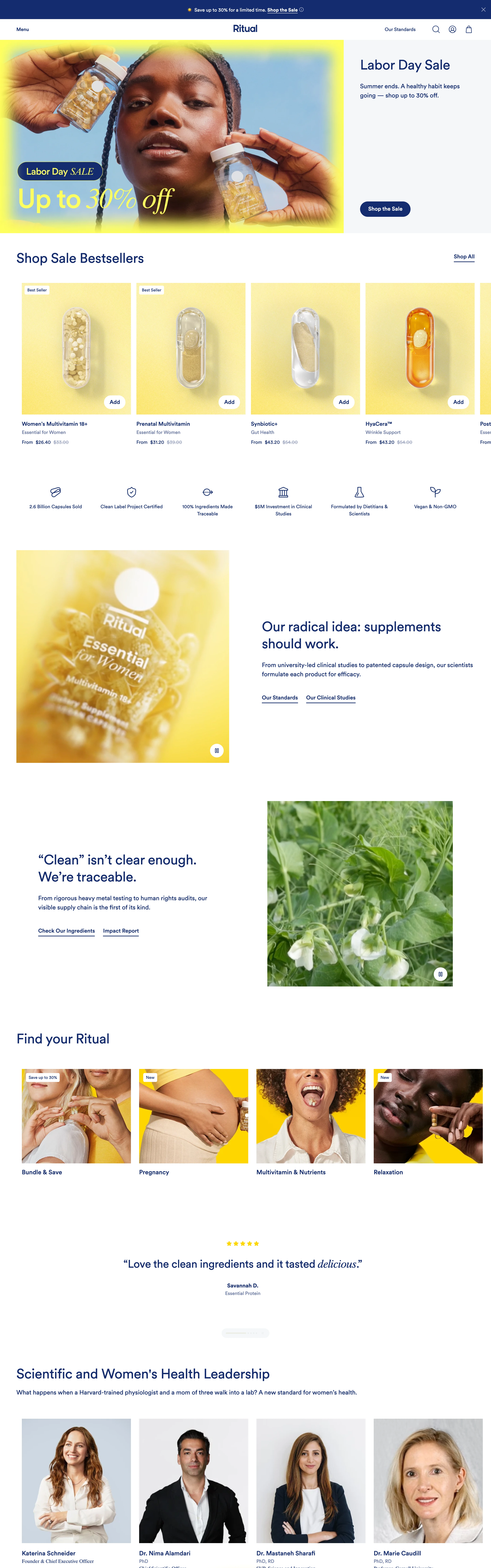
Supplements sold to skeptics: white canvas, deep cobalt ink, vivid yellow product world, transparent capsules shot like lab specimens, and traceability told as a story.
Rigorous but warm. 'For Skeptics, By Skeptics' — every claim wants a citation, yet the brand still smiles. Science as the sales pitch, proof as the aesthetic.
Colors
Clean white canvas, deep cobalt/indigo ink for all text and buttons (#142B6F feel), and one vivid brand yellow (#FFD600) doing heavy lifting: capsule backdrops, category card panels, star ratings, sticker graphics. Warm amber photography moments as contrast. No other hues.
Type
A modern sans in cobalt for headlines and UI, spiked with an italic serif for wit and emphasis ('Hotter Savings', 'By Skeptics', 'delicious.'). Sentence-case headlines at medium scale; small underlined text links; airy body copy. The serif italic is a seasoning, never the base.
Layout
Classic DTC modules elevated: half-photo half-panel hero, product card rail with Add buttons and strikethrough pricing, a hairline-ruled benefit icon strip (line icons + two-line labels), alternating image/story sections for traceability, category photo cards on yellow, centered pull-quote testimonial, portrait grid with name/credential captions, and a glowing centered manifesto CTA.
Motion
Gentle and assured: soft fade-ups, product cards that lift on hover, a slow rotating or settling capsule video moment. Small video-play chips on imagery hint at motion content. Nothing gimmicky — trust is the animation budget.
Texture
Flat white and cobalt UI against lush photographic texture: glassy capsule macro, backlit amber glow, botanical close-ups. Line icons stay hairline-thin. No gradients in the UI itself.
Imagery
Product truth-telling photography: transparent capsules and bottles shot macro on vivid yellow backgrounds so the beadlets show; warm amber backlit bottle stills; macro crop/leaf shots for the traceability story; studio portraits of founders and scientists on neutral grey. Pexels for macro botanical and portrait bases; kie-ai Seedream for the yellow-background capsule shots. Transparency is literal — always show what's inside.
Don't
No vague wellness pastels, no lifestyle-only imagery hiding the product, no unsupported-claim energy, no more than the two brand hues plus photography. Never crowd the whitespace — proof needs air.
Make it your own
Turn this reference into a useful brief for your project. Copy it into the AI tool you already use.
Add constraintsPreview & edit promptAssembled in your browser. No API key or AI request needed. Changing the fields refreshes the preview.