Rive — Marketplace
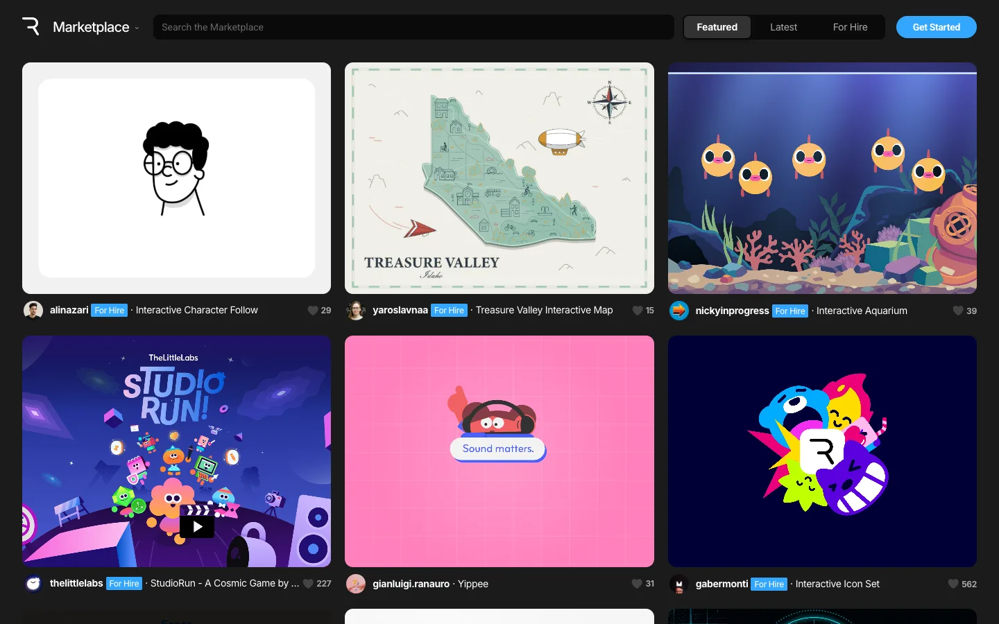
The chrome is near-black and says almost nothing, so every wildly different palette in the grid — mint, magenta, navy, deep blue — reads as the creator's work rather than a UI accent. The metadata line sits below and outside each card, never on top of the art.
Why this pattern works
Take the full-bleed card with zero overlay, paired with a meta row placed entirely below and outside the card box: avatar, handle, a `For Hire` pill, a truncated title, and a like count, all in the app's own small type. Because nothing sits on top of the artwork, a card can be any palette or composition and the grid still reads as ordered — the discipline is in the row underneath, not the card itself.
Design notes
- Surface
- Marketplace, Featured tab, logged out
- Navigation
- Single tier. Logo and dropdown on the left, a segmented Featured/Latest/For Hire control center-right, a filled blue `Get Started` button on the far right. No secondary nav, no breadcrumb, no sidebar — the grid is one click from page load.
- Layout
- A full-bleed near-black canvas holding a 3-column card grid with generous gutters. Each card is a fixed-aspect rectangle; the meta row beneath it is a separate flex row, not part of the card's own box.
- Density
- Six cards visible per screen at roughly 445px square — big enough that each thumbnail reads as a finished piece of work rather than an icon.
- Color
- Chrome is near-black and grey with one blue accent (the CTA button and the `For Hire` badges). Every other color on the page — mint, deep blue, magenta, purple, navy — comes from inside the cards, because each is a full-bleed export of the creator's actual piece.
- Type
- Small sans UI text throughout (13-14px meta line); any large or display type visible on the page is baked INTO the artwork itself (a map's serif place-name, a game's logotype), not rendered by the app's own type system.
- Pattern
- Full-bleed card art with zero overlay, paired with a meta row placed entirely below and outside the card: avatar, name, a blue `For Hire` pill, a title, and a like count with heart icon, right-aligned.
- States
- Logged out: `Get Started` replaces any account affordance; `For Hire` pills appear per-creator rather than reflecting any personalized feed state.
- Don't
- Don't put the creator name, badge or like count on top of the artwork — the grid works because the art is never dimmed by a scrim or covered by a caption. Steal the discipline of keeping every piece of metadata off the image entirely.
Make it your own
Turn this reference into a useful brief for your project. Copy it into the AI tool you already use.