← Back to library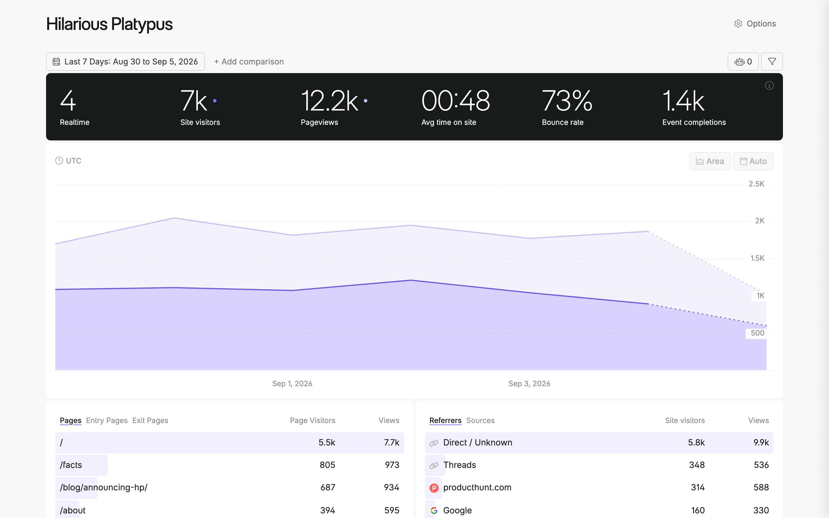
Viewport capture · opening screen Assembled in your browser. No API key or AI request needed. Changing the fields refreshes the preview.
Fathom — Analytics dashboard
Analytics DashboardSee it liveapp.usefathom.com
A dark metric strip anchors a light analytics dashboard with a broad purple trend chart and paired breakdown tables.
Why this pattern works
Web analytics dashboards that need an immediate summary and a clear path into supporting dimensions.
Design notes
- Surface
- Fathom public Hilarious Platypus analytics demo.
- Navigation
- Site name and options at the top; date range and comparison controls above the data.
- Layout
- Summary strip, full-width time series, then side-by-side breakdown tables.
- Density
- Moderate to high in tables, spacious around headline metrics.
- Color
- Black metric band, white surface, purple chart and highlights.
- Type
- Large numeric summaries above compact descriptive labels.
- Pattern
- Arrange summary, time trend, and breakdowns in the order a reader asks questions.
- States
- Populated public demo; displayed metrics are example data, not Swipe analytics.
- Don't
- Do not present demo metrics as evidence of actual business performance.
Make it your own
Turn this reference into a useful brief for your project. Copy it into the AI tool you already use.