← Back to library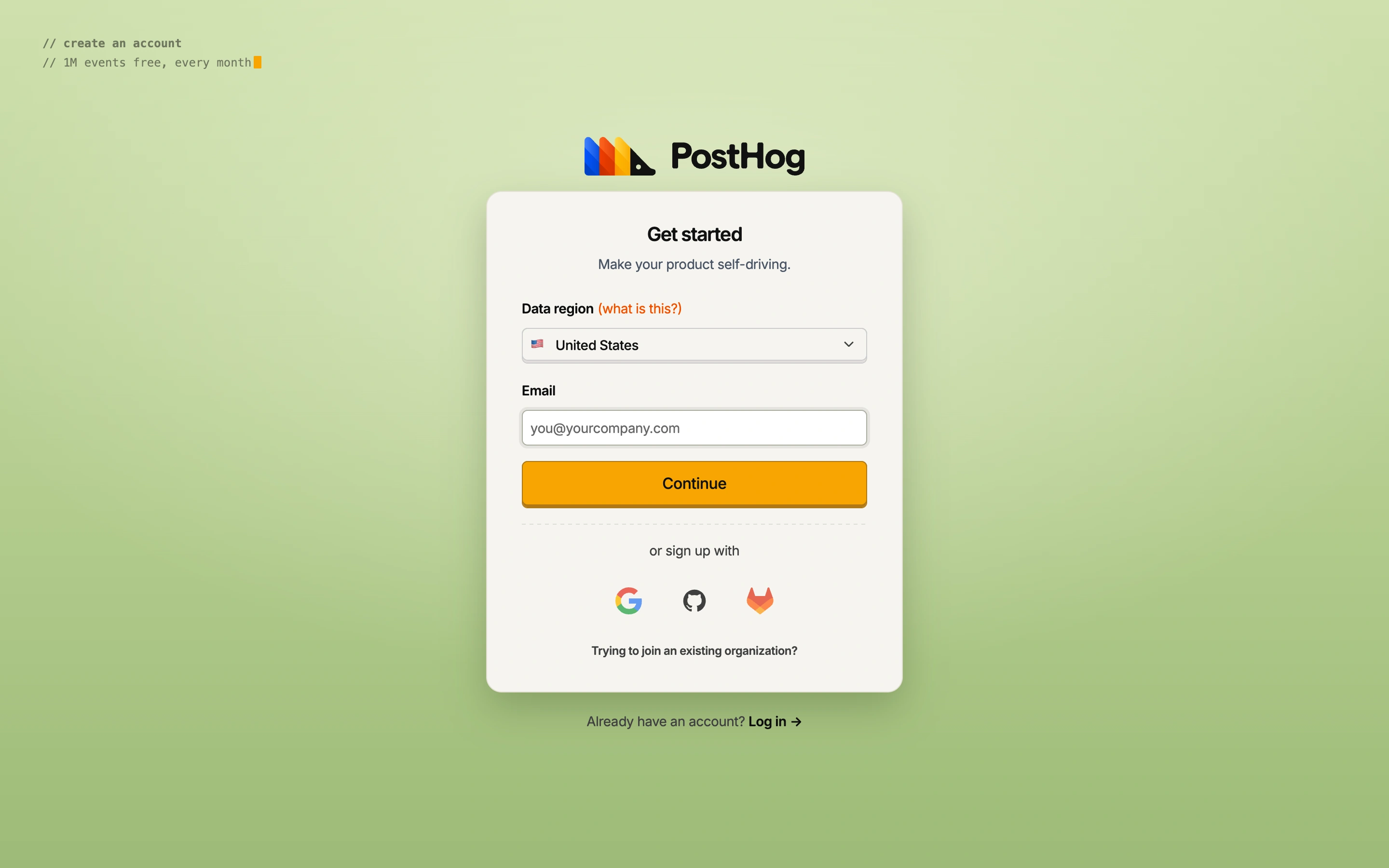
Viewport capture · opening screen Assembled in your browser. No API key or AI request needed. Changing the fields refreshes the preview.
PostHog — Create account
Forms & OnboardingSee it liveus.posthog.com
A cream signup panel on a green backdrop places a data-region choice before email entry and three identity-provider options.
Why this pattern works
Infrastructure and analytics signup flows where data location is an early decision.
Design notes
- Surface
- PostHog public account-creation screen.
- Navigation
- Single account card with an existing-account link below.
- Layout
- Centered stacked region selector, email field, Continue action, and provider icons.
- Density
- Low with short, clearly grouped form sections.
- Color
- Soft green background, warm cream panel, orange primary action.
- Type
- Plain sans labels with small monospaced introductory text.
- Pattern
- Expose a consequential setup choice before account creation and explain it beside the field.
- States
- Initial signup, with region selection visible; no account was created.
- Don't
- Do not use unlabeled provider icons or bury the meaning of the region choice.
Make it your own
Turn this reference into a useful brief for your project. Copy it into the AI tool you already use.