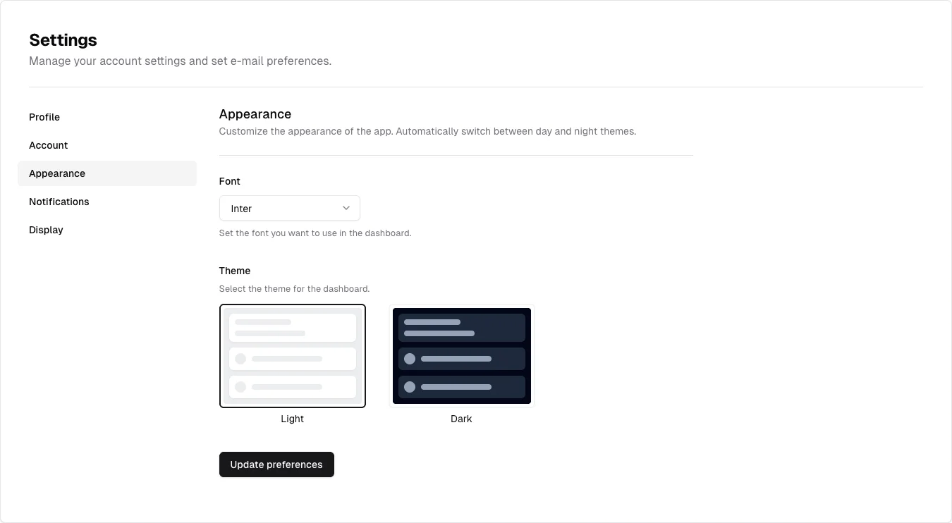
Show the effect of appearance choices visually rather than relying on labels alone.
Design notes
Surface
Appearance settings
Navigation
Appearance remains selected in the same navigation used by other settings screens.
Layout
A settings rail sits next to a narrow form with a font picker and side-by-side theme previews.
Density
A constrained form column leaves room between groups while keeping labels and controls together.
Color
Neutral settings chrome with miniature light and dark interface previews.
Type
Give visual theme choices enough space to compare while keeping their labels close.
Pattern
Show the effect of appearance choices visually rather than relying on labels alone.
States
Public v3 appearance-settings demo; no preference was submitted.
Don't
Adapt the interaction pattern to your own product. Do not copy brand assets, sample identities, proprietary text, or assume unseen states. Specify keyboard behavior, loading, empty, error, and narrow-screen layouts for your implementation.
Make it your own
Turn this reference into a useful brief for your project. Copy it into the AI tool you already use.
Add constraintsPreview & edit promptAssembled in your browser. No API key or AI request needed. Changing the fields refreshes the preview.