← Back to library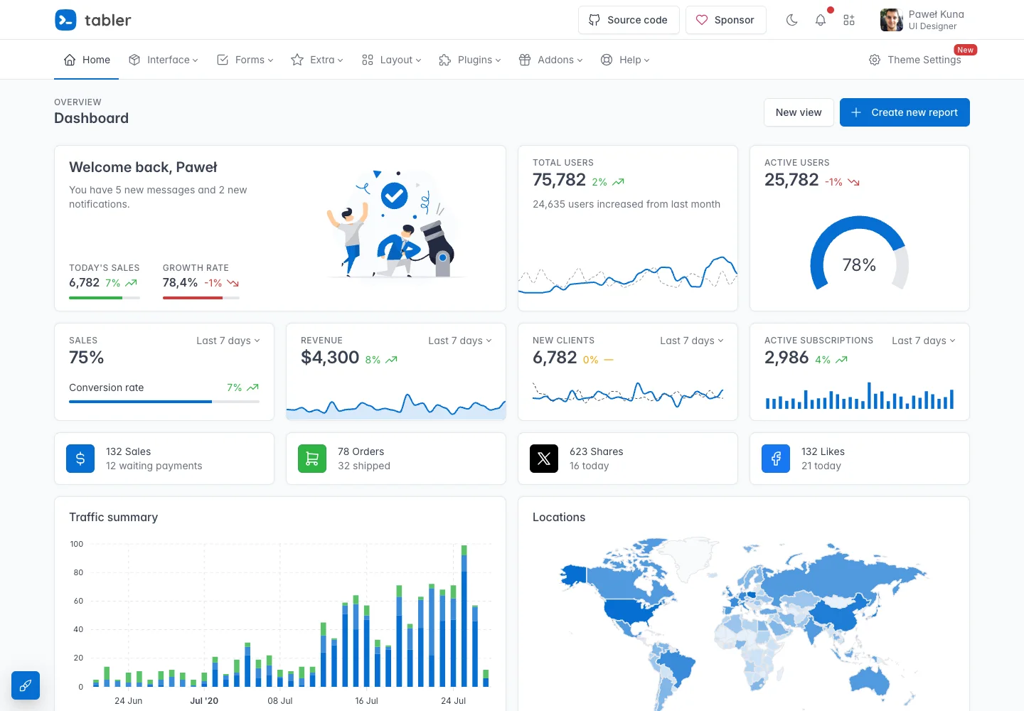
Page excerpt · scroll inside to explore Assembled in your browser. No API key or AI request needed. Changing the fields refreshes the preview.
Tabler — Dashboard demo
Analytics DashboardSee it livepreview.tabler.io
A dashboard demo combines metrics, trends, and activity in a consistent grid.
Why this pattern works
Place summary values before detailed tables and use a predictable widget rhythm.
Design notes
- Surface
- Dashboard demo
- Navigation
- A horizontal product menu separates global sections from the dashboard heading.
- Layout
- A multi-column metric grid leads into charts and activity summaries.
- Density
- Use consistent spacing within repeated information so headings, values, and secondary details remain easy to compare.
- Color
- Pale backgrounds, blue accents, and small green trend labels.
- Type
- Use a clear type hierarchy for the page title, primary content, and supporting labels.
- Pattern
- Place summary values before detailed tables and use a predictable widget rhythm.
- States
- Public dashboard demo with sample metrics and fictional account details.
- Don't
- Do not copy brand assets or sample records. Preserve keyboard access and design empty, loading, and error states for the actual task.
Make it your own
Turn this reference into a useful brief for your project. Copy it into the AI tool you already use.