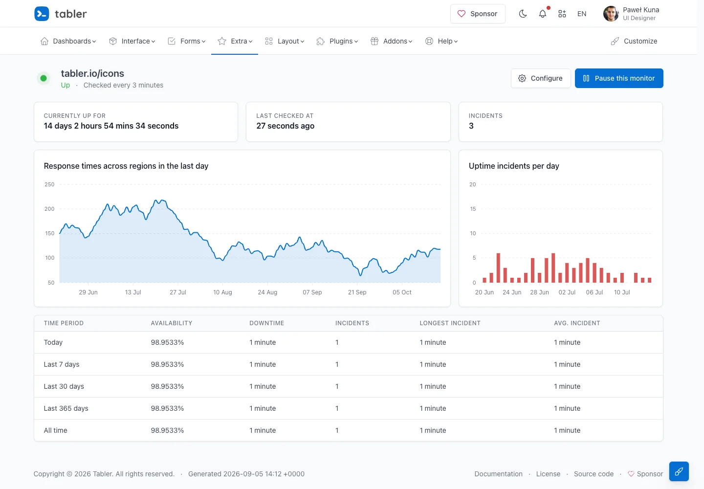
Connect current health with historical performance so users can understand both status and reliability.
Design notes
Surface
Uptime monitor
Navigation
Monitor configuration and pause actions share the title row.
Layout
Summary values sit above paired charts and a historical availability table.
Density
Headline metrics are spacious; supporting chart labels and rankings use denser alignment.
Color
Pale surfaces, blue response-time chart, red incident bars, and a green current-status indicator.
Type
Large duration values lead smaller chart labels and aligned historical measurements.
Pattern
Connect current health with historical performance so users can understand both status and reliability.
States
Public monitor demo with sample availability and incident data.
Don't
Adapt the interaction pattern to your own product. Do not copy brand assets, sample identities, proprietary text, or assume unseen states. Specify keyboard behavior, loading, empty, error, and narrow-screen layouts for your implementation.
Make it your own
Turn this reference into a useful brief for your project. Copy it into the AI tool you already use.
Add constraintsPreview & edit promptAssembled in your browser. No API key or AI request needed. Changing the fields refreshes the preview.