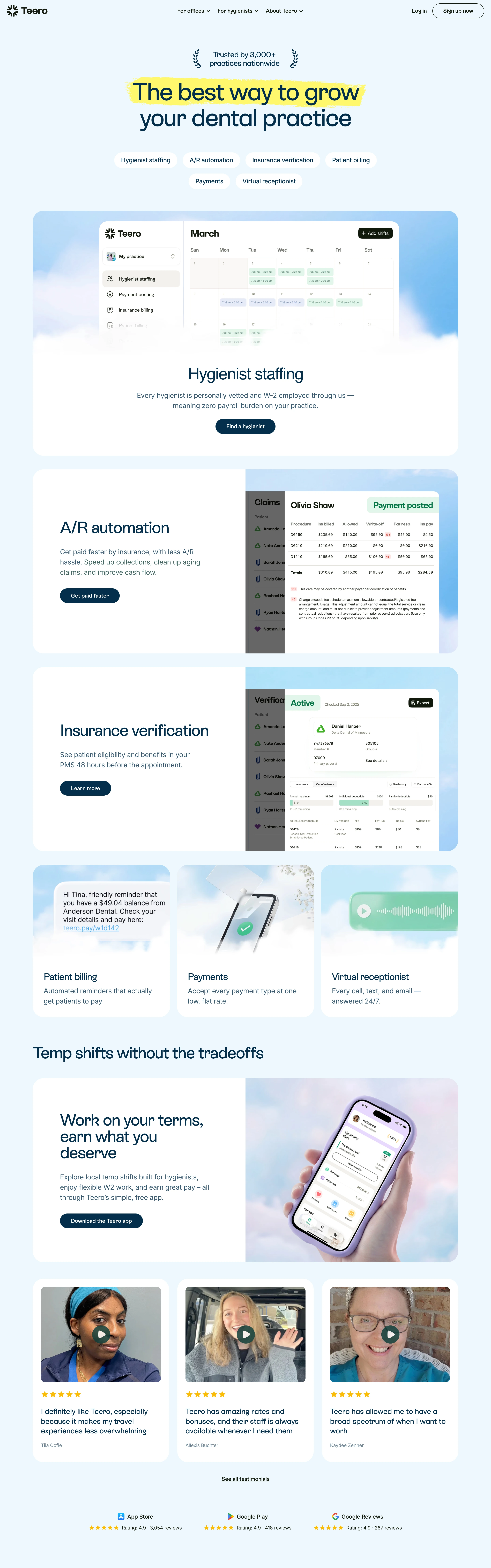
Friendly operational trust. A vertical SaaS that talks like a colleague who has already done your billing — plain claims, real faces, zero enterprise posturing.
Colors
A pale sky canvas (#EEF8FE) instead of white, deep navy (#042F4B) for headline type and for every filled pill CTA, and one yellow highlighter stroke (#FDF96D) swept behind the key phrase in the hero. Dark olive-black (#11190C) for the closing band and footer; sand neutrals (#A19D8D, #CAC4B7) for muted text; cloud-blue gradient plates (#93C9F4 → white) behind every screenshot; white cards on top of the sky. Saturated colour is confined to the product UI — mint payment pills, green checks, star yellow.
Type
ES Rebond Grotesque Semibold for everything — a soft-cornered grotesque whose quirky curves do the warming, so no second family is needed. Hero around 64–72px at roughly -0.02em, broken over two lines with only the first highlighted; section titles ~40px, often set as two short lines rather than one wide one; 16px body at a generous 2.0 line-height. Sentence case throughout, no italics, no all-caps.
Layout
Centred hero stack: a small laurel trust line, the highlighted two-line headline, a wrapping row of white pill chips naming every module, then one wide product screenshot on a cloud plate. Below that, alternating half-and-half module cards — copy, sub-copy and a navy pill CTA on the left, a screenshot bleeding off the card's right edge on the right — broken up by a 3-up card row whose tops are cloud plates and whose bottoms are plain text. Then a section header set flush left at the page edge, a persona block for the other side of the marketplace, three testimonial video cards with star ratings, and an app-store rating strip.
Motion
Restrained: cards and screenshots ease up into view on scroll and the pill chips are simple hover states. The energy comes from the highlighter and the faces, not from movement.
Texture
999px pills for every chip and button, ~32px card radii, soft cloud gradients under all imagery, real photography inside the cards, and the marker highlight as the only hand-made mark on the page.
Imagery
Generate: (1) cloud plates — soft lilac-to-sky gradient panels with faint cloud wisps, used as the backdrop every screenshot and photo sits on; (2) the product-UI mockups themselves, composed in real markup and cropped so they bleed off the right edge of their card: a month calendar of colour-coded shift blocks, a claims table with a green 'Payment posted' pill, an eligibility panel, an SMS balance reminder bubble, a phone with a green payment check, a voicemail waveform; (3) a phone-in-hand photo held over a lilac cloud plate; (4) three selfie-style video stills of real practitioners for the testimonial row, each with a play button and five yellow stars; (5) a thin laurel-wreath mark for the trust line. Tool: kie-ai Seedream or Flux for the cloud plates and the phone-in-hand shot, Pexels for the practitioner stills, real markup for every UI mockup. Screenshots always sit ON a cloud plate, never on flat white.
Don't
No mint-and-teal dental clichés, no stock hero of a smiling dentist over a chair, no gradient-filled buttons (the navy is flat), no dark mode, no icon grid of features — the pill chips do that job — and never more than one highlighted phrase on the page.
Make it your own
Turn this reference into a useful brief for your project. Copy it into the AI tool you already use.
Add constraintsPreview & edit promptAssembled in your browser. No API key or AI request needed. Changing the fields refreshes the preview.